We value your privacy
This website uses cookies to ensure you get the best experience on our website.
 Skip to main content
This website uses cookies to ensure you get the best experience on our website.


We look at how to leverage predictive eye tracking to improve your Black Friday marketing campaigns.
Read more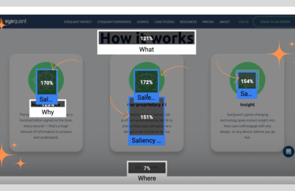
Imagine having the power to pinpoint exactly what grabs your customers’ attention. Well, now you can with our new...
Read more
We are very pleased to announce that we’ve been selected as a winner in the Digital Marketing Toolkit Awards...
Read more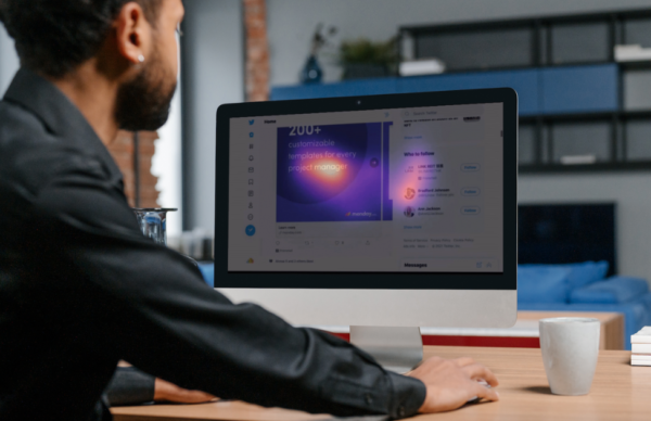
Our AI-powered eye-tracking technology provides instant, actionable insights to empower your design team. In this article, we give an...
Read more
Philip Storey is the founder of the email marketing agency, Enchant. He is an email marketing guru with over...
Read more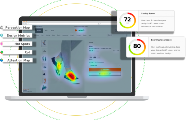
Check out our latest top tips on how you can use EyeQuant to spy on your competitors, analyse mobile...
Read more
EyeQuant’s unparalleled visual analysis tool is the result of over 20 years of academic research by three of the...
Read more
We are thrilled to announce that our CEO, Charles Blake Thomas, has been selected as one of the Top...
Read more
In this article, we’ll discuss our data-driven approach to CRO, including fundamental tools and principles that will help to...
Read more
We’re very excited to announce today the launch of our partnership with leading digital signage software platform, Signagelive. Through...
Read moreNo more posts to display
No more pages to load

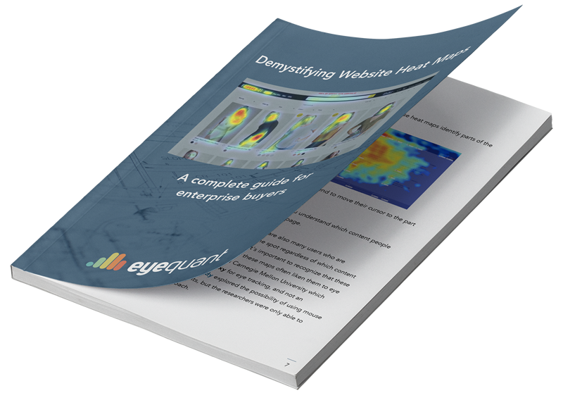
Heat maps: It’s probably the broadest, most popular category of insight tools available to any company that wants to understand and improve the user experience on their website.
They’ve been around for years, and most companies have used them at some time or another. They’re a staple tool for Analytics departments, Conversion Optimization teams, and User Experience professionals everywhere.
To learn how EyeQuant could improve your design process and increase conversion rates, book some time with one of our specialists.