We value your privacy
This website uses cookies to ensure you get the best experience on our website.
 Skip to main content
This website uses cookies to ensure you get the best experience on our website.


As most of you probably know, Amazon offers a premium membership called “Prime”, which allows you to get fast, free shipping on your purchases, as well as other benefits like streaming video and music. If you shop a lot on Amazon, it’s a pretty good deal at just $99/year, which is why many people (including myself) have signed up.
To drive these subscriptions, Amazon has a landing page set up where it offers users the opportunity to sign up for a free trial of Prime service. I decided to run a quick audit of this page and see if there might be some opportunity to improve it. For all the EyeQuant users out there, this is a good example of how you can use EyeQuant on your own sites.
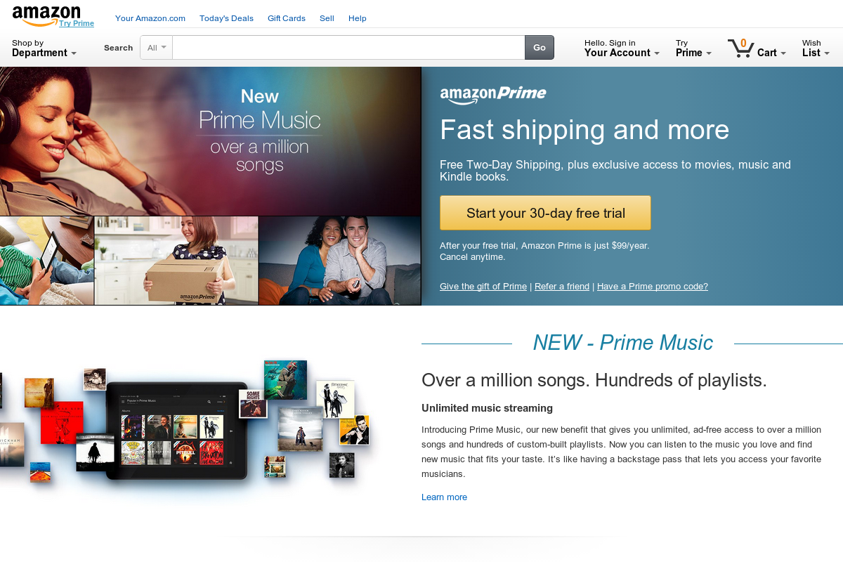
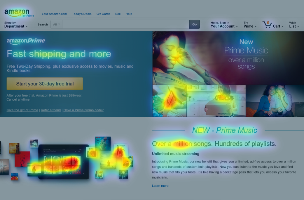
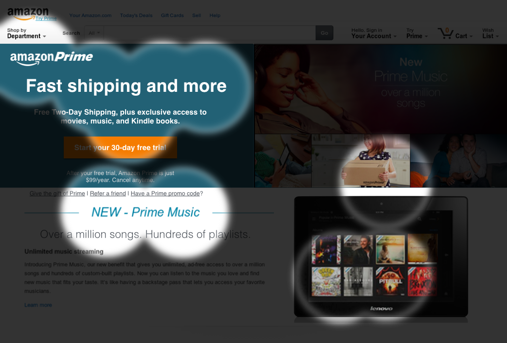
OK, here’s what you’re presented with when you click through to the landing page:
With a page like this, there are really 3 key pieces of information we need to convey to users:
I like to call this the “3 Ws”, but I’ve also seen it referred to as the Conversion Triangle or Conversion Trinity (shout out to Bryan and Jeffrey Eisenberg).
The first step to optimizing any landing page is making sure that you actually have all 3 of those present. For the Prime landing page, the 3Ws are present in the header, sub-header, and call-to-action button. So far so good!
But users (especially online shoppers!) are busy. They’re distracted. They have 6 other tabs open. So when they land on the page, we can’t expect (nor should we) that they will invest much/any of their precious time in finding the information they need to convert. That’s why pages that immediately direct a person’s attention to the “good stuff” enjoy dramatically higher conversion rates.
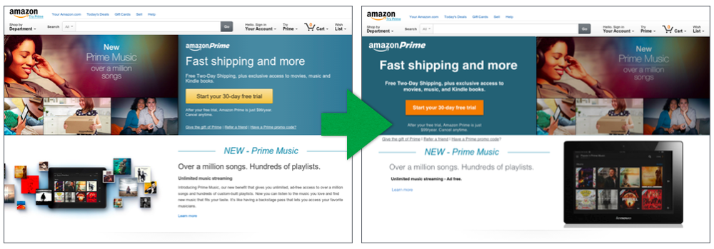
Unfortunately for the Prime team – and even more unfortunate for would-be Prime customers, this landing page falls quite short on this criterion. Here’s an EyeQuant Perception Map of the page. It shows which content people are likely to look at during the first 3 seconds of landing (with 85%-95% accuracy):
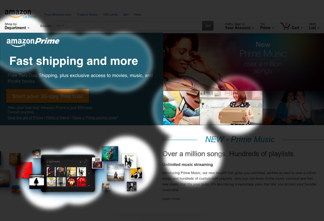
Looking at the Regions of Interest map in EyeQuant, we can see that by reversing the content positioning between the hero banner and the offer itself, we’ve effectively made the offer, value proposition, and 6x more eye-catching. Yet the busy creative on the right is still hogging up a lot of initial eyeballs.
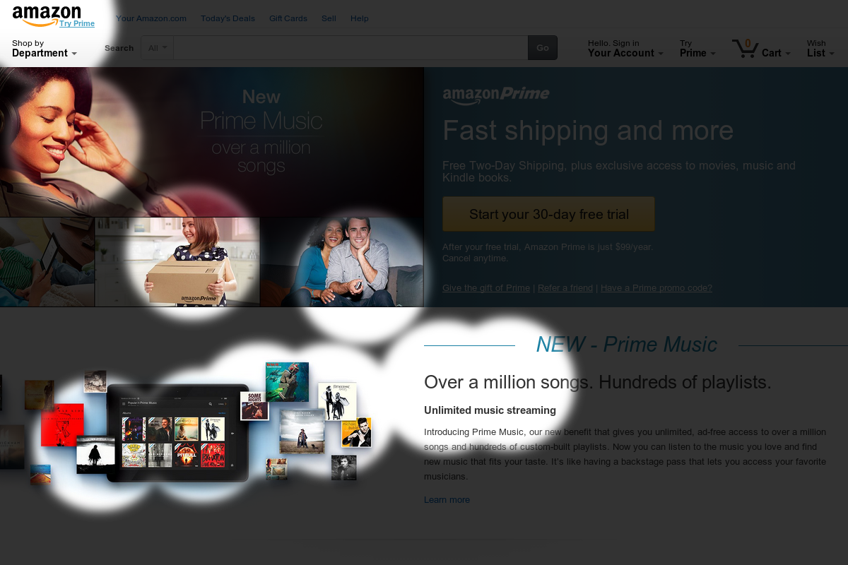
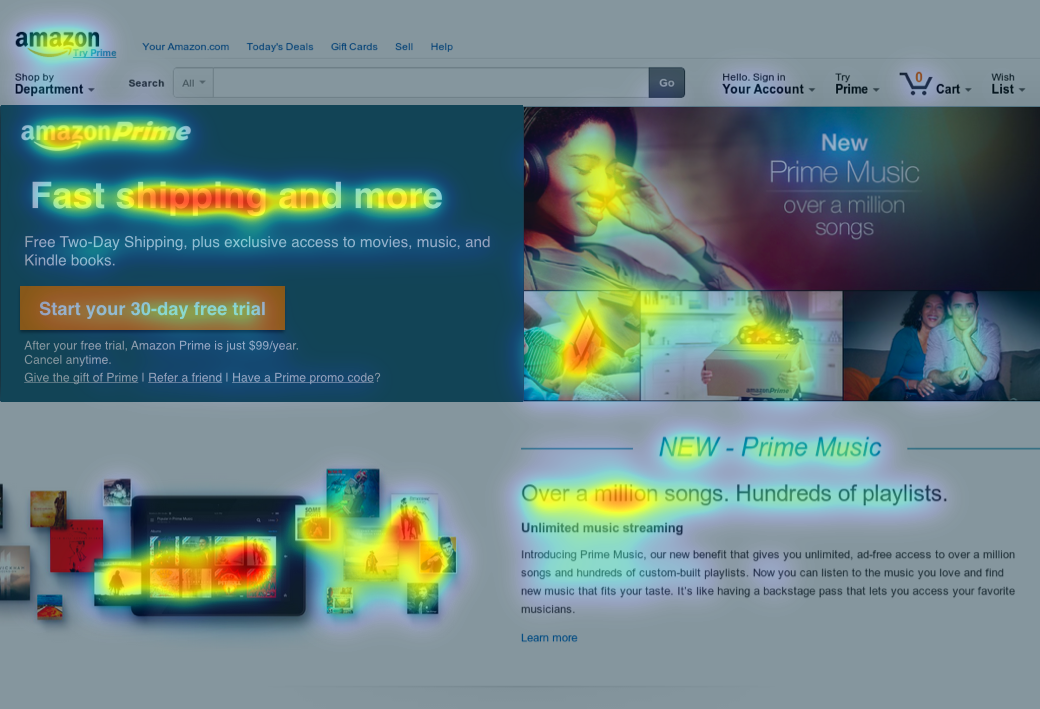
This is a big improvement, but a quick look at the Attention Map shows that the key message is still getting lost in the supporting imagery. So we’re not nearly done yet.
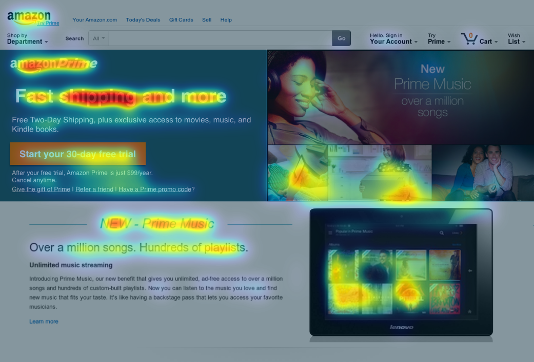
Here, I took the gradient background and made it a solid color, using the darker hue, while using a bolder typeface for the headline. Then, I darkened the CTA button to the exact colour we see on the Amazon logo. This one made a big difference. If we look back to the Perception Map, we can tell now that users are seeing the key offer in the headline within 3 seconds of landing.
The attention map shows that the imagery is still very strong – and is taking up valuable attention that we’d prefer to direct towards the 3 Ws.
First, I moved the tablet image to the right side – further away from that prime left-side real estate. Then, I got rid of a lot of the small, floating album covers, which didn’t convey a particularly strong message, but were visually grabbing. Instead, I simply showed one, larger image of the tablet with the Prime interface on the screen. Next, I turned down the contrast levels on the images. From the Attention Map, we can see that this dramatically shifted attention towards the headline area.
Ok, so now we’ve got a lot of attention on the headline, and we’ve minimized the distractors in the images, but the sub-header and CTA, which contain important information, aren’t as salient as we’d like.
Here, I moved the “give the gift” and referral links down, and centred the text and button to give the content a bit more breathing room, which tends to help attract eyeballs. Oh – I also changed the colour of the “Over a million songs…” header to a dark grey instead of black, so that it wasn’t so strong. The results were pretty great. We can now look at the Perception Map and observe that user immediately see the header, sub-header, and CTA – fulfilling our “conversion trinity”.
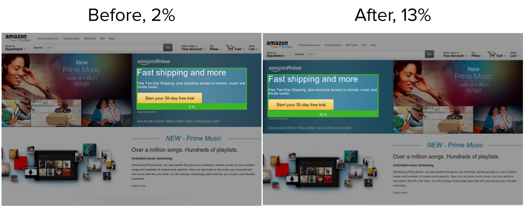
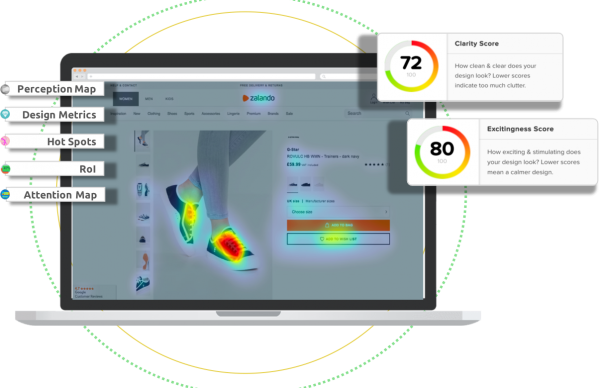
There’s still a critical flaw on this page though: according to EyeQuant, people are still likely to consider this page “busy” or cluttered. It’s visual clarity score is a 61/100, which is generally below average for single-product landing pages.
This shoots our clarity score up to 72 – effectively an 18% increase in visual clarity. More importantly, it’s now in the top 20% of all web pages in terms of design clarity (benchmarked against the Alexa 5000).
There are still ways to continue improving the clarity score, but without more information on which content is truly mission critical for Prime’s prospective customers, we’re satisfied with our 72.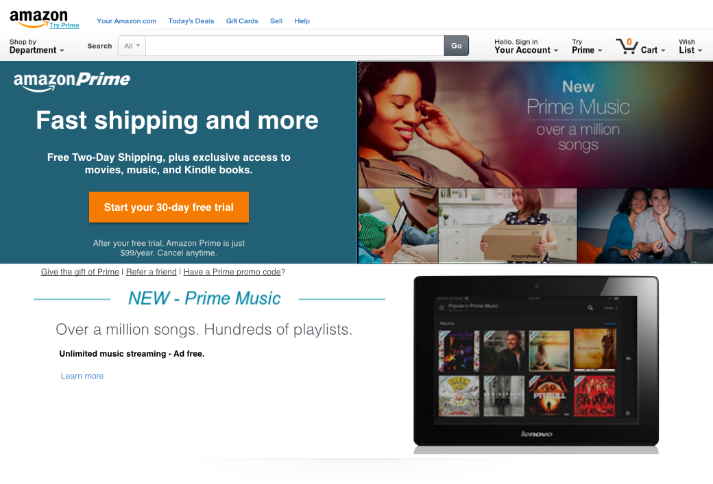
Let’s look at what we’ve accomplished here: with these relatively simple design changes, we’ve taken a page that was scattered, unfocused, and busy, and turned it into a laser-focused, relatively clean design, as measured objectively by EyeQuant. We even managed to stick with (presumed) brand guidelines.
Of course we don’t know for sure that this will perform better – we do need to verify our work here with a proper A/B test. But if you were a betting person, it would be wise to put your money on the data we’ve just seen!


Check out our latest top tips on how you can use EyeQuant to spy on your competitors, analyse mobile...
Read more
In our latest blog we explore how to use neuroscience to help create higher performing digital products.
Read more
Figma is the go-to prototyping platform for many UX and web designers – and not without reason. Its functionality,...
Read more