We value your privacy
This website uses cookies to ensure you get the best experience on our website.
 Skip to main content
This website uses cookies to ensure you get the best experience on our website.


You know Piet Mondrian’s (1872-1944) work: He made those paintings of intersecting lines in black and grey intermittently filled with blocks of white and primary colors, which have been printed on everything from carpets to coffee mugs. But when you get close to an actual painting by Mondrian, so close that a museum security guard walks purposefully toward you with a walkie-talkie in hand, you start to notice something: His lines aren’t perfectly straight; white paint has been thickly applied with visible brush-strokes, and it is cracking at the weight of its application. From X-rays made of several Mondrian paintings, we can see that black lines have been shifted left to right and up to down, layers of a blue, red, or yellow -each in a slightly different hue – have been applied and reapplied. In other words, his painting process was a lengthy one, full of trial-and-error.
Mondrian was a master of spatial harmony. He was a king of luminance. And…he was a great step-by-step optimizer.
Mondrian’s long road to innovation was surely influenced by balancing the opinions of his friends, his audience, his gallerists, his patrons, and his own self-criticism. From painting to painting, he learned by juxtaposing combinations of elements and various versions of essentially the same theme until increasingly complex and refined patterns emerged. During his time in pre-war Paris, for example, this resulted in the gradual understanding that an augmentation of white space would not only render colorful elements more salient, but would also create a more harmonious and fluid experience for the viewer. Sound familiar? This might be because web designers follow essentially the same process. In this article, we take a look at the process through which iconic paintings are made, how they are tested, and what this means for designers, landing page optimizers, and conversion experts.
We often think of great works of art as a singular stroke of genius – work that is begotten and finished in one grand, divinely inspired gesture.
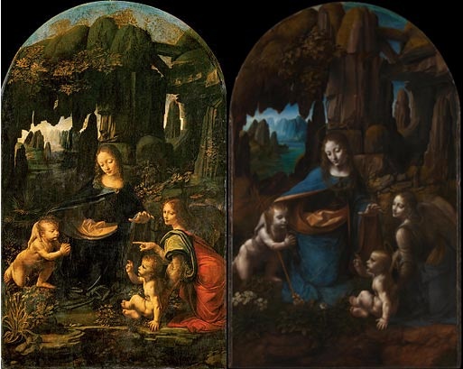
Excuse our pun, but reality paints a rather different picture: Some of the world’s greatest artists are and were extremely process-driven, and tend to use their own form of “A/B testing” as a way both to evolve their practices and to please their clients by testing and comparing each iteration of their work. While this form differs in some ways from the way in which websites are tested, the basic concept remains the same; their audience might just be a bit smaller. More surprising might be that many artists (especially during the Renaissance) made multiple versions of the exact same painting. There are endless examples of this peculiar tendency, but notable ones include Pieter Bruegel the Elder, who painted three versions of his Tower of Babel (1563), each slightly different in size, color, and composition; Michelangelo Caravaggio, who executed two versions of his Supper at Emmaus (1601 and 1606); and Leonardo Da Vinci, whose Madonna of the Rocks (1483-1486 and 1495-1508) famously has two versions.
Why do artists paint multiple versions of the same painting? While the answer to this question is debatable, two dominant reasons usually surface. First, as we know, artists – even ones on the more expressionistic end of the spectrum – develop their work through comparison and contrast, improving on the second revision of a painting by learning what doesn’t work in the first. Secondly, just like other entrepreneurs, artists too must sometimes oblige the whims of patrons who often want the latest and improved version of a painting they may have seen or just heard about – all for themselves.
Artists may have been A/B testing their work for generations, but with the emergence and availability of photo-editing and eye-tracking technology as an analytic tool, neuroscientists realized that they could study what compositional elements make a work of art great by studying the way people look at it in an actual A/B test. A study published in 2011 by University of Leicester professor Rodgrigo Quian Quiroga and his team set out to quantify the elusive power of spatial and luminance balance in painting by conducting A/B tests on original and modified versions of four abstract and figurative masterpieces, including two works by Piet Mondrian: Composition II in Red, Blue, and Yellow (1930) and his later, more visually complex Composition No. 8 (1939-42).
Quiroga and his team altered the two Mondrian’s by simply moving around their regions of color: A dominant square at the top right corner of Composition II in Red, Blue, and Yellow was switched from red to blue, while its smaller square in the bottom left switched from blue to red. In Composition No. 8, the small red square in the top left corner was moved to a region in the bottom right corner. Ten subjects were asked to look at high resolution images of the two versions of these and other paintings at their leisure as the paths their eyes took around the paintings were monitored using eye-tracking technology.
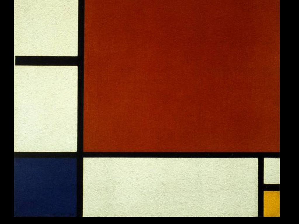
Their findings are fascinating: In the modified version of Composition II in Red, Blue, and Yellow, viewers couldn’t move their vision away from the large, now blue square – their gaze was essentially trapped there, and the harmony of the composition was compromised. The modifications to Composition No. 8 had a similar effect: When the red square was moved to a position that was normally filled with white, the viewers’ gaze was immediately drawn down (and stayed there); once again the path they would normally follow to visually explore the painting was corrupted. Essentially: seemingly simple tweaks created compositional quagmires in the maze of lines, complicating the system through which the artist intended to guide his viewers through the painting to safety.
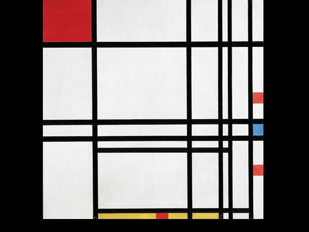
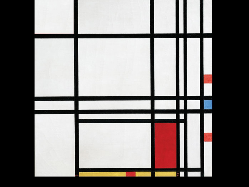
The reasons for these reactions to the modified versions lie in Mondrian’s uncanny aptitude for luminance and space. He may have understood, for example, that a highly salient color pattern such as a deep cool blue against a warm white surface would trump even a large area of red in drawing a viewer’s attention. It is even hypothetically possible to imagine his recognition that a predominantly Western audience would read from left to right and down, and so in the original version of Composition No. 8, the vibrant red square in the top left corner doesn’t ensnare a viewer’s gaze, but becomes a point of entry. Essentially, Quiroga and his team were able to quantify the success of Mondrian’s compositional skills, which may have had the artist himself – famously known for equating his painting process to spirituality – rolling in his grave.
The chasms between aesthetics and analytics – not to mention art and science – are deep. With relatively few exceptions over the ages (such as Op-Art during the 1960’s, which directly embraced the science of visual perception), artists and designers have been known to eschew the way in which their work is analyzed by scientists because it tends to negate intuition, historical and cultural context, and subjectivity. The relatively recent popularity of eye-tracking studies into the way in which an audience looks at an image – whether it be a modernist masterpiece or a landing page – is often met with a raised eyebrow and a stern warning that science cannot quantify art and design – and in many ways they’re right. No matter how much scientists delve into the analytics of composition, colour, and form, and subject-matter, they will be hard-pressed to elucidate the punctum (that special, unquantifiable aspect) of why certain art and design simply ‘works’. Certainly, there are limits to the point at which science can understand the highly nuanced and mysterious ability to determine elegance, beauty, cultural specificity, or the elusive ‘good taste’.
To further complicate matters, artists and designers are separated by their own prickly differences. While artists are most often able to relish in a certain freedom from the rationality of their actions, the very platform on which design stands is its practical application of artistic thinking. Designers are often wont to think of themselves more as artists than as engineers, exempt from analysis and comparative testing due to their honed intuition for what makes for ‘good design’. Working on the Internet – and for online businesses as clients – however, means that a design’s effectiveness becomes measurable: the internet enables analytics, and analytics breeds accountability.
Iterative optimization and creativity are not mutually exclusive concepts and processes – in fact, viewing it as such would be to misunderstand the ways in which artists have produced their work for centuries.
As cheesy as it might sound though, the same is true for conversion rate optimization. A successful CRO strategy requires you to work with both mindsets, embracing both creative and analytical tools and concepts. And we’re thrilled to see exactly this mindset in our customers and users at EyeQuant.
Don’t miss our next post and subscribe to the EyeQuant Blog by Email!
—


We look at how to leverage predictive eye tracking to improve your Black Friday marketing campaigns.
Read more
In this article, we’ll discuss our data-driven approach to CRO, including fundamental tools and principles that will help to...
Read more
Great SEO brings users to your site. A great UX helps them achieve their goals after they arrive. Too...
Read more