We value your privacy
This website uses cookies to ensure you get the best experience on our website.
 Skip to main content
This website uses cookies to ensure you get the best experience on our website.


Carousels. Sliders. Rotating banners. Whatever you call them, we all know them. They inhabit the home pages of most eCommerce and corporate websites, much to the chagrin of experts and the annoyance of users everywhere.
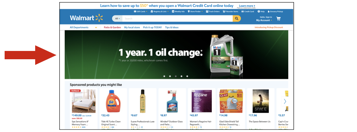
Walmarts’ homepage features a prominent banner carousel.
The usability issues around carousels are well documented. We all know the experience of landing on a site, trying to read the banner, having it switch on us before we’re done reading, trying to navigate back, etc. This frustrating experience is captured brilliantly in Jared Smith’s website “Should I use a carousel?“. But the obvious usability problems aren’t the only reason carousels negatively affect conversion.
There’s another factor that people don’t talk about as much, which is that they can have a dramatic impact on users’ first impression of your website. And since new banners are often added weekly or even daily, your carousel might inadvertently be sending mixed messages about your brand. In this post, we’ll look at just how important it is to make the right first impression.
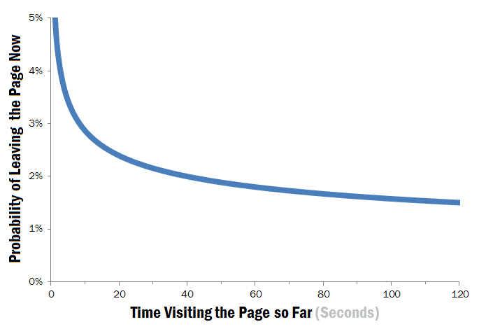
Research shows that the first few seconds of a users’ experience on your website can have a dramatic impact on their behavior.
This chart below shows the likelihood of a user leaving your site over time, and is exactly why Peep Laja has said that “the first second on your website might matter more than all other seconds that follow.” In fact, another study shows that it only takes about 50 milliseconds for users to form an opinion on your website.
What does all this mean if you have a carousel banner front and center on your home page?
Every time you update a carousel, you’re completely altering the most important seconds of the user experience – without even thinking about it. Worse, it’s often just to appease various internal stakeholders.
Huge! To illustrate, let’s look at 3 ways you could be sending a dramatically different message depending on which banner you happen to be running:
The design of a page sends powerful visual cues to users that indicate which content is important. These visual cues also determine which content will be looked at first. Very simply: when you change a banner, you change the visual hierarchy of the entire page.
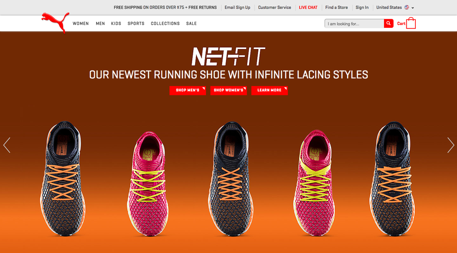
For example, Puma – the popular athletic wear brand – has a carousel on their website with 4 banners in total.
To show how different designs affect the visual hierarchy of your site, we used the EyeQuant A.I. to instantly simulate where people will likely look on the screen when presented with each of the 4 different banners currently running on the home page. The perception maps below show which content people will see in the first 3 seconds after arriving on the page.
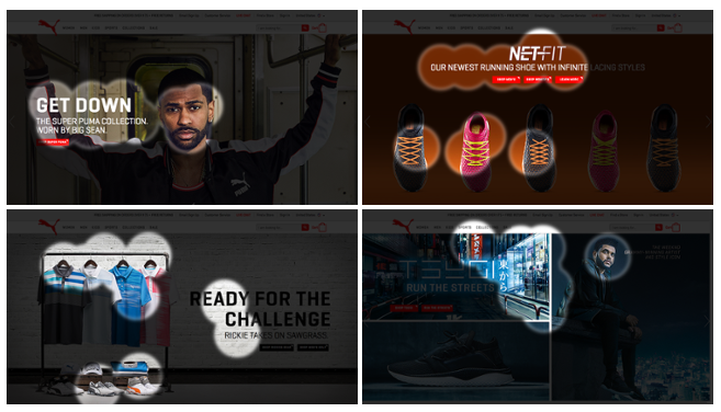
As you can see, the banner significantly affects which content users focus on: will it be the relevant bits (top row; headlines, CTAs), or completely unrelated content (bottom row)?
Depending on which banner happens to be showing, Puma is visually directing users to completely different content.
Users can also immediately identify designs that seem cluttered or busy. Landing on a clean, simple page like Google.com just feels very different from landing on a site like the famous Ling’s Cars:
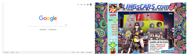
There’s a branding component to this: the Ling’s Cars website is intentionally busy – it’s part of the quirky, fun, and successful brand that Ling Valentine has built. But think about other brands that base their image on concepts like simplicity and elegance, such as Apple. For them, a cluttered page on their website can hurt their image.
In most cases, cleaner, simpler design reduces cognitive load and makes it easier for users to understand the interface and make decisions.
Looking at the Puma website again, we can see how changing the banner can make the entire design feel cleaner and clearer (bad if you’re Ling’s Cars), or cluttered and busy (bad for most eCommerce sites).
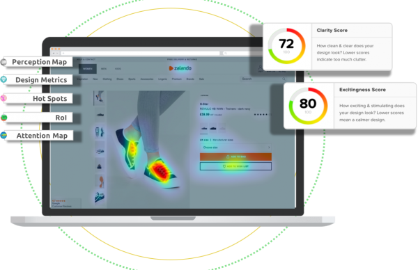
For each variation, you’re seeing a clarity score from EyeQuant, which rates the clarity of a design from a users’ perspective between 0 and 100. These scores are calculated using a predictive model trained with data from real user research. The results are representative of a 200-person survey.
As you can see, perceived clarity varies wildly depending on which banner is displayed:
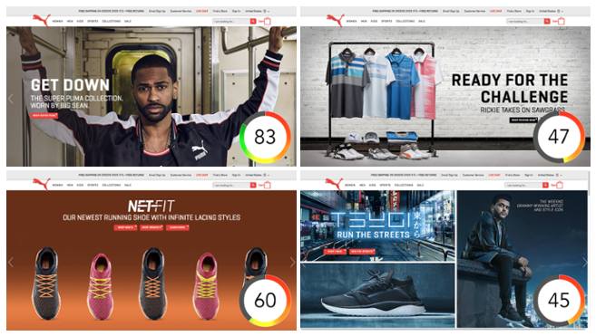
In one example, Puma enjoys Apple-level design clarity, while other versions come off as cluttered and busy, possibly leading to confusion or even frustration for users.
Users can also quickly discern between sites that are visually stimulating (exciting), and ones that are more calming, or even potentially boring. For any business, you want that first impression to match your brand personality and be appropriate for the type of products being offered.
A skateboard shop might want an exciting design, but what about a page offering life insurance? Here, a stimulating, exciting design might come off as overly playful or inappropriate. The imagery and color scheme of a banner can quickly decide whether your site triggers the desired emotion or not.
Even Apple is guilty of this. Here are two of the banners currently being displayed on their homepage, along with their excitingness scores from EyeQuant (again a 0-100 score from a predictive model trained with real user data).
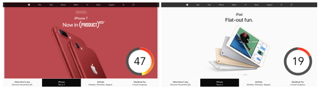
The design on the left is nearly 2.5x more exciting than the one on the right – ironic considering that the headline on the right is “Flat-out fun”. This is a simple case of the website not triggering the intended emotion – just because of the banner design.
In this post we’ve only looked at 3 facets of users’ critical first impression of your site, but already we’ve seen how rotating banners significantly impact that experience. This is just another reason why most companies should avoid using rotating banners to display content on their websites.
But that doesn’t change the fact that most eCommerce companies are using carousels today, and they aren’t going to disappear overnight. So what can you do if you have no choice? It’s important to have a proper quality control process for banner creative to ensure that the user experience is consistent from day to day and week to week. The most direct way would be to conduct daily or weekly user research sessions to evaluate banner alternatives.
If this isn’t an option, you can use EyeQuant to get instant, objective feedback on how a large sample of users will likely react to new banner creative. This approach enables you to test lots of variations and make sure that they’ll have the impact that you want before you put a banner live.


Check out our latest top tips on how you can use EyeQuant to spy on your competitors, analyse mobile...
Read more
In our latest blog we explore how to use neuroscience to help create higher performing digital products.
Read more
Figma is the go-to prototyping platform for many UX and web designers – and not without reason. Its functionality,...
Read more