We value your privacy
This website uses cookies to ensure you get the best experience on our website.
 Skip to main content
This website uses cookies to ensure you get the best experience on our website.


Demystifying Website Heat Maps: A Complete Guide for Enterprise Buyers.
Heat maps: it’s probably the broadest, most popular category of insight tools available to any company that wants to understand and improve the user experience on their website.
They’ve been around for years, and most companies have used them at some time or another. They’re a staple tool for Analytics departments, Conversion Optimization teams, and User Experience professionals everywhere.
But there’s a tremendous amount of confusion out there about what heat maps actually measure and how they should be used.
The truth is: most people that use heat maps are using them wrong.
It’s no wonder people get confused; the maps all look the same – just a reddish-yellowish-bluish-green blob overtop of your website.
The vendors in this space haven’t made it any easier. In an effort to simplify their message, many are guilty of using overly vague terms to describe what they do, and there’s no consistent naming conventions for the different types of heat maps.
In this post we’ll try to shed some light on the topic so you get more value out of the maps you use, and know which kinds you actually need depending on your goals. We’ll also point out common pitfalls and misunderstandings.
Let’s begin with the #1 rule for you to know:
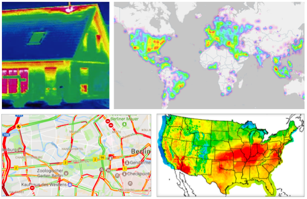
It’s incredibly important to internalize this concept. Heat maps aren’t data, they present data. They’re a way of color-coding numbers. A heat map can represent anything from the weather, to traffic congestion, to the energy efficiency of your house, etc.
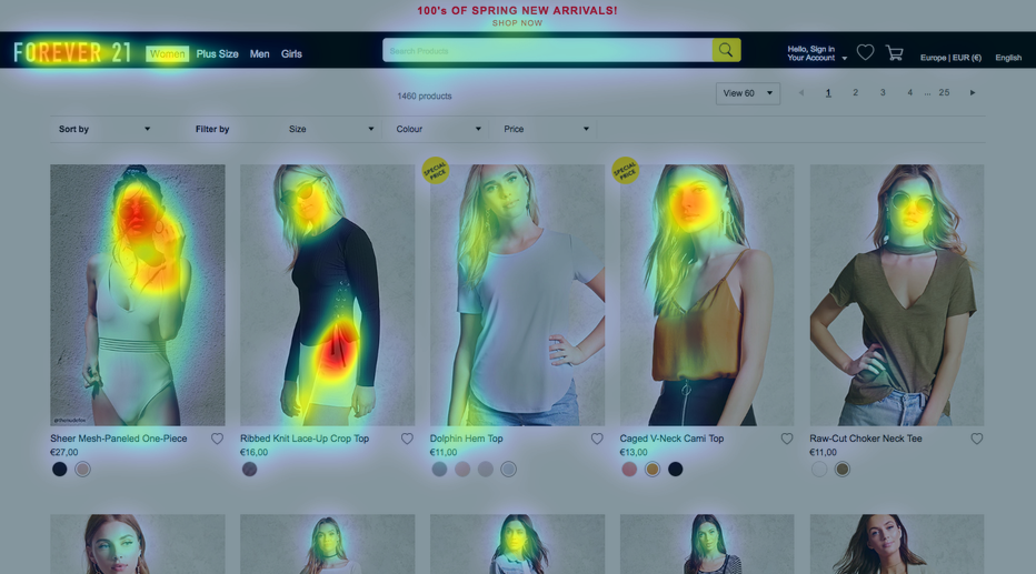
In the context of websites, a heat map can also represent many different things: mouse movements, clicks, physical eye fixations (either fixation volume or duration), scrolling patterns, and more.
You could be looking at a heat map that shows data collected during specific time frames, or an entire user session. You could be seeing data from all types of users, or just a specific subset. There are lots of variables and you need to have a very clear idea of which information you’re getting, and which information you want.
For example, here are 3 different kinds of heat maps for the EyeQuant homepage:
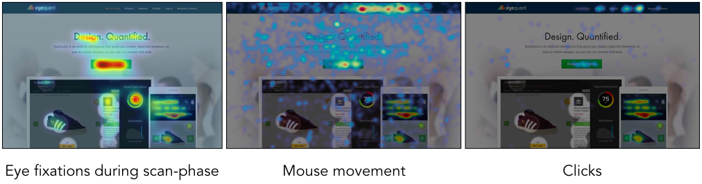
As you can see, there are noticeable differences between them. The map on the left is from EyeQuant itself, and it shows which content is most likely to catch users’ eyes when they first arrive on the page (note: this is actually simulated using an AI – more on that later). You’ll notice people tend to see the headline, call to action, and product image right away.
The second map (from HotJar) shows where users’ cursors were during their time on the page. You can see that many people hovered over the text and the links in the navigation, while other users moved their cursor to the side (on whitespace) so that it was out of the way. Here, we can gain a bit of insight into which content was most interesting for users.
Finally, the click map (also from HotJar) shows where people ultimately clicked. Seeing these 3 maps together shows a nice picture of the user experience: from what caught their eye initially, to which content was interesting, to what users ultimately decided to do.
Which one is most relevant? It depends entirely on what you’re trying to accomplish. With that in mind, let’s take a deeper look at the different kinds of heatmaps available.
This guide is thorough, so here’s the roadmap in case you want to jump ahead:

These are the most common category of heat map. You place some tracking code on your website, let it run for long enough to collect enough data, and you’ll end up with some interesting insights into how users are using their mouse to interact with your website. There are 3 main types of mouse-based heat map you can get:
They show which parts of a page are most (and least) clicked; whether it’s a link, photo, text, or even whitespace.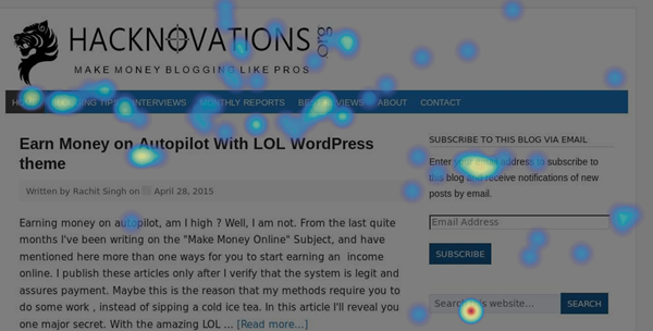
This click map from Hacknovations shows that visitors often clicked the search function
and navigation panel.
Click maps are useful to visualize which links & buttons are most popular, but they’re also useful for spotting some usability flaws. For example, you might occasionally find that people are clicking on something that doesn’t link anywhere. This can indicate potential confusion about how to navigate the site. For example, people may click on a product image because they expect it will take them to a page with more information on that specific product. Once you’ve spotted them, problems like this are relatively easy to fix.
Many people also use click maps to understand where people drop-off when filling out forms. This can help you make some quick changes to the form fields to increase completion rates.
Also called “Hover Maps” or “Attention Maps”, these heat maps identify parts of the screen that users hover over most with their cursor.
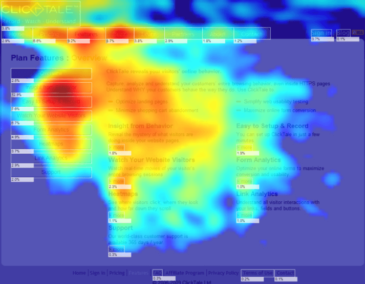
This mouse-movement heat map from Optimizely’s blog shows that users tended to hover over the table on the left of the page, suggesting it was a useful feature.
These maps are interesting because many users tend to move their cursor to the part of the page that they’re currerently attending to. As a result, a mouse-movement map can help you understand which content people tend to find most relevant or interesting on your page.
Be careful not to over-generalize, though: there are also many users who are “parkers”, meaning they leave their mouse in one spot regardless of which content they’re currently interested in. For that reason, it’s important to recognize that these maps don’t tell the full story. Vendors that offer these maps often liken them to eye tracking, despite a 2013 study by Google and Carnegie Mellon University which suggests that mouse tracking is a weak proxy for eye tracking, and not an appropriate substitute. A 2007 Google study explored the possibility of using mouse movment data to predict eye movements, but the researchers were only able to achieve 64% accuracy using this approach.
These are a great way to visualize how far most users are scrolling down a page, and which sections they spend the most time on.
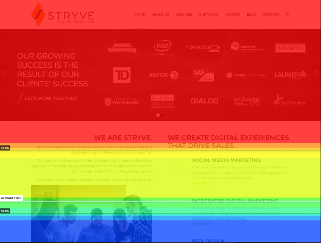
This scroll map shows that nearly half of users won’t scroll far enough to immediately discover the full range of services offered by Stryve – that’s useful insight for their team.
Scroll maps help you understand how much your users actually know about your products or services. It can be quite illuminating and a little bit distressing to find out that many users don’t make it far enough down the page to absorb certain content.
![]()
Hot Jar, Crazy Egg & Clicktale seem to be the most popular choices in the space. Hot Jar is the newest of the 3, and has rapidly gained market share since it was founded in 2014. Crazy Egg is the most basic option, with a fairly limited but very affordable offering.
Decibel Insight is another good option for enterprise buyers.
Last but not least, TruConversion is an interesting new player in the space. According to Founder Justin Rondeau, the company (which was acquired by Digital Marketer) intends to differentiate itself with powerful segmentation features and advanced filters.

To truly understand how users actually look at your website, you can perform studies that involve measuring and recording the physical eye-movements of people using your website. The classical approach to this is lab-based, where participants in the study wear tracking devices that precisely measure each eye movement, although some vendors now offer a web-cam based approach as well.
When conducting physical eye tracking studies, you have the ability to gather lots of interesting data that can be visualized as a heat map. When dealing with eye tracking heat maps, it’s incredibly important to understand exactly what you’re looking at. One major source of confusion is timeframe.
A heat map showing how users look at the page during the first 3 seconds – while very valuable – won’t look the same as one that spans 30 seconds. The example below shows how timeframe impacts how the heat map looks:
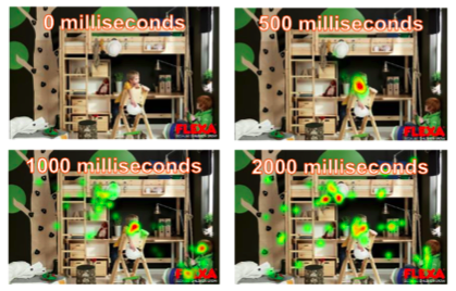
This example from IMOTIONS shows how fixations on the ad evolve over several different timeframes (from 0 to 2000 milliseconds).
Another common source of confusion with eye tracking heat maps is around the actual data being shown. There are 2 main types of heat maps in eye tracking, and they’re very different.
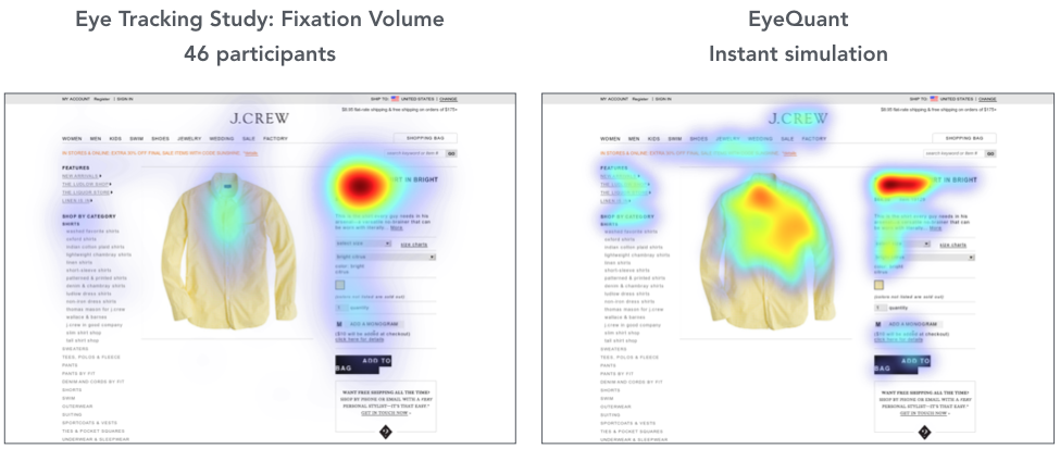
A fixation volume heat map shows which parts of the the page attracted the highest number of eye fixations. Usually, a fixation is recorded every time a user looks in a single spot for more than 50 milliseconds, essentially measuring how often people looked at a particular piece of content. Meanwhile, a fixation duration heat map shows how long they looked in a particular spot. Many people confuse the two or are unaware that this distinction exists. As a result, they misinterpret the data. Again, the #1 rule : you have to understand what data the heat map is actually visualising, otherwise it’s not useful.
For example, a fixation volume heat map will be more useful to understand which content actually stands out in a design (i.e. is the most eye-catching), while a fixation duration heat map might provide more insight into which content was most visually interesting for users.
An eye tracking study also makes it possible to understand common gaze paths, and the typical order of fixations across the page.
The pros and cons of eye tracking vary depending on the methods you use, but in general you gain insight that goes beyond the transactional nature of clicks and mouse movements. Further, you can run an eye tracking study on prototypes and mockups – not just live websites. That’s a huge advantage if you’re working on a major redesign.
The downside of eye tracking mostly comes down to practicality. It tends to be expensive and time-consuming, yet it can still make sense depending on the project. Let’s take a look at a few of your options if you’d like to collect some eye tracking data:
There are many user research labs that you can hire to run professional eye tracking studies with high grade hardware and expert experiment setup. This approach delivers the most precise results, and and allows you to customize the different types of insights you’d like to get from the study.
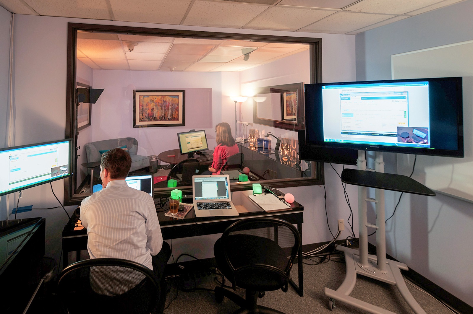
A professional usability lab at the Experience Dynamics consultancy.
You’ll likely be able to combine the data with qualitative interviews with the people looking at your site, which can yield additional insight. This is an interesting option if you’re looking for a one-off project to gain a deeper understanding of how users see your website, not just how they click or navigate it. It could also be a great method to use if you want to validate late-stage prototypes for a major redesign that hasn’t gone live yet.
![]()
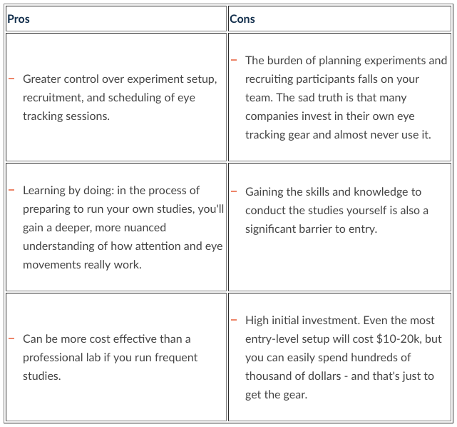
There’s a DIY option for eye tracking as well. The required hardware has become much more affordable in recent years, so it’s entirely possible to buy your own gear and set up your own eye tracking studies. This can make sense if you plan to conduct constant testing on high-value projects, and are wiling to invest in both the equipment and the expertise.
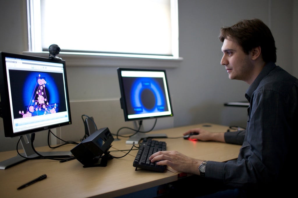
An example of an in-house eye tracking setup from ConversionXL’s blog.
Top Vendor for Eye Tracking Gear:
The leader in the space is Tobii, which offers a wide range of eye tracking hardware.
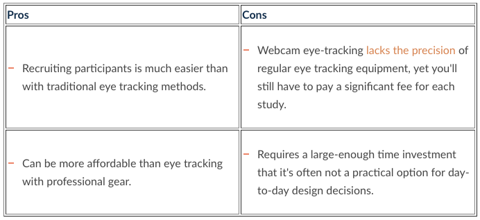
This approach doesn’t use any professional gear at all, and allows you to crowdsource participants to have their eye movements tracked through their own webcam. This is an interesting option for when you want to do regular eye-tracking but don’t have the budget for a professional study.

Pros and Cons of Remote Eye Tracking via Webcam
Top Vendor for Webcam Eye Tracking:
Sticky is the leading vendor in this space.
The heat maps we offer at EyeQuant are another popular approach to gaining insight on web design, which would have seemed like science fiction a decade ago.
By applying machine learning algorithms to user research data, we’ve built an AI for design analysis that includes intitial visual attention heatmaps. What’s special about this approach is that you can get feedback on any design in a matter of seconds.
Here’s a quick look at the different maps you can get:
This map is the equivalent of a 3-second fixation volume eye tracking heat map with at least 25 participants. It shows which content is most and least eye catching for users when they first arrive.
Armed with this map, it’s easy to spot content that might distract users. The results from EyeQuant are 85-90% as accurate as lab-based eye tracking.
This visualization shows which content the EyeQuant AI expects people to see within 3 seconds of landing on the page (roughly covering the first 10 eye movements).
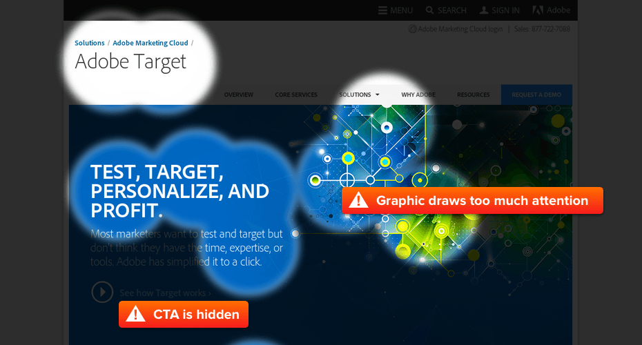
This allows you to quickly and easily check if users will see the most important content on the page right away, or if they have to exert effort to find it. If you’ve done a good job of establishing a visual hierarchy on the page, users should immediately see what the page is about, why they should care, and where to go next.
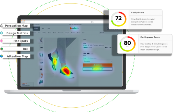
Clarity maps (also known as clutter maps) from EyeQuant show which parts of your design are most (and least) likely to be considered overly cluttered.
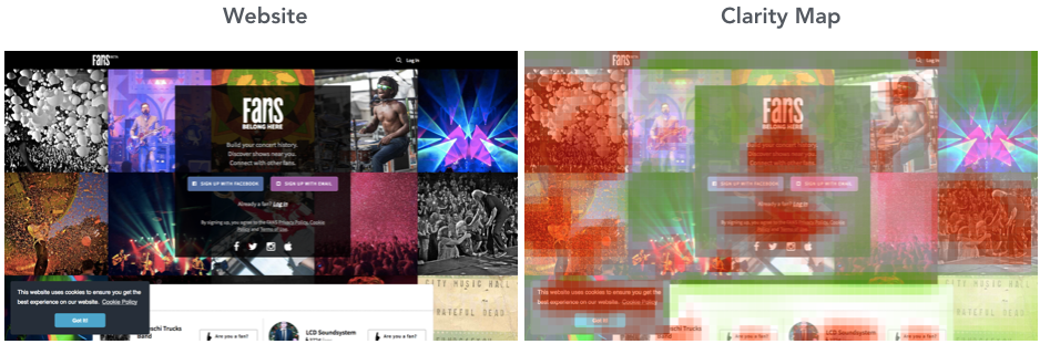
The clarity map for Fans.com suggest that the background imagery might be too busy.
This map is useful for spotting areas in a design that should be tidied up, removed, or redesigned.
Some typical use cases are: comparing and validating design ideas, communicating design decisions to stakeholders, qualifying design variants for further testing, and for quality control on creative (banner choices, hero images).
Which ones you need depending on your goals
Not all heat maps are necessary to help you accomplish particular tasks. Other times a certain heat map might be nice to have but isn’t all that feasible to implement. Here’s the one’s we recommend you use depending on the type of work you’re carrying out.
Professional eye tracking, EyeQuant
Nobody wants to invest a ton of time and money redesigning their website only to have it flop when launched. But it happens all the time: from Marks & Spencer, to Healthcare.gov, to the multiple failed re-designs of Target.com.
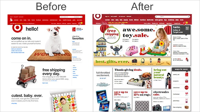
Target’s 2013 redesign prompted an article from AdWeek titled “Pretty much everyone hates the new Target.com redesign”.
There is absolutely no excuse to ship a new website without doing some prior testing on it to validate the new design. Failing to do this can be an expensive mistake that sets the company back in its digital transformation, and could even cost you your job.
In addition to qualitative user testing, it can be useful here to conduct a professional eye-tracking study on the new designs before going live. However, that final design will be the result of thousands of smaller design decisions, and each one of those should be made as objectively as possible. Those day-to-day where EyeQuant heat maps can be extremely helpful.
Mouse tracking heat maps
Many companies start looking at heat maps because they’ve recently decided to invest in a more sophisticated analytics suite, and are building a tool stack to provide hard data on how users are behaving on your website. In most cases the analytics team will own this stack, and provide insights to other areas of the business when needed.
Example of an Adobe Analytics dashboard.
For this use case, mouse tracking heat maps (which passively collect data) are probably the best bet, while a specialized UX researcher might be more interested in the other methods we’ve looked at.
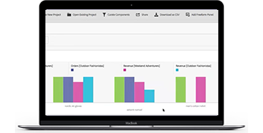
Mouse tracking heat maps, EyeQuant
Many companies now have a dedicated conversion optimization team that collects ideas for how to improve their website and conducts A/B tests in the hopes of increasing conversion rates. The mantra in years past was that even losing tests are actually winners, because you learn something about your users. While true in a sense, the business also needs to see a return on investment, and very few A/B tests actually generate meaningful uplifts.
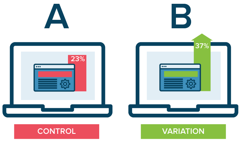
Photo from Neil Patel’s post on mastering A/B testing
That puts pressure on the optimization team to improve its win rate. The most fundamental way to do that is to form better hypotheses by doing more up-front research on how users currently engage with the website. The more data sources that point in the same direction, the better. That’s where mouse tracking heatmaps can be very valuable, in addition to user testing, surveys, etc. EyeQuant can also help here by showcasing potential UI flaws.
Another key way to improve win rates is by validating potential page variants before committing to the A/B test. For design-related changes, EyeQuant is a great way to validate design variants before launching a test, and to weed out weaker variants. The effect of this is two-fold: you should see a higher win-rate, and you’ll waste less time on poor variants, which helps you increase test velocity.
Eye tracking is usually not a great solution for the day-to-day work of optimization teams – primarily for practicality and budget reasons.
Internet professionals have been using heat maps for years to learn incredible things about how users are interacting with their website. At this point you should be well equipped to cut through the jungle of marketing messages, and bring the right heat maps into your arsenal of tools. Here are a few important things to remember.
1. The most important piece of the puzzle is understanding the data each heat map represents. Determine what you’re trying to accomplish, then figure out which data is most relevant to help get you there.
2. Think about your workflow: when do you need insights and how often? Some heat mapping tools are better suited for one-off projects, while others can be used everyday. Some can be used during the design process while others can only give you feedback once a page is live on your website.
3. It’s not an either-or decision. World class digital teams often use several different types of heat maps in different parts of their workflow. You may need to look at using more than one vendor.
Most vendors do provide personalized demos, whitepapers, or free trials – so it’s fairly straightforward to get a taste of what their service has to offer.


Check out our latest top tips on how you can use EyeQuant to spy on your competitors, analyse mobile...
Read more
In this article, we’ll discuss our data-driven approach to CRO, including fundamental tools and principles that will help to...
Read more
From maintaining audit trails to preparing your “toolkit”, the key strategies to successfully manage senior stakeholders in any design...
Read more