We value your privacy
This website uses cookies to ensure you get the best experience on our website.
 Skip to main content
This website uses cookies to ensure you get the best experience on our website.


In 2006, Nielsen Norman published some fascinating research on how people scan and read websites. They announced that their study showed users tend to view web pages in a kind of “F-Pattern”, and shared 3 examples of heat maps containing a distinct F-shape:
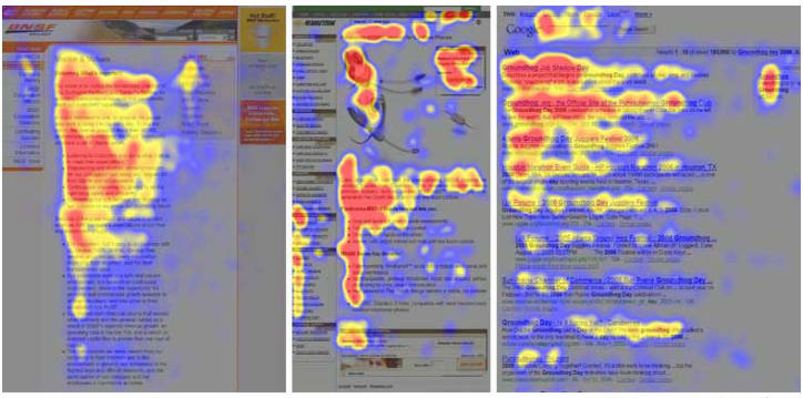
The study’s conclusion has been shared by several influential blogs over the years, and a huge number of designers and marketers have incorporated this insight into the way they work.
However, here at EyeQuant, we’ve done an extensive amount of quantitative analysis of eye tracking data, and we’ve yet to find any evidence that this bias towards an F-Shape exists at all.
For example, we analyzed one of our past eye tracking studies that included 99 websites spanning several different categories. Each one was viewed by 46 participants who were given realistic tasks for each website. On an eCommerce site they might be asked to research a particular kind of product, while on a hotel website they might be asked to book a room, etc.
We specifically tracked how users scanned the page when they first arrived on each website, and recorded 157,498 “scan-phase” fixations. What did we find?
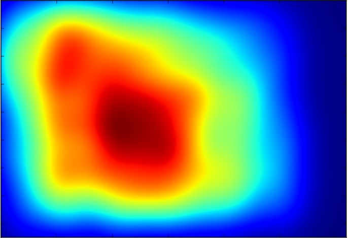
As you can see, users do exhibit a bias towards certain parts of the screen, but that bias does not necessarily look like an F (or any other letter). It’s simply a blob. The bias we observed was mostly towards the middle of the screen, and slightly to the left. Empirically, this appears to be the best place for you to put priority content (i.e. your 3 Ws).
In fact, out of those 99 websites, we didn’t find any individual heat maps that closely resembled an F. Here are some examples of the heat maps we did see:
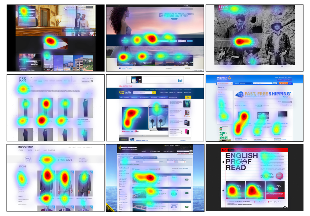 A sample of fixation-volume heat maps for different pages in the study (46 participants).
Of course, that doesn’t mean that such examples don’t exist, and we don’t have any proof that it wouldn’t emerge over a longer viewing time, as we only studied where people looked in the first 15 sec (+/- 6 sec) on average.
But this data does suggest that you probably shouldn’t rely on the F-Shape as a golden rule when designing websites. In fact, looking at the heat maps above, it’s clear that there is no “golden rule” for layouts that you can confidently apply to any design. There are simply too many other factors that influence eye movements. Here at EyeQuant, we use machine learning to figure out what those factors really are. If you’re interested, you can learn more about our research here.

