We value your privacy
This website uses cookies to ensure you get the best experience on our website.
 Skip to main content
This website uses cookies to ensure you get the best experience on our website.


Epson increased sales by using Design Metrics to drive 10% more clicks on the “buy now” button.
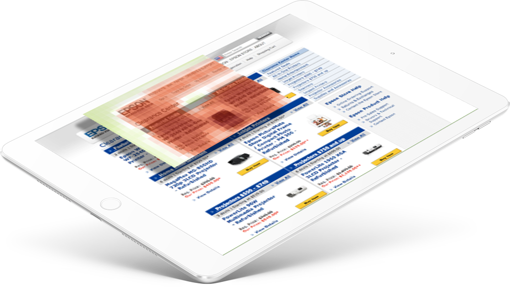
On the Epson website, customers can buy printers, ink, paper, projectors, and other products. Epson’s eCommerce team is continuously running A/B and Multivariate tests, and were looking for an insights tool that could help them run smarter design tests. They turned to EyeQuant for help.
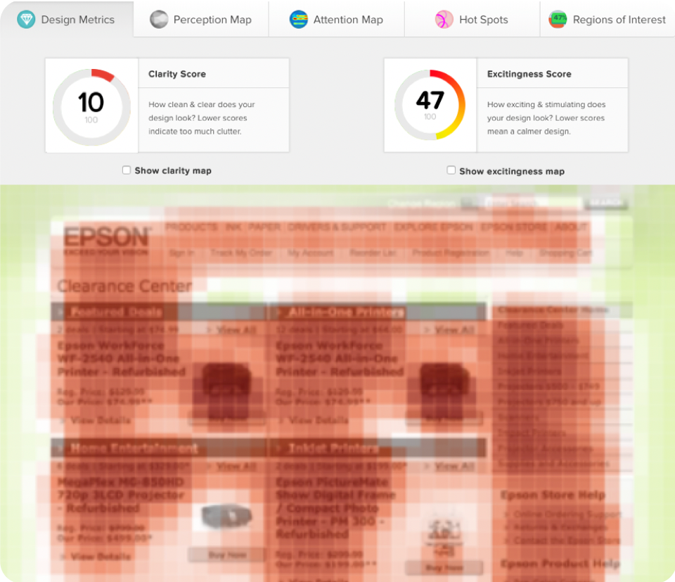
A quick EyeQuant test uncovered that the category page presented too much content upfront. It’s clarity score was at 10/100, which can lead to higher cognitive load for users.
Epson decided to change this by de-cluttering their page and creating a clear visual hierarchy.
They tested a number of hypotheses such as:
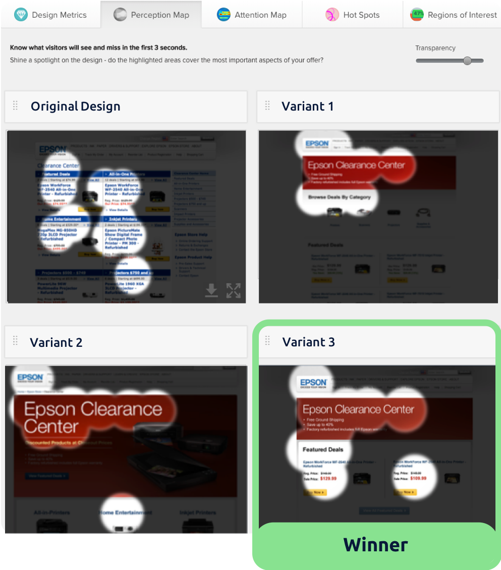
The team ultimately decided on a design that a) directed user attention to exactly the right content, and b) did so in a way that was visually clean, clear, and well organized – achieving a clarity score of 78.
This is well above average for category pages, and is a 68-point improvement on the existing version of the page. The new design was shipped for A/B testing.

To learn how EyeQuant could improve your design process and increase conversion rates, book some time with one of our specialists.