We value your privacy
This website uses cookies to ensure you get the best experience on our website.
 Skip to main content
This website uses cookies to ensure you get the best experience on our website.


In this pilot research study we analysed over 200 website homepages, from 12 individual industries, using the EyeQuant algorithm to identify the emotional impact and visual clarity of each design. We filtered lists of websites starting with the lowest Alexa Traffic Ranking score to ensure we were reviewing the most popular websites within those industries i.e websites that had the highest website traffic within that industry. The majority of time spent on websites still comes from desktop users, compared to 40.1 percent for mobile users, so for this study we focused our analysis on desktop experiences rather than mobile.
Why have we conducted this pilot study? We wanted to discover which industries have the most stimulating and/or cluttered website designs. We hoped that by revealing the differences in averages for visual clarity and excitingness we’d be able to identify interesting trends, as well a providing a source of inspiration. You’ll see from the findings section below that we used EyeQuant’s attention and perception heatmaps to conduct more in depth analyses of how the top websites from ecommerce, gambling, insurance, banking, pharmaceutical, higher education, travel booking, airlines, SaaS, car sales, car rental and healthcare directly compare.
It’s well documented that emotion and speed of decision making (closely linked to clarity) play a huge role in decision making so which industries are using design Psychology to attract and convert users?
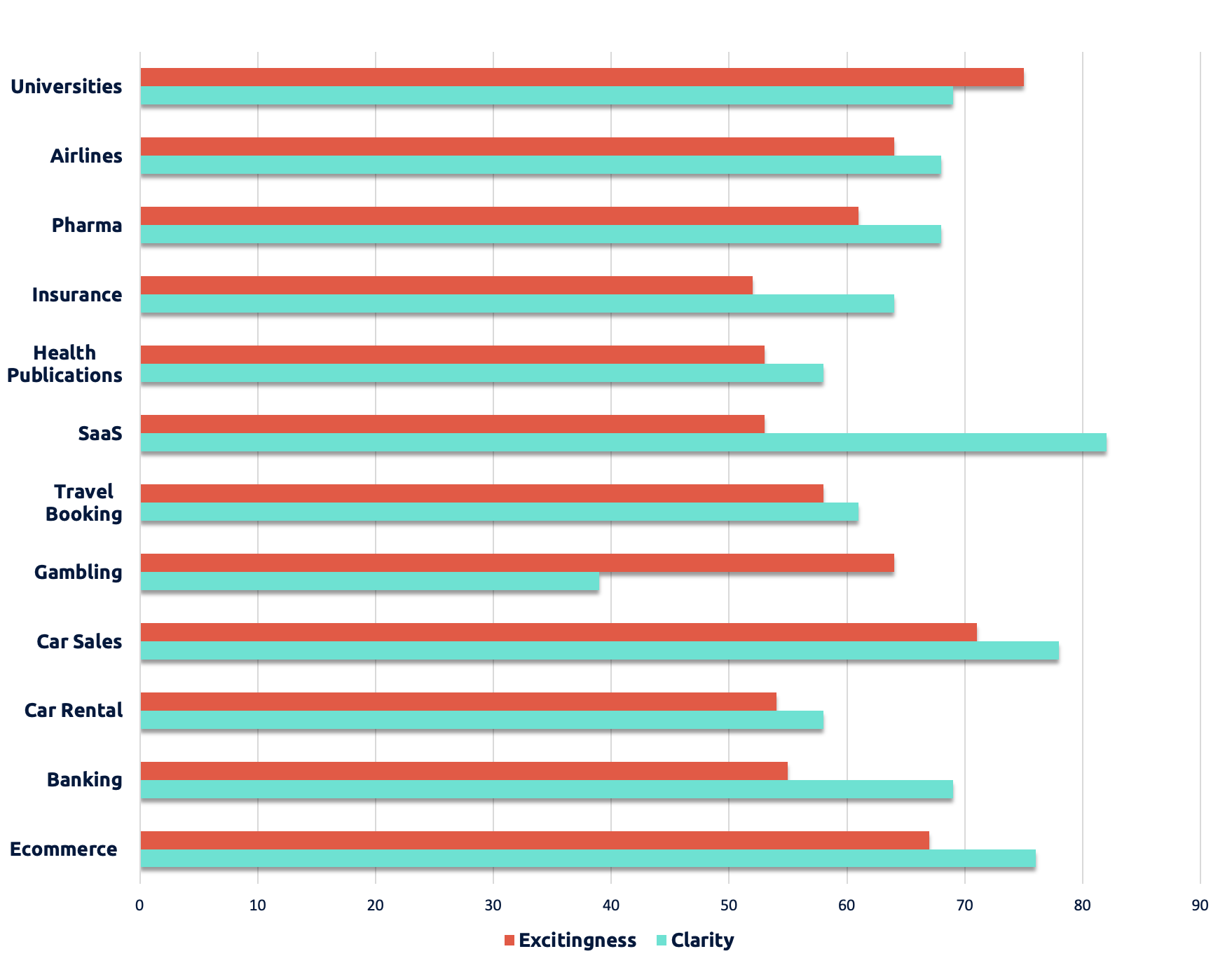
What do car sales and software-as-a-service websites have in common? Turns out quite a lot actually. Buying a car is a very considered process, taking weeks, often months. Similarly, most SaaS decision making processes take much longer than making a decision to buy a new pair of shoes, book a flight or place an online bet.
More often than not, more expensive purchases like software or cars require greater consideration and involve more decision makers. These longer decision making processes are less likely to be influenced by emotion. This partly explains why the designers behind the most popular car sales and SaaS websites have developed websites that are exceptionally clear and easy to navigate. This article has collated ‘30 Best Automotive Websites For Your Inspiration’ and they are pretty inspirational.
The algorithm calculating the Clarity Score is influenced by factors like the amount of text on the screen, layout, and the imagery used on the page (pictures with many sharp contrasts and lines tend to make the whole page feel cluttered).
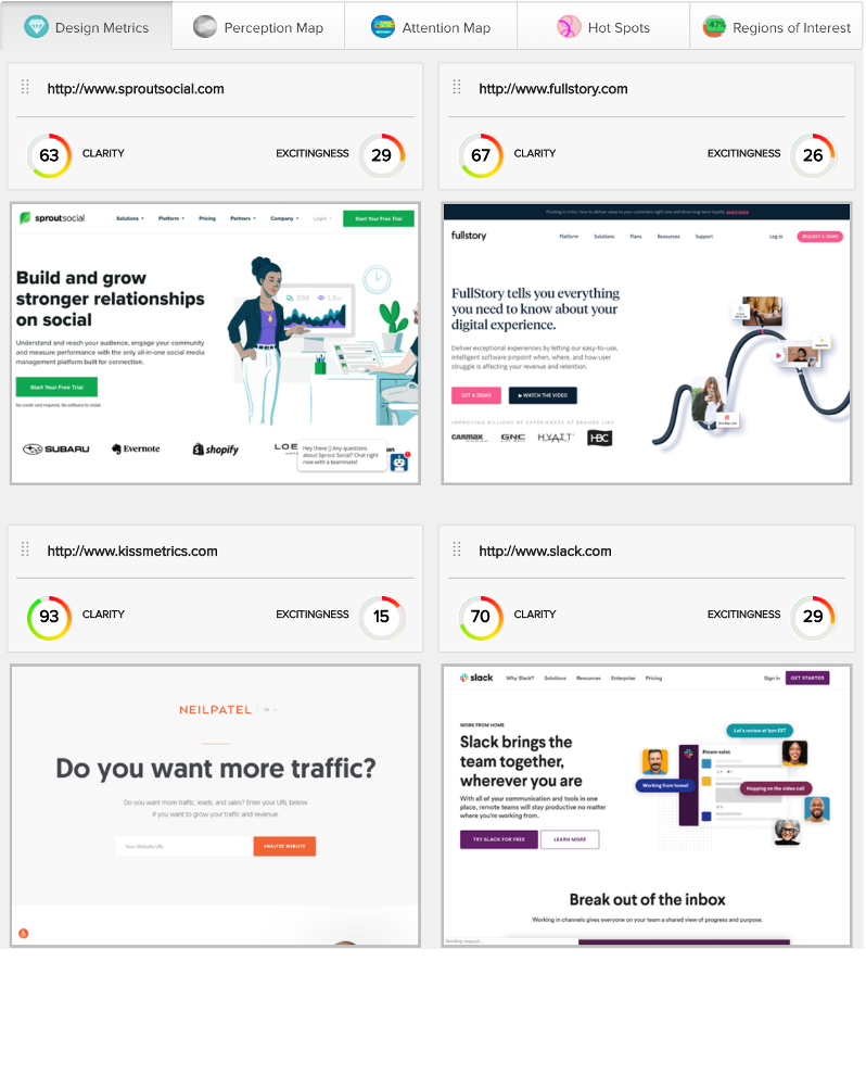
By clicking HERE, you can take a deeper dive into how some of the leading SaaS websites compare.
Generally speaking, cleaner and clearer designs tend to be more successful than cluttered designs. Cleaner, clearer designs make it easier for customers to find what they’re looking for, and reduces their cognitive load. You can use tools like EyeQuant to help you aim for a higher than average Clarity Score for your industry, without compromising content.
“Site design ultimately has two goals: 1. facilitate action and 2. affect perception. The balance of these two needs is what most companies struggle with. Understanding how people process the content, the copy and imagery, is the first step at knowing how to get at these two goals.”
– Ben Labay, Research Director at CXL Agency
A low Clarity Score would indicate that a website is cluttered. For most industries that doesn’t sound like a good idea, does it? However, the objective of a gambling website could not be more different to the objective of a calming SaaS or car sales website. Gambling itself is related to a psychological phenomenon that has been extensively researched due to the addictive nature of risk taking. It comes with the possibility of huge rewards and financial losses. So it’s fair to say emotion plays a huge role in the decision making process which is why the analysis shows a really low Clarity Score and a relatively high Excitingness Score.
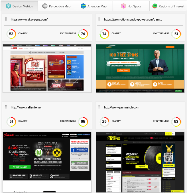
By HERE, and exploring the Perception and Attention heatmaps you can see which elements of leading gambling sites compete for user attention and the elements generating the highest stimulation.
Gambling websites average scores:
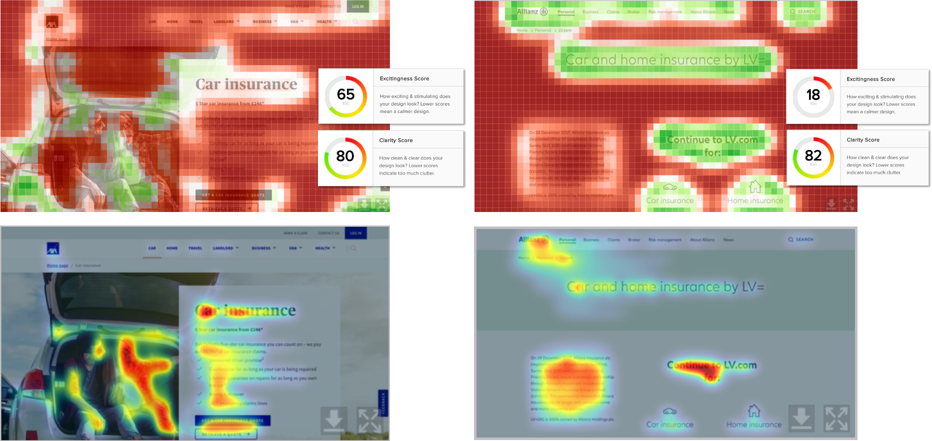
Insurance is something everyone needs. Unfortunately, for that very reason, it’s one of the least exciting products to market. That fact is reflected in the average Excitingness Score for the industry. Emotional stimulation is only going to play a very small role in influencing user behaviour so it’s not surprising to see that the majority of websites in this industry have high Clarity Scores and Low Excitingness scores. Click HERE to take a look at the results for two leading insurers, AXA and Allianz, these pages are specifically for car insurance.
Insurance websites average scores:
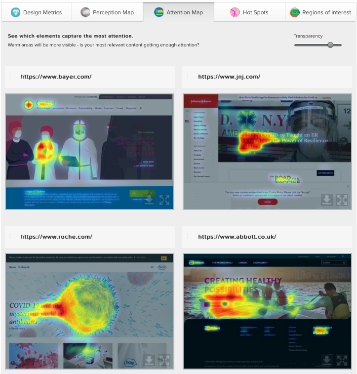
The previous days of airline websites being cluttered full of additional add on products and dark patterns, seem to have shifted – finding the balance between stimulation and clarity to give the user a better experience. And by the very nature of Pharmaceutical websites, the information should be clear and add a tone of authority in the brand to build consumer trust, but the results also show a change towards more giving users for of a stimulating experience through the use of video, motion and large imagery.
Click HERE to see a more detailed analysis of two websites.
Pharmaceutical websites average scores:
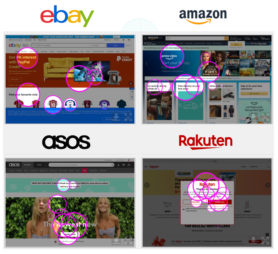
And perhaps, most interestingly, eCommerce websites come third when looking at how stimulating the designs are. This could be a reflection of one of the biggest design trends of recent years – minimalism. More often than not, eCommerce sites are packed full of items to buy, so leaving a lot of white space can allow users to focus on the items in question, removing excess noise and helping draw users down through the content.
Click HERE to see a more detailed analysis of two of the largest eCommerce websites in the world.
eCommerce websites average scores:
“Design and copy are inseparable. Message comes first—what it is that we want to communicate. The role of design is to increase the impact of this message. Sometimes an added visual helps you drastically cut down on the number of words to communicate the same thing.”
– Peep Laja, CEO at Copytesting
It’s an incredibly exciting time to be working in the field of UX design. Whether you’re designing killer websites, improving user interfaces, enhancing dashboards, building apps, or any other digital product, you’ll have noticed there is an abundance of new tools, techniques and even more stakeholder opinions to battle with.
If you’ve found the benchmarking data useful, let us know. We have every intention of rolling out a larger study analysing way more websites, but we’ll only do it if its valuable to you. Email us at marketing@eyequant.com if you’d like to participate in the full study or complete the form below to see how your website design compares to the industry average.