We value your privacy
This website uses cookies to ensure you get the best experience on our website.
 Skip to main content
This website uses cookies to ensure you get the best experience on our website.


This article is intended to help you understand the various EyeQuant results, and ways to interpret them. It also includes a few helpful hints and recommendations.
To jump to a particular topic, click on one of the following links:
—
EyeQuant delivers 3 types of analyzes in seconds:
EyeQuant delivers predictions for these three types of analyzes based on the first 3 seconds of visitors landing on a page. The results represent what is likely to be within the foveal view, or direct sight, in those first few seconds.
Here’s an example of the Perception Map results for H&M.
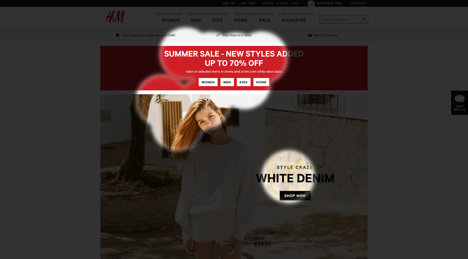
The Perception Map is based Visual Attention data. This map illuminates content which is either seen or missed by visitors in the first few seconds of landing on a page. The Perception Map is like a spotlight tool; it highlights the elements users will see right away. Areas which aren’t highlighted are “missed”.
The perception map is a great way to determine whether or not your web page, email, user interface or design effectively directs user attention to important or relevant content. Important content is ultimately driven by your specific design’s objectives, but we’ve devised a good framework for determining which content is the most relevant called, the 3Ws Approach.
3Ws Approach
If your 3Ws are not visible according to the perception map, this presents a clear optimization opportunity.
Here’s an example:
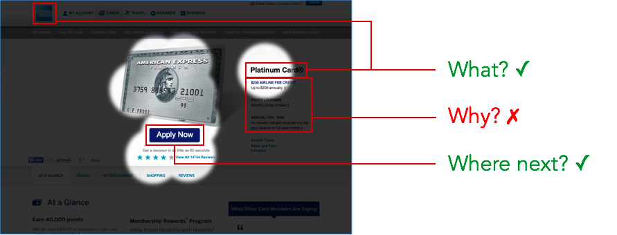
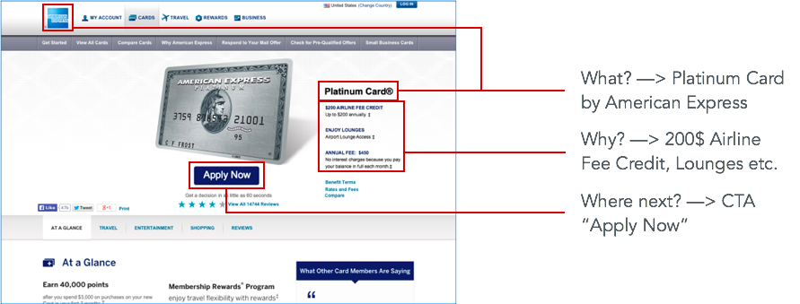
To improve the above example, American Express should make the value proposition, or incentive for this offer, more visible and prominent on the page.
—
Here’s an example of the Attention Map results for Adidas:
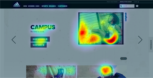
The Attention Map is also based on Visual Attention data. This heat map gives us a more granular perspective of which content receives the most attention. With this result, you can easily determine if the elements receiving the most attention are in line with your design goals. Warmer (red) areas have the most visibility. lease note that the Attention Map predicts fixation volume (most seen), not fixation duration (attention length).
Here’s a tip: Think of attention as a finite budget. Make sure you’re spending that budget wisely, and leveraging attention towards the most relevant content.
In the above example, the majority of the attention budget is spent on the images, instead of the CTAs. This could indicate an area for improvement.
—
Here’s an example of the Hot Spots results for Mercedes:
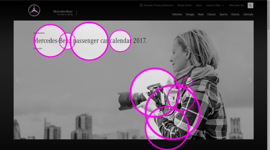
The Hot Spots map is also based on Visual Attention data. This map is a similar perspective as the Perception Map, but the magenta circles represent the 10 different focal points. The center of each circle is a focal point, and the size of the circle represents the intensity of that focal point. The larger the circle, the more visible the focal point. With Hot Spots, you can create a visual hierarchy, and better make sure that the most visible focal points are in line with your design objectives.
In the example above, we can see that the hero image captures the three biggest focal points. That may not be in line with the objectives of this particular design.
—
Here’s an example of the Regions of Interest results for Virgin Atlantic:
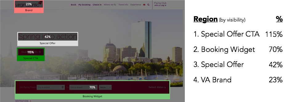
The Regions of Interest is a tool for measuring the specific visibility of different regions, based on Visual Attention Data. With this tool, you can actually measure how eye-catching certain regions are with quantitative data. The specific visibility is calculated by comparing the selected area to the average visibility of the entire design. When you highlight a region, EyeQuant measures the average saliency of the pixels within the selected area as compared to the average saliency for all pixels on the page. This means that your score can be above 100%, and can be negative (below 0%).
You can add new regions, adjust the size of each region, move them around the design, and even rename the regions. It’s important to use Regions of Interest as a comparison tool. Either to compare different regions on a page to create a visual hierarchy (as depicted above), or to compare similar elements across different iterations. For instance, take a look at the Spotify example below:
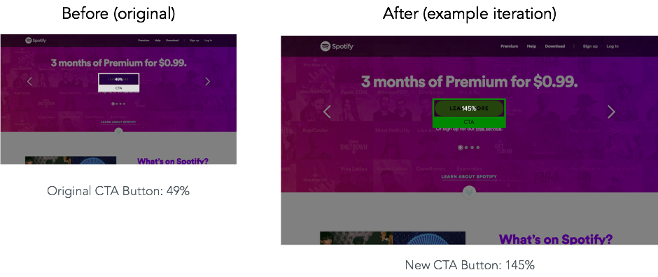
In this example, we can see that by increasing the contrast of a specific element in the example iteration, the new CTA button is 3x more visible than before. This is a great tool for communicating design decisions because you can use quantitative data to showcase how much more, or less, visible specific elements are when modified.
—
The Clarity Score is an instant design metric based on Visual Clarity data. It’s based on large-scale studies with thousands of human raters and represents how a large group of users would judge the clarity of your visual design.
Clarity is the opposite of Clutter. Clutter is the state in which excess items, or their representation or organization, lead to a degradation of performance at some task [Rosenholtz, 2007]. From a neurobiological perspective, cluttered designs lack visual order, thus increasing cognitive load as users struggle to navigate the visual landscape and understand which parts are important. Studies show that the higher the Clarity the Lower the Bounce rate.
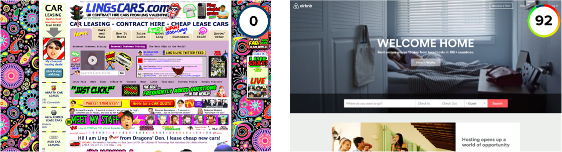
It instantly scores a design for clarity in an objective way, providing a rating between 0 to 100 where 50 represents the average page on the internet. A score of 0 indicates an extremely cluttered and busy design, whereas a score of 100 means your design is extremely clean and clear, or perhaps even blank! Please note that EyeQuant is strictly evaluating the clarity of the design only, not the clarity of your content or marketing.
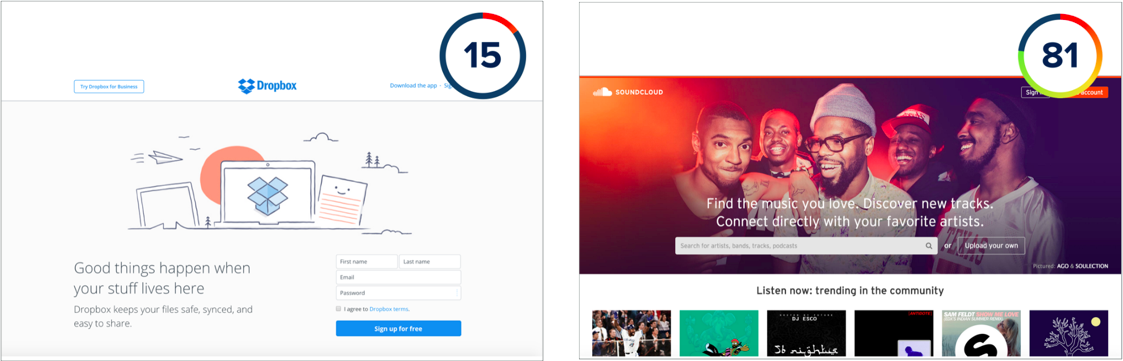
In the following examples, we can see two extreme examples of Clarity Scores:
Generally speaking, cleaner and clearer designs tend to be more successful than cluttered designs. Aim for higher than average Clarity scores, without compromising content. Clarity is important. If your content is too cluttered, you may be losing visitor attention. Cleaner, clearer designs make it easier for customers to find what they’re looking for, and reduces their cognitive load. Here are some points to consider:
Here are some tips for improving your clarity score:
—
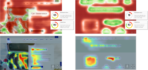
Below are two examples of Clarity Maps, one with extreme clutter (Chobani, left) and one with less clutter (Sixt, right):
The Clarity Map is based on Visual Clarity data, and this map depicts which content actually contributes to clutter on a particular design. Areas highlighted in red are contributing to clutter. If you want to improve clarity on a specific design, this map will help you pinpoint which content could be removed or modified to generate some quick wins.
Clarity is important. If your content is too cluttered, you may be losing visitor attention. Cleaner, clearer designs make it easier for customers to find what they’re looking for, and reduces their cognitive load.
Here are some tips for reducing clutter:
—
What is it?
The Excitingness Score is an instant design metric based on Emotional Impact data. It’s based on large-scale studies with thousands of human raters, and represents how a large group would judge the excitingness of a design.
Why is it important?
Aesthetics have been recognized as important because of their positive influence on people’s behavior, such as on performance under conditions of poor usability, or on purchase intentions. Even before elaborate considerations about purchases can possibly take place, the first impression of appeal determines how we perceive other attributes of a product, such as its usability and trustworthiness.
How does it work?
It instantly scores a design for excitingness in an objective way, providing a rating between 0 to 100 where 50 represents the average page on the internet. A score of 0 indicates an extremely calm, or even boring design, whereas a score of 100 means your design is extremely stimulating. Please note that EyeQuant is strictly evaluating the excitingness of the design only, not the excitingness of your content or marketing.
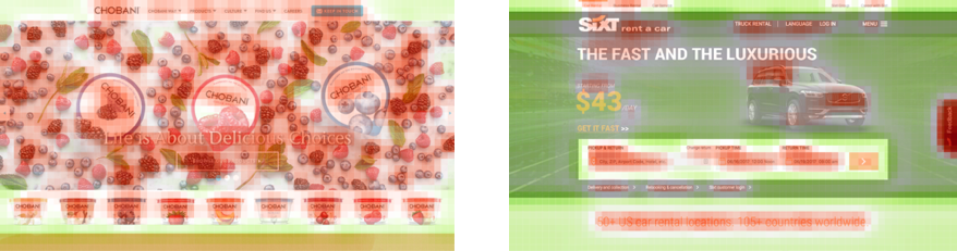
In the following examples, we can see two extreme examples of Excitingness Scores:
Whether a design has a “good” or “bad” score depends entirely on your offer, brand, industry, and audience. The score will help you understand and quantify exactly how exciting or calm your design really is.
As an example, If you’re catering to a young and adventurous audience, a higher Excitingness score could drive significantly more conversions than a lower one. Conversely, if your audience is more conservative or the product/service you sell requires a high level of trust, a lower score (therefore calmer design) might achieve better results.
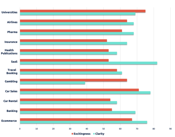
This means that unlike with EyeQuant’s Visual Clarity Score, not every design should aim to be exciting. Don’t forget, you can get to know the industry norms by checking out our 2020 Industry Benchmark report here, it reveals top scores for ecommerce, gambling, insurance, banking, pharmaceutical, higher education, travel booking, airlines, SaaS, car sales, car rental and healthcare websites.
Here are some helpful tips for affecting your Excitingness Score to achieve a desirable result: