
The Project
Liberty London was struggling to drive significant change in its ecommerce performance so they engaged Journey Further to help increase its conversion rate and, ultimately, drive significant revenue performance for the business.
Through a series of experiments, Journey Further used EyeQuant's tool to achieve instant insights, allowing them to complete the programme within the prescribed time.
The problem: Users searching for search
Based on previous research and feedback, one of the biggest issues for users of the Liberty website was that they struggled to find the search bar. For a retail website, this was understandably a big problem.
Liberty was using an uncommon navigation menu style, with part of the menu on the left-hand side of the screen, and the other part (including the search bar) on the right. Journey Further wanted to test a more conventional, horizontal navigation along the top of the page.
Using eye-tracking data to improve site navigation
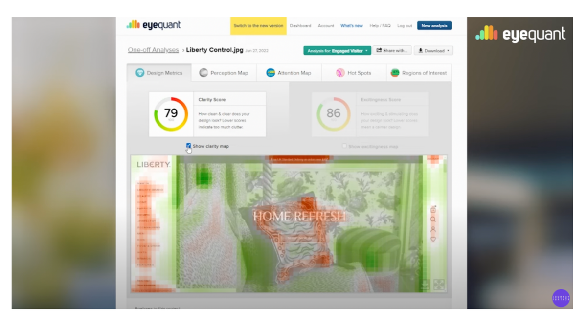
When experimenting with redesigning the site's navigation, Journey Further used EyeQuant to predict where users will look on a webpage.
Using the different features of EyeQuant Inspect, they were able to measure the clarity and excitingness of their prototypes, while also testing new positions for the search bar to see which would be the most easily visible.
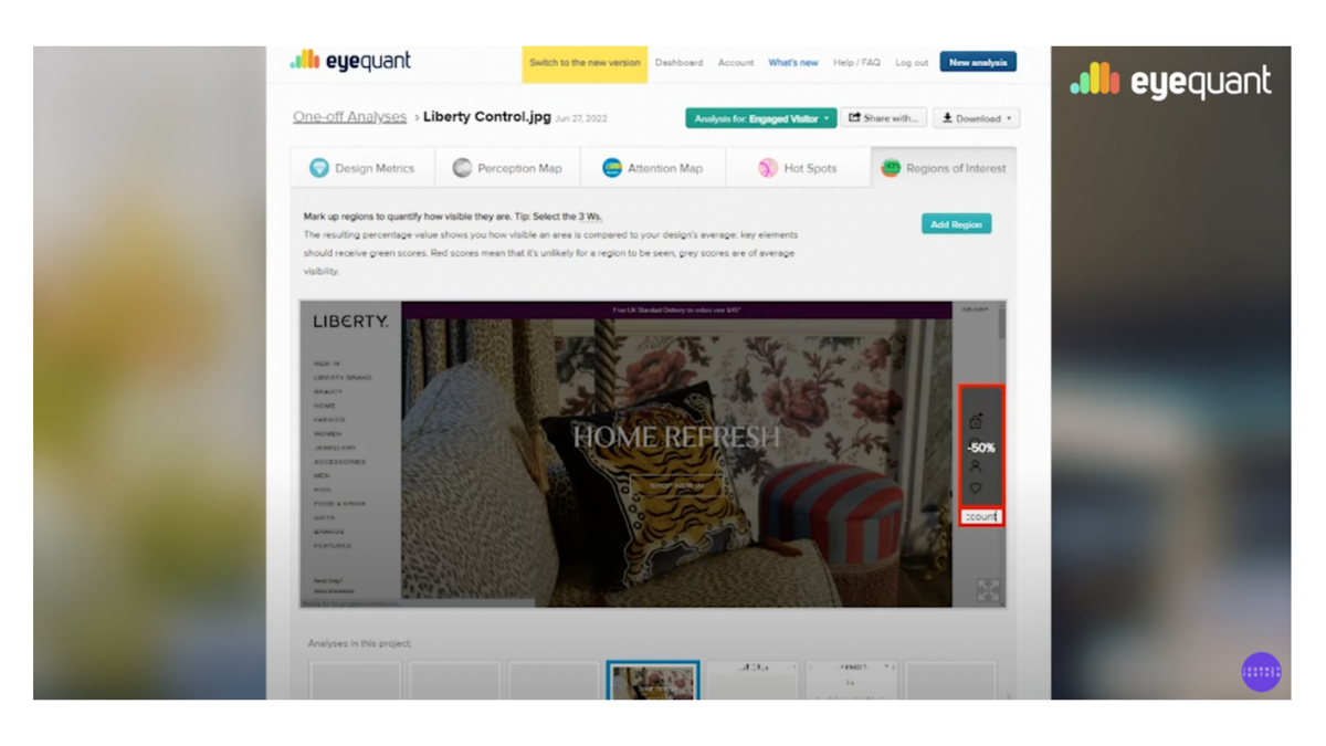
Finding areas of high and low interest
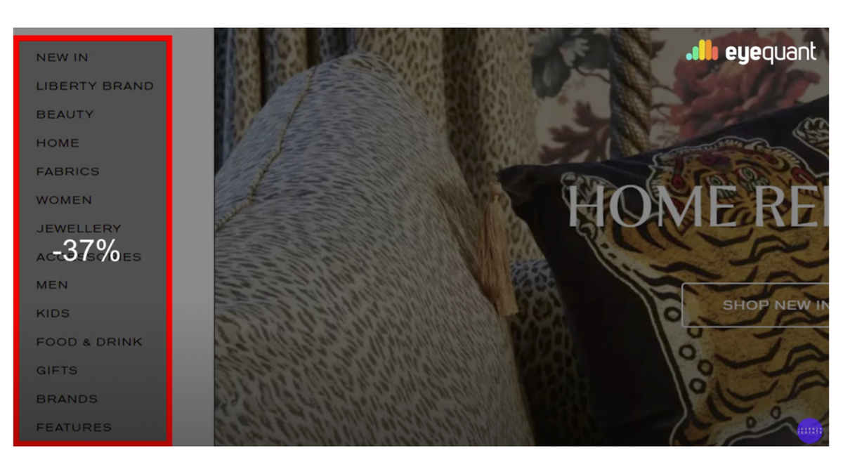
Using EyeQuant's Regions of Interest tool to hone in on specific elements of the design to see how visible they are, Journey Further identified that the navigation menu on the left-hand side of the screen (on the live version of the site) had a visibility value of -37%. This is calculated by comparing the selected area to the average visibility of the entire design.
The right-hand menu, which housed the search bar, was measured by EyeQuant as having a visibility value of -50%, which was consistent with the anecdotal feedback that had been gathered previously.
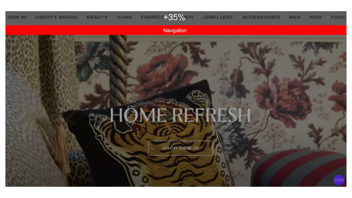
They created a new design that had the navigation menu at the top of the page and ran through EyeQuant – the visibility value of the menu now stood at +35%, meaning it was now significantly more visible than the entire design on the whole – a very positive result, considering the aim of the experiment.
Conversion Director at Journey Further, Jonny Longden, said: "Liberty's decision making process around the original design had been complex and there was reluctance to move away from it. We used EyeQuant to help make our case. "Our UX and creative team mocked up a rough version of what a horizontal navigation would look like, and we were then able to compare both to assess the viewability and engagement of the search function. We were able to demonstrate that users are far more likely to notice the search function in a more conventional location."
Further menu experiments
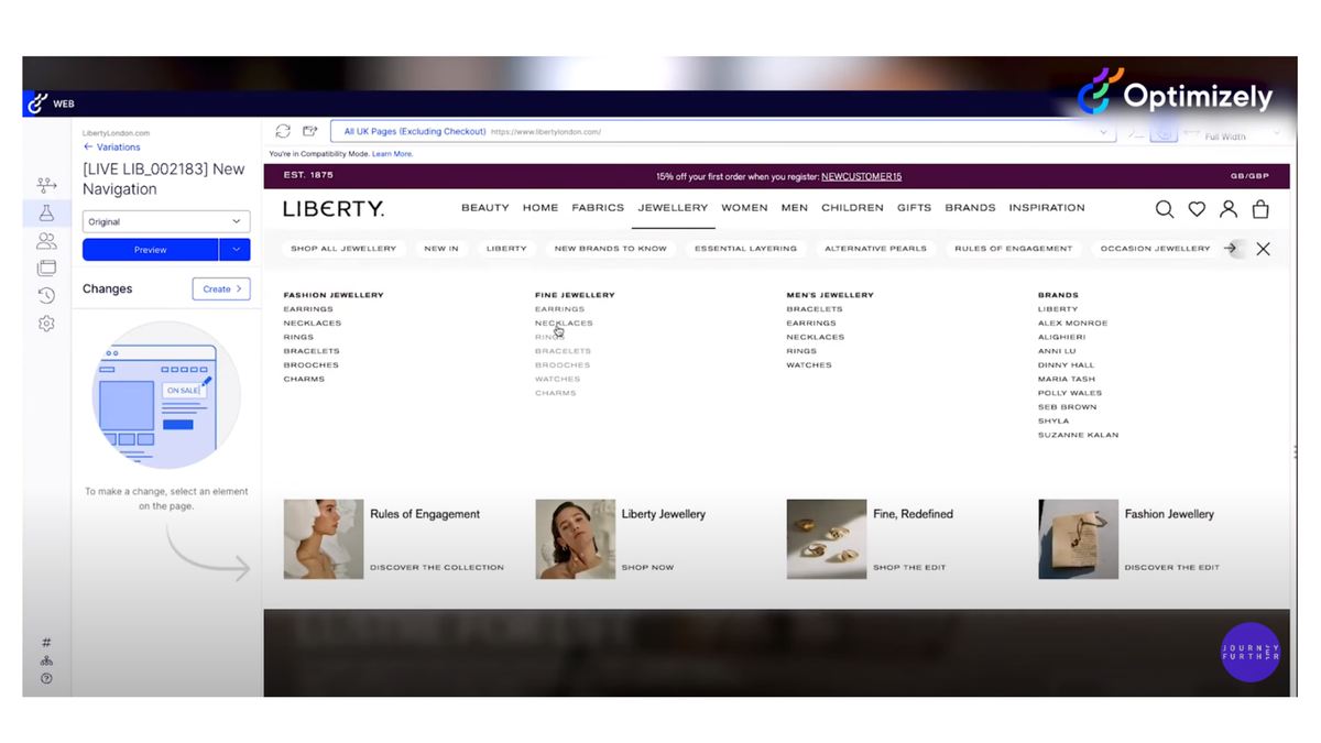
Once they had determined the optimal position for the navigation menu, Journey Further ran some further user testing to determine how best to arrange the many menu items. They asked participants to group all the menu items first, forming the top-level navigation menu, then place all the individual items within the groups – a technique known as "card sorting" which helps designers understand users intuitive ranking of information.
Using Optimizely, they created a prototype of the new layout and tested that on users well before moving into development.
Positive outcomes
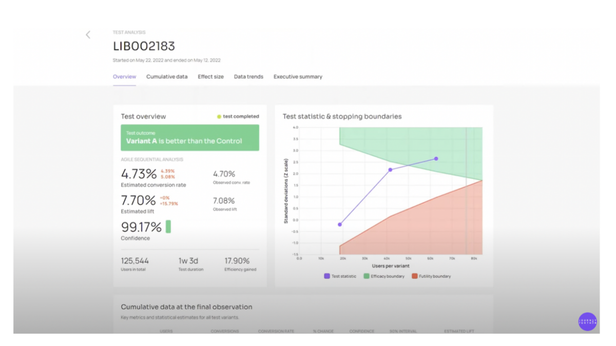
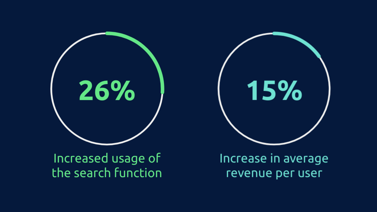
By using EyeQuant and Optimizely, the team from Journey Further was able to analyse, assess, design and test their experiments in four weeks – this resulted in a significant, observed uplift in conversion of over 7% and average revenue per user of 15%. The new navigation also increased usage of the search function by 26% and the account icon by 20%.
After the new design was launched, Liberty London saw an increase of £150,000 in incremental revenue over a two-week period, and an increase of around £4m over the course of 12 months.

“At Journey Further, experimentation is at the heart of everything we do and we believe it is key to drive growth, EyeQuant enabled us to quickly test and prove our hypotheses around the visual performance of the Search design, carry out experiments, and then easily validate our new design hypotheses, all before writing a single line of code. We also found huge value in the removal of subjectivity from the process. By using EyeQuant with our client, we could demonstrate our decision making concisely and objectively, cutting down on the need for multiple rounds of discussion and feedback. EyeQuant really is an essential tool in our tool box.”
— Jonny Longden, CONVERSION DIRECTOR @ JOURNEY FURTHER
Ready to see results like these?