We value your privacy
This website uses cookies to ensure you get the best experience on our website.
 Skip to main content
This website uses cookies to ensure you get the best experience on our website.


Any designer would agree that establishing a clear visual hierarchy is one of the most basic functions of web design. It’s beginner-level stuff, right?
Apparently not. A recent experiment by our team at EyeQuant shows that it’s not just smaller online retailers who are struggling with an effective visual hierarchy on their websites, but so are many of the world’s eCommerce stars too – even on their most important pages!
To collect a sample of popular online retailers, we consulted the National Retail Federation’s Top-50 list. Next, we visited each site on the list and took screenshots of their product detail pages (PDPs). We chose to analyze PDPs because:
We excluded some outliers that weren’t typical e-commerce sites.
To determine whether or not these pages had an effective visual hierarchy, we ran a 3 Ws Test on them. This test is based on a simple framework that recommends that each page should clearly convey to the user:
On PDPs, the “What” is usually a descriptive product title or the product image. The “Why” is a value proposition or benefits of buying a particular product (and from this particular retailer). This could be conveyed in the form of a product description, a star-rating, a discount, etc. For fashion products where the look of the product is the main value proposition, we considered the product image to also cover the “Why” criterion. “Where Next” is normally a call-to-action button, or some other next steps (choose a size, color, etc).
In order for a design to pass the test, the 3 Ws need to be visible within 3 seconds of landing on the page.
That might not sound like a long time, but for a typical user, that’s about 10 eye-movements. If you need to make more than 10 eye-movements to find the most basic information on the page, the design isn’t doing a great job. Of course, the exact cut-off point here is a bit arbitrary, but it’s a straight-forward, attainable benchmark to use. Note that users don’t actually have to read or understand the content within that time frame – they just have to be able to figure out where that content is on the page.
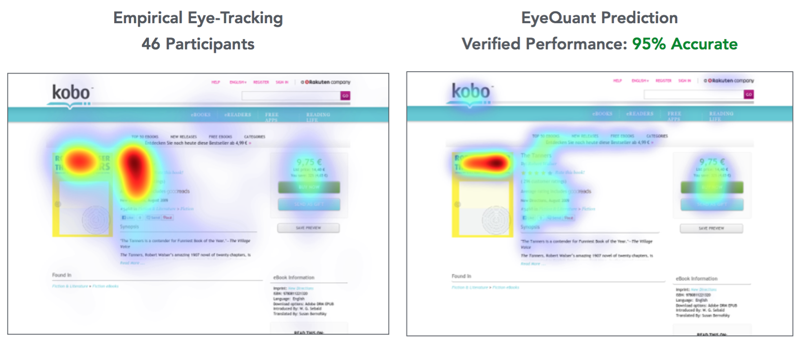
In order to test this, we used EyeQuant’s patented visual attention algorithm, which was built by applying machine learning to data from past eye-tracking studies. It’s 85-90% as accurate as a 3-second physical eye-tracking study.
After excluding outliers we analyzed 43 retailers and found that a shocking 70% (30 in total) of them failed the test. Some noteable mentions here are Walmart, GAP, OfficeDepot and Target:
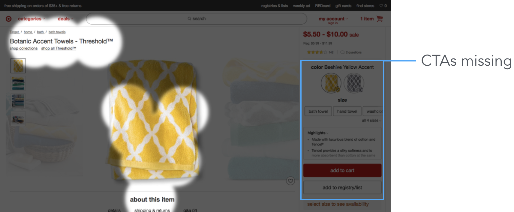
Target’s site draws in user’s eyes towards the left side of the screen. The price and CTAs remain in the background.
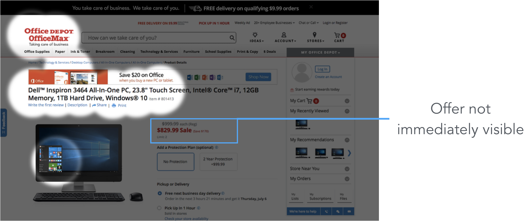
Due to the sharp contrast of OfficeDepot’s headline, the discounted price does not stand out as much as it should.
On the opposite end we have companies like H&M or BestBuy that immediately answer all 3 Ws:
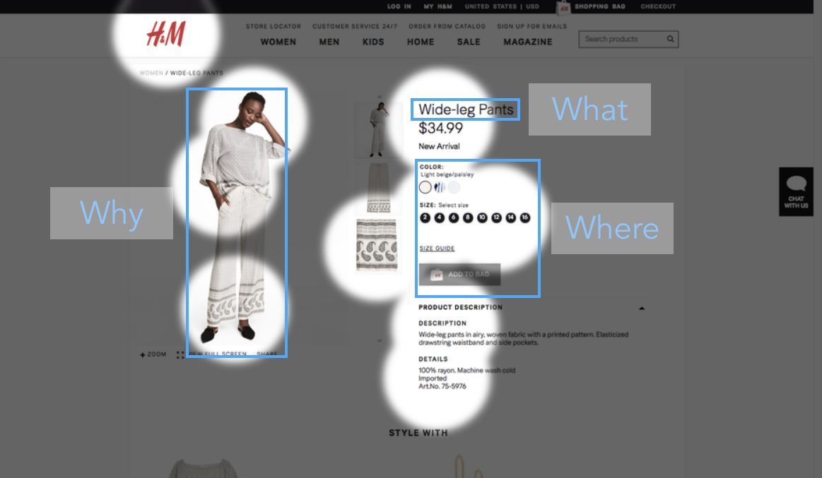 H&M does a great job at leading the user’s eyes to the product image, description and next steps.
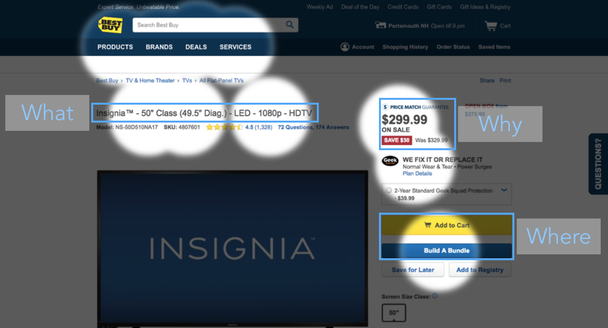 BestBuy effectively uses contrast to make navigation easier for the user.
So what can we learn from this study? Here are 3 key insights:
One major reason is because a lot of design decisions are still based on gut-feel. If you’re not explicitly measuring visual attention you might be leaving money on the table.
Providing a great user experience is equally challenging for every business. Just because a company is successful doesn’t mean their sites are perfect. This is why copying other websites can be dangerous.
Beautiful design is not the same as great design. Webpages, and especially PDPs, are created for the purpose of leading users down the sales funnel. As Paul Rand said: “It is no secret that the real world in which the designer functions is not the world of art, but the world of buying and selling.”


In this session, we explored how teams can move beyond instinct and start making creative decisions based on how...
Read more
What does attention prediction actually look like in day-to-day design work? In this month’s webinar, we’re joined by leading...
Read more
The way teams predict attention is changing fast — and so are the tools that make it possible. In our...
Read more