We value your privacy
This website uses cookies to ensure you get the best experience on our website.
 Skip to main content
This website uses cookies to ensure you get the best experience on our website.


Internet Retailer recently released its top 500 guide (note: paywall), which tracks the performance of the largest eCommerce sites in the world.
One of the most interesting parts of the guide is the list of the top 50 fastest growing eTailers. For anyone interested in user experience for eCommerce, these companies are the ones to watch. After all, these are the shops that are successfully taking customers away from their competitors.
But why are customers switching? Surely there are many reasons (conscious and unconscious), but is user experience one of them?

Here at EyeQuant, we were curious to see if there is any measurable connection between UX and revenue growth rates for these fast-growing companies. After all, if we can’t prove that investing in better UX does indeed lead to consumers “voting with their wallet”, then what’s the point?
We decided to investigate.
Quantifying user experience is a difficult task, but we’ve been working on several metrics here at EyeQuant that can help us objectively measure the quality of web designs based on how users will see and perceive them.
One of our most recent creations is the Visual Clarity index. As reported by Wired, it’s an AI that tells you if a design is likely to be perceived as visually clean, or cluttered and busy. It assigns a score between 0-100.
If you were to show 100 people a pair of designs and ask which one is cleaner, EyeQuant’s predicted winner would match the ‘real’ survey results about 95% of the time.
While visual clarity is only one factor in user experience, it’s an aspect that we can quickly and accurately measure. We decided to see if visual clarity seems to correlate at all with the growth rates of the companies on this list.
In theory, there should be a trade-off between clarity and content. A blank page would have a perfect clarity score (no clutter at all), but it surely wouldn’t create a great user experience. So is there a sweet spot?
To find out, we calculated the clarity metrics from the home page of each website in the top 50. While the home page is not a perfect representation of a website’s overall design clarity, our testing suggests it works well as a proxy. For example, websites that have cleaner home pages generally have cleaner category and product pages.
In the data, we found 3 main insights.
Insight #1: Amongst top-performing eTailers, sites with cleaner designs have higher growth rates.
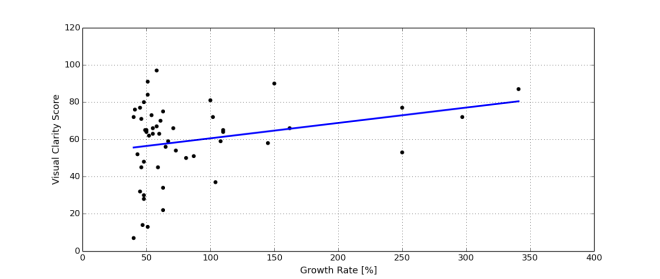 There is a correlation (r=0.27) between clarity and sales growth rates. Internet Retailer only includes 50 companies in this particular list so the data set is smaller than ideal, but this is very much an indicative result, as the p-value (0.06) is hovering around conventional levels of significance.
Clearly, there are plenty of other factors at work here, but the modest correlation implies that clarity is certainly one of them.
This supports a hypothesis that our team at EyeQuant has held for a while: clean, simple design is winning in eCommerce. We’ve seen lots of anecdotal evidence from our customers using the clarity score as a metric to improve conversion rates, but this is the first data we’ve seen that hints at a larger-scale relationship between clarity and cash.
Consider this: amongst the top 10 fastest growing eTailers in the US, the average Clarity Score (home page) was 69.1, which is about 16.4% higher than the list average of 59.36.
By comparison, the bottom 10 on the list (#41-50) had an average score of 52.6. Keep in mind that these are still highly successful companies, so it came as no surprise that even the bottom 10 had (on average) a 9.5% higher score than the average of all sites in the Alexa 5000 (48.0).
Insight #2: None of the top 25, and only 2 of the top-50 fastest growing companies had a higher score than 90.
This supports the hypothesis that having an extremely high clarity score doesn’t actually improve performance. This makes sense intuitively, as having a score in the mid-to-high 90s requires you to have very little content on the page. That means that you might be withholding information that is important to your customers, which is unpleasant. This is a cautionary tale for minimalist designers. Cleaner isn’t always better if it means removing content that is critical to your users’ buying decisions.
Insight #3: The importance of design clarity seems to vary depending on your customer base and your brand.
The worst score of any site that we looked at was TackleDirect.com, which is a key property owned by eCommerce Outdoors, the 50th fastest growing eTailer in the IR 500.
TackleDirect scored a 7.

Given the data, we’ve just seen, you’d think that such a cluttered, chaotic-looking website has absolutely no place on the top-50 list, and should in fact be struggling to stay in business.
Instead, they’re doing quite well for themselves.
But who buys fishing tackle? Typically it’s older men, who grew up consuming print advertising, where marketers traditionally aim to use up every single inch they’ve paid for.
It might be the case that improving the visual clarity of TackleDirect.com would improve conversion and increase sales, but this data suggests that maybe it’s not that critical for the specific type of person who buys on this website.
Also consider 2 European businesses that are enormously successful despite extremely cluttered websites: Cdiscount.com and LingsCars.co.uk. Both of these companies have essentially made chaotic design a part of their brand identity.
Key Takeaways
1. For most eTailers, improving the visual clarity of your design today would increase sales (as long as you beat your competitors to it).
2. Don’t go overboard. As always, there are diminishing returns at high levels of visual clarity, and there comes a point where improving this metric would mean removing important content.
3. As always, there are exceptions to the rule. No matter what the averages say, there will always be a Cdiscount.com or a LingsCars.co.uk that breaks the rules and profits from it.
Want to see the clarity score for your own design? Request a personal demo with one of our experts and we’ll show you a free analysis of your website.


Why do users miss what seems obvious? In our latest webinar, Professor Peter König, one of the world’s leading...
Read more
In this session, we explored how teams can move beyond instinct and start making creative decisions based on how...
Read more
What does attention prediction actually look like in day-to-day design work? In this month’s webinar, we’re joined by leading...
Read more