We value your privacy
This website uses cookies to ensure you get the best experience on our website.
 Skip to main content
This website uses cookies to ensure you get the best experience on our website.


A lot of our decision-making, and the way we process information, is subconscious. There are, however, many different factors that influence this. If we can understand these factors, then we can begin to use them to guide people’s decisions – for example, to encourage them to follow a particular path while using a digital product.
More broadly, by understanding the way that people process information, particularly visual information, we can use that information to improve the user experience within our digital products for most people.
Before we talk about using neuroscientific data to create better user experiences, we should clarify what exactly we’re referring to when we talk about UX.
While there can be a tendency towards – and, perhaps, an argument for – including emotional and subjective responses as a measure of the user experience, we focus specifically on measurable, quantifiable metrics such as clarity and cognitive load.
When we talk about digital products, this can include anything from websites, apps, email campaigns, social media content, digital signage, or anything else that is consumed electronically.
EyeQuant’s AI uses a wealth of neuroscientific user research to calculate how visual stimuli will be perceived and processed by the brain, providing accurate and comparable data.
At any given second, there are over 100 billion pieces of information being sent to your visual cortex.
Fun fact: this doesn’t stop when you go to bed – the brain continues to process information even while you sleep!
When we design landing pages, or any other digital experiences for that matter, we’re competing with a lot of other visual stimuli that are placing cognitive load on the brain, and we’re trying to draw the user’s focus towards specific elements of that design.
To influence attention and perception, we need to understand the fundamental processes that are happening at any given second.
Traditionally, designs were based on traditional behaviours, such as reading a book – starting from the top left (in Western cultures), and working down.
Through eye-tracking studies – and a better understanding of visual tools such as contrast, luminance, spacing, density and padding – we have gained new insights into visual hierarchy, or the order in which the brain processes visual information.
Here’s a well-known example:

For most people, the order in which they read each line is the order suggested in the diagram.
Using EyeQuant’s predictive eye-tracking analysis tool, we can also see (below) where the fixation points will be for most people, combining fixation points and the duration of attention.

This is a really basic example of how you might base the structure of your design’s visual hierarchy around the way that it is perceived by the brain.
Conveniently, this predictive software allows you to test your designs before launch, and to compare the results of numerous iterations.
Interestingly, note how much attention the words under the box receive due to the strong contrast with the background. Is this something you would have picked up?
The visual cortex uses two, simultaneous processes when processing information: Bottom-up and Top-down.
The Bottom-up Process focuses on incoming sensory data and takes place in real-time. This is completely data-driven. In the image below, the Bottom-up Process will tell your brain that there are some white dots on a black background with lines through them.
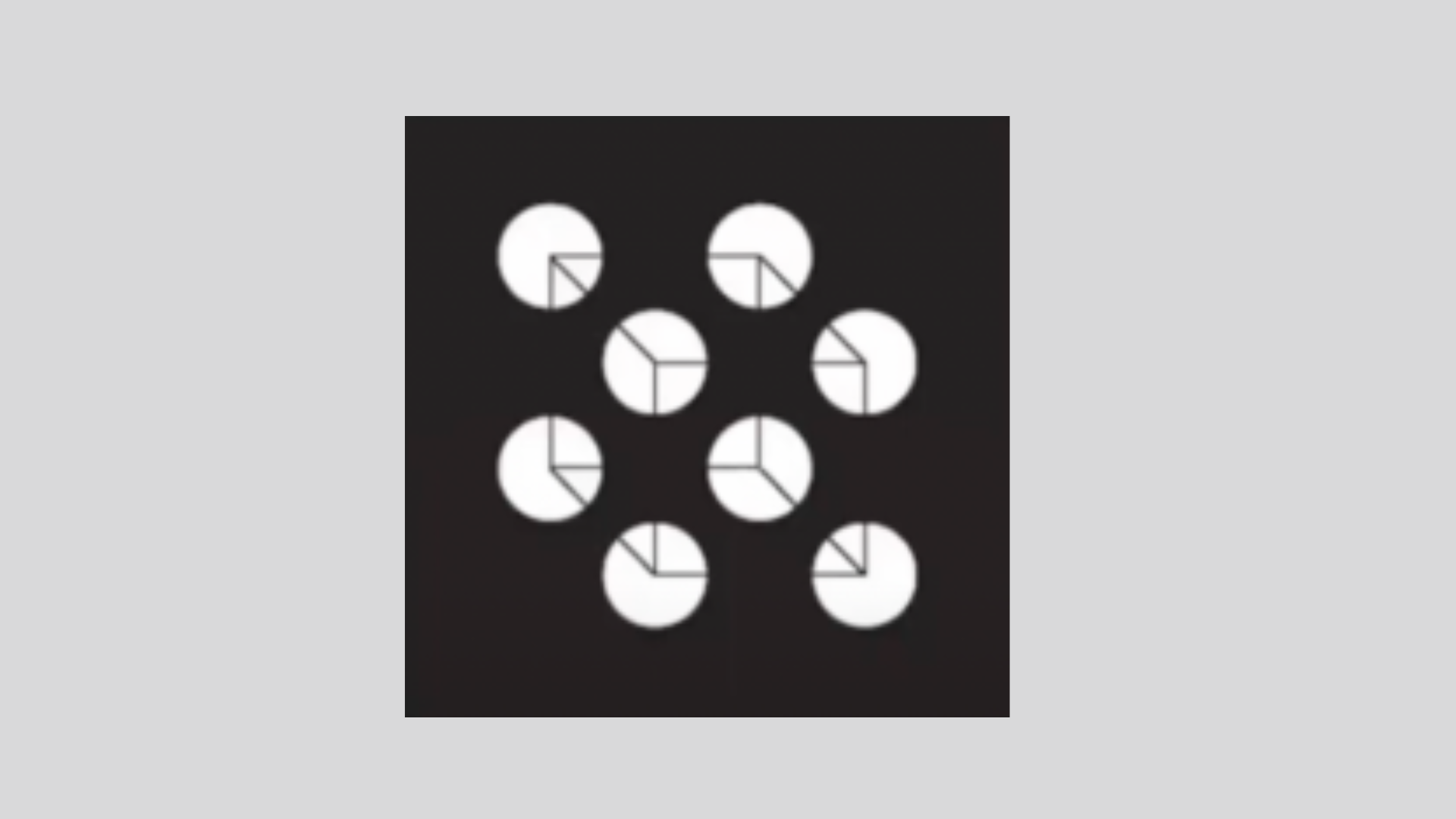
The Top-down Process is more schematic and contextualised. It uses existing knowledge to fill in the gaps in between the raw data – in this case, to tell you that you see a cube.
This is also a very basic example of how visual information is processed, but it acts as a great reminder that the way we design an experience isn’t always the way that it is perceived.
Much like the way clutter in the home makes it difficult to find things, visual clutter makes it difficult to quickly identify things within a digital experience.
If the intention of a particular webpage or design is to steer attention towards a specific element of it – for example, a call to action button – then visual clutter makes it all the more difficult for the user to follow that intended path.
Visual clutter increases the cognitive load a user experiences while processing the information in our designs, making it harder to find what they’re looking for, and hindering the overall user experience.
The opposite of clutter – not literally, but in a digital design sense – is saliency. Something is salient when it is noticeable, or when it attracts attention or focus.
Through eye-tracking studies, we now know that saliency affects fixation – so the more salient something is, the more the brain will fixate on it over other things, and for longer. The importance of this in designing digital experiences is that there is a direct link between fixation and selection. In simple terms, the more prominently a user sees something, the more likely they are to click or tap on it.
To put these concepts into context, if we can reduce visual clutter within a design, and increase the saliency of the areas that will help the user complete the task they are trying to complete, we would materially improve the user experience of that particular design.
Increasing the clarity of a design can have a meaningful impact on users’ engagement with it. Higher clarity means lower cognitive load, making it mentally easier to buy, find, or complete the task at hand.
It’s also unsurprising that there is a direct relationship between clarity and bounce rates – where the higher the clarity score, the lower the bounce rate.
Simple ways to improve the clarity of a design include:
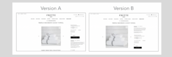
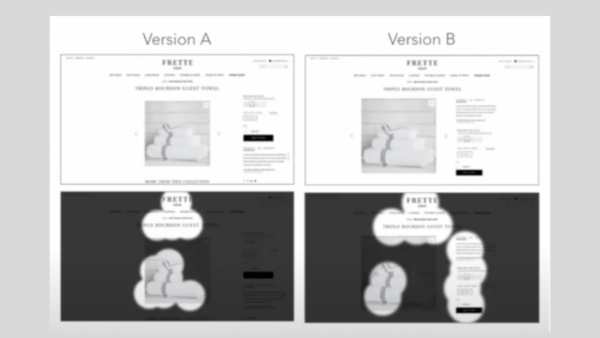
As an example of how clarity can improve the user experience, let’s look at two versions of the same design. Version A was the initial design, and Version B was a subsequent design, optimised for clarity.
Using EyeQuant’s perception map tool, we can see how some subtle changes to the design can have a significant effect on the way it’s perceived and the areas of it that come into focus at first glance.
EyeQuant’s neuroscience-based AI tool analyses future users’ perception, attention, cognitive load and level of visual stimulation. This enables designers to optimise their designs and improve their products’ user experience before (and also after) they are launched.
For a free trial of our software, visit: https://www.eyequant.com/free-trial-monthly-plan/


Why do users miss what seems obvious? In our latest webinar, Professor Peter König, one of the world’s leading...
Read more
In this session, we explored how teams can move beyond instinct and start making creative decisions based on how...
Read more
What does attention prediction actually look like in day-to-day design work? In this month’s webinar, we’re joined by leading...
Read more