We value your privacy
This website uses cookies to ensure you get the best experience on our website.
 Skip to main content
This website uses cookies to ensure you get the best experience on our website.


Use EyeQuant to analyse how users see and perceive your competitors’ designs, including email campaigns, landing pages, apps and any other publicly available content. This lets you measure your designs against different brands, see how they compare, and make informed decisions for future iterations.
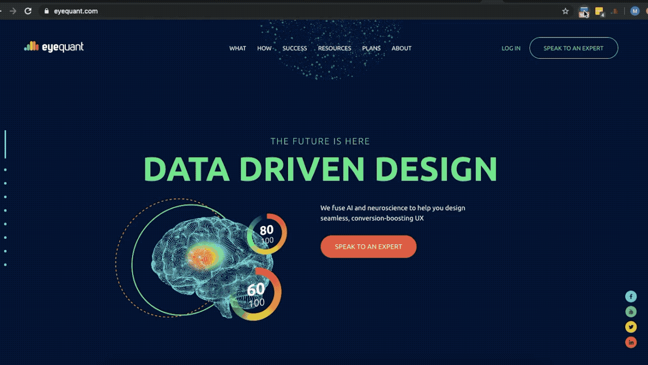
EyeQuant can analyse a live URL or an uploaded screenshot, so no permissions or technical integrations are necessary:
By providing near-instant visual and emotional scores for your designs, EyeQuant allows you to experiment with more designs to find the one that best meets your design goals.
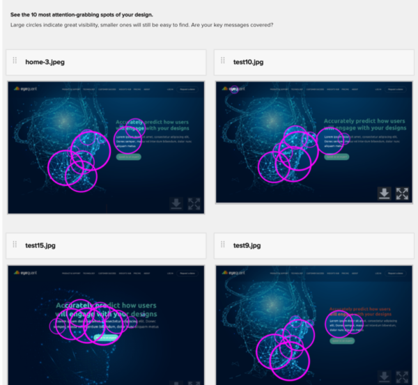
Using the simple drag-and-drop functionality, upload up to 6 files and compare the results straight away. This can be used to compare a variety of completely different design ideas to see which one performs best. Once you’ve settled on a theme, compare several designs with minor differences.
EyeQuant’s analysis gives you the confidence to experiment with different ideas and different variations of an idea, safe in the knowledge that the most effective layout will make it to the final version.
Below, you can see how we used EyeQuant to optimise our own landing page during the initial design stage:
Globally, mobile traffic makes up more than half of all web traffic, with an increasing majority of mobile phone users accessing the internet primarily via their devices. As a result, there’s never been a more important time to focus on responsive design trends, and to ensure your designs take into account the perspective of the end user.
Use the EyeQuant browser extension to test that users see the same content, with the same ease, whether they’re using a desktop, smartphone or tablet. To learn more about using and installing the browser extension, see EyeQuant browser extension:
The ever-increasing digital ad spend around the world, where larger slices of budgets are allocated to display, native and banner advertising, is a solid indicator that competition to capture user attention is intensifying.
Using EyeQuant’s Ad Visibility Score tool, you can maximise your marketing budget and ensure you’re producing the most effective ads.
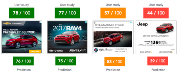
How does it work? Using deep learning, EyeQuant has developed software that identifies how eye-catching your ad will be. The algorithm is built on top of a neural network for object recognition that’s been pre-trained with millions of images.
It is expressed as a score from 0-100 where the ‘average’ ad scores around 50. During validation studies hosted at Osnabrück University, the algorithm’s results had an impressive correlation with the results of a recent user study with 500 real people (using eye-tracking and online panel research).
The results are displayed below:
If you’d like to see which of your display ads are more likely to capture attention, why not schedule some time to speak with one of our experts?
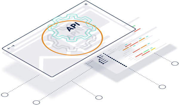
By integrating with EyeQuant, you can add huge value to your current product. Your customers will benefit from instant access to predictive algorithms, design scores, and visualisations so they can understand how users perceive and respond to their designs.
Imagine if your platform could now generate visual attention heatmaps, analyse mobile web designs, and calculate perception scores without having to spend time or resources developing the capability in-house. Well, with the EyeQuant API, that’s now possible.
EyeQuant API provides access via a RESTful HTTP interface and uses JSON for both input data and responses. To get started, see API Documentation.
First impressions are critical to email marketing success. As the competition for users’ attention becomes more fierce, it’s increasingly important to optimise our email designs. Email design is still one of the most underrated aspects of the email marketing process, despite having an immense impact on click-through rates and conversions.
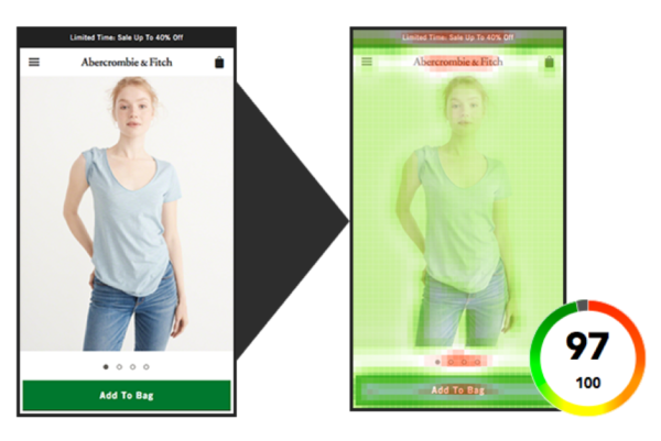
Before launching a campaign, use EyeQuant’s heat mapping technology to improve engagement and click-through rates. It shows marketers and designers what a recipient will see – and more importantly what they will miss – as soon as an email is opened.
By seeing which design elements get users’ attention and encourage them to click on an element, you can optimise your email campaigns to get better engagement.
As a business, we invest vast amounts of time and resources in R&D. As part of our ongoing work to uncover how human attention can be harnessed, we’ve conducted a lot of research.
In a recent study, we put together a list of 50 eCommerce sites in the clothing sector, selected by website metrics such as the number of daily visitors and page views. We analysed each brand’s design for Clarity and Excitingness.
Based on the results, we learned that Desktop homepages in this sector score around 71 (out of 100) for Clarity. They average about 61 for Excitingness.
On the other hand, Mobile homepages scores are slightly higher on average – 76 for Clarity, and 67 for Excitingness.
Product detail pages often contain more content and details than the homepage, but surprisingly, the average clarity for PDPs on desktop was 78 (higher than the average desktop homepage score). On the other hand, the average Excitingness score for the PDP hovers at 27.
If we look at the mobile version of the product detail page, we see a big increase in Clarity, with the average score being 87. We also see an increase in Excitingness, with averages at 46.
Use these clothing eCommerce averages, or analyse the competitors in your sector, to benchmark your design ratings against industry standards.


Why do users miss what seems obvious? In our latest webinar, Professor Peter König, one of the world’s leading...
Read more
In this session, we explored how teams can move beyond instinct and start making creative decisions based on how...
Read more
What does attention prediction actually look like in day-to-day design work? In this month’s webinar, we’re joined by leading...
Read more