We value your privacy
This website uses cookies to ensure you get the best experience on our website.
 Skip to main content
This website uses cookies to ensure you get the best experience on our website.


Most Website Redesigns are a Waste of Money. Here’s What Sets the Successful Ones Apart.
In the digital world, trends dictate everything – and that most certainly extends to websites. Why else would practically every homepage on the internet use a rotating carousel banner? Why else would eCommerce shops ask if you want to share their product detail page on Twitter? Remember when half the websites you visited had music? Remember when they were all made in Flash and took 2 minutes to load?
In a trend-happy industry, you rarely hear anyone ask why, and if you’re not careful, you might end up paying for an expensive re-design every 2 years without ever really seeing improved business results.
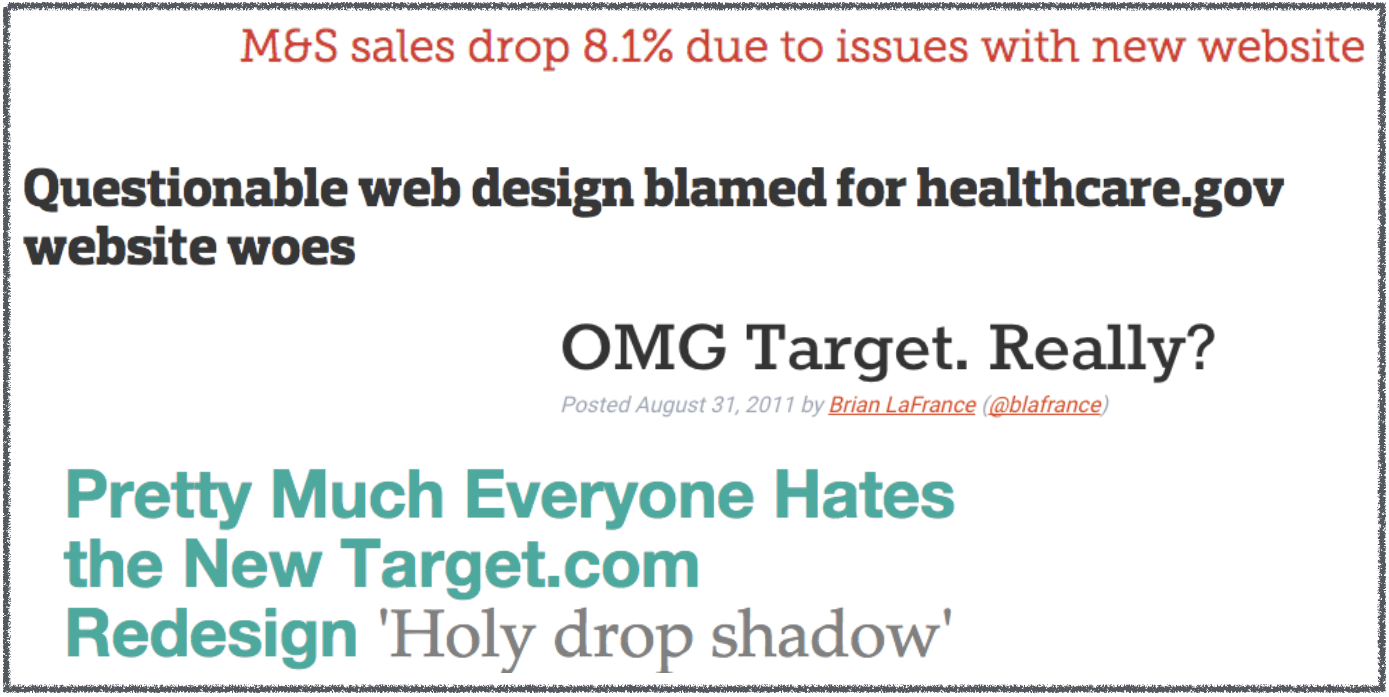
Indeed, billions of dollars are spent each year on website redesigns, with questionable returns on investment. Target famously redesigned its website twice in the span of a couple of years, only to have users hate each revision. Marks and Spencer spent 150+ million Pounds ($202 million) to redesign their website, only to see an immediate 8% drop in sales as a result. Reddit just raised $200 million to revamp it’s desktop web presence – roughly 20x it’s annual advertising revenue. Will investors ever see a return on that money? Why do we even bother designing fancy websites at all, when most could probably be text documents?
In theory, there are many different ways that web design can positively influence your website’s user experience, conversion rates, and sales. And we’ve certainly seen many examples of redesigns leading to significantly better business results.
But most redesigns fail to do this. For example, let’s consider some data from the world of conversion rate optimization. According to at least 2 popular A/B testing platforms, only 1 in 7 A/B tests leads to a statistically significant improvement in conversion rates. This implies that when you make a change to your website (thinking it’s an improvement), there’s about an 85% chance that you’ll see no benefit.
With that in mind, let’s look at a few ways that design updates can legitimately help you improve your business results. If you focus on these factors, you’ll maximize your chances of seeing positive business results, and avoid the trap of the meaningless redesign.
Design is not simply an aesthetic enterprise. Redesigns led by improvements to the core user experience are the most likely to succeed, so above all else, good design makes it easy for users to find exactly what they’re looking for, as quickly as possible.
To make that happen, your redesign must involve serious content prioritization. You need to understand which content creates value for users, and use design to emphasize that content. For example, one simple approach to do so is the 3Ws framework. It recommends that any site should immediately be able to answer 3 questions when a user arrives:
This is where information architecture plays a key role, but it’s also where simple design concepts like visual hierarchy are very important. Make no mistake about it: it is possible to strategically design certain content to “pop” and get seen.
Here’s an example of a re-design gone right: Groupon re-vamped their landing page by using the attention-hacking checklist to strategically emphasize the most important information, which had previously been overshadowed by distractors on the page. This led to a massive 52% increase in sign-ups.
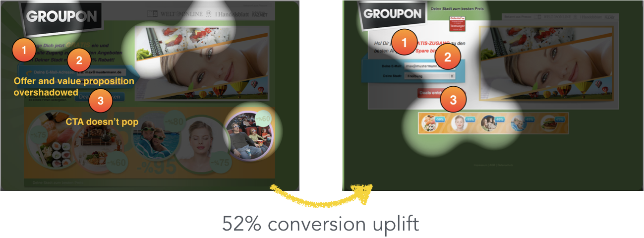 The EyeQuant Perception Map above shows that the new design does a better job at emphasizing key content.
Meanwhile, most others are getting it wrong. We recently found that 70% of top e-retailers are failing to create an effective visual hierarchy on their product detail pages – one of the most basic components of an eCommerce experience.
Website redesigns are often about branding. And almost every company has a certain set of adjectives that define the desired brand image or personality. Redesigns can create value by aligning the experience of the website to the desired perception of the brand.
For example, if you’re selling skateboards to teenagers, your website should probably be stimulating and visually exciting. Meanwhile, an insurance company website might convert better with a more calming, conservative design. The visuals are important because users form a first impression of a web page in as little as 50 milliseconds.
Just how much can a design change influence user’s emotional reaction? Here are two examples of banks that redesigned their home page: Bank of America and US Bank.
Their initial designs were rated as more calming, with some risk of being seen as “boring” according to an emotional impact analysis from EyeQuant. In both cases, the redesign succeeded in making the website feel more stimulating.
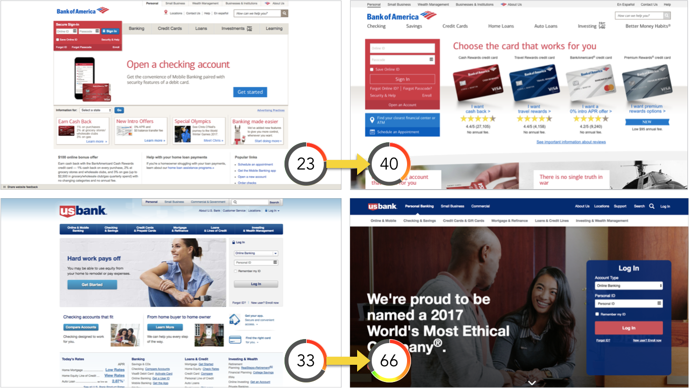
The scores shown in these examples are from the EyeQuant emotional impact analysis. On this 0-100 scale, extremely low scores may suggest the design could be perceived as boring, while high scores suggest the design is stimulating and exciting. Benchmarks vary by industry and page type.
Unfortunately, most redesigns don’t involve any specific research to confirm the emotional impact of a design, which can often lead to brands sending mixed messages.
Most UX and CRO experts would agree that credibility and trustworthiness are huge contributors to how well a site performs. Meanwhile, research has shown that users judge a website’s credibility in as little as 3.42 seconds, suggesting that page aesthetics can have a significant impact on perceived credibility.
Dr. Brent Coker from the University of Melbourne explains:
“As aesthetically orientated humans, we’re psychologically hardwired to trust beautiful people, and the same goes for websites. Our offline behaviour and inclinations translate to our online existence.”
For example, The Nielsen Norman Group asked several study participants which of the following two competing sites appears more appealing to them:
The left design received better ratings and as a result, NN/G suggests that it will also appear more credible to potential customers.
All of this implies that redesigns can be valuable if they involve making a design more aesthetically pleasing. Here’s the catch though: it needs to be more pleasing according to users, not necessarily according to your marketing department or your designer – you simply need a bigger, less biased sample size.
If you’re redesigning a site to be more trustworthy, but basing the new design on gut feel, you’re at risk of making an expensive mistake.
A key theme in each of the factors we’ve examined so far is DATA. Basing your decisions on hard data and research findings can mitigate the risks involved with a redesign. Don’t jump into a redesign project blindly or trend-hop.
You need to understand how users currently see and perceive your website, how you’d like that to change, and how to make sure your new design has the design impact. None of this is possible without doing your homework through user research.


Why do users miss what seems obvious? In our latest webinar, Professor Peter König, one of the world’s leading...
Read more
In this session, we explored how teams can move beyond instinct and start making creative decisions based on how...
Read more
What does attention prediction actually look like in day-to-day design work? In this month’s webinar, we’re joined by leading...
Read more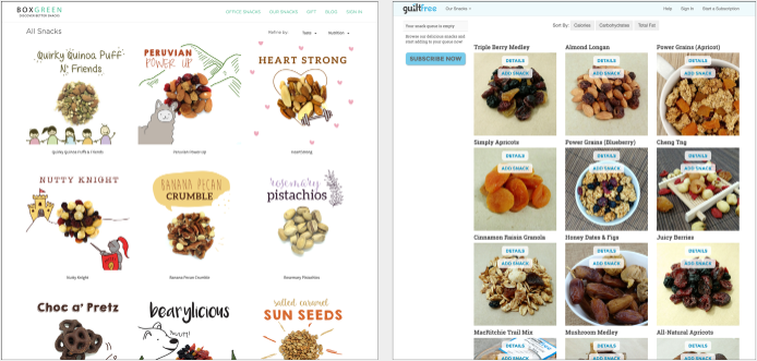 (
(