We value your privacy
This website uses cookies to ensure you get the best experience on our website.
 Skip to main content
This website uses cookies to ensure you get the best experience on our website.


Bet you’ve heard that one before. It rings true in landing page optimization as much as it does at a cocktail party.
Since the dawn of the Internet age, talk of dwindling web-user attention-spans has become common-place. Whether the actual number is one second or ten, the fact of the matter is that landing pages only have a moment to draw the user in.
In this EyeQuant blog post, we’ll take a look at:
If you’ve read the EyeQuant blog before, you’ve likely come in contact with themes like the “attention economy” and “cognitive load”, terms that describe the difficulty for the human mind to deal with the scope of information available to us at any given time. On a daily basis, the Internet presents its users with an unquantifiable measure of content for potential browsing behaviour.
The problem is, our attention spans to process all this information are finite, and our ability to multi-task isn’t as good as we’d like to think it is.
Seasoned internet users and internet addicts’ neural pathways have been shown to have altered as they experience heightened activity in their pre-frontal cortexes (the area of the brain that is mostly responsible for processing complex thoughts, personality expressions, decision making, and social behaviour), and as a result tend to improve on their hand-eye coordination and processing visual cues. However, this fundamental “re-wiring” of our brains as a result of heightened Internet use means that “we read faster and less thoroughly as soon as we go online”, according to Nicholas Carr in his seminal Wired article from 2010. Carr reported that it is not only the span and scope of information that is detrimental to our ability to focus, but the speed and simultaneity at which we are exposed to it. Hyperlinks, advertisements, share buttons, and cues to related content are just some of the distracting influences that drive users away from the seemingly simple act of reading and exploring, not to mention the constant pressure of open chat windows, email updates, and social media connectivity. The bottom line: Attention is a limited resource, so use it wisely and avoid superfluous visual pathways and exits.
In 2011, the always insightful Nielsen/Norman Group posted an article explaining Weibull Distribution (a theory originally formulated in 1951 to calculate the likelihood of “system failure” in machines) in online marketing terms. Researchers at Microsoft used the Weibull Distribution theory as an analogy to talk about the likelihood that a user will abandon a page early. The research revealed intriguing data, suggesting that around 99% of websites are susceptible to “Negative Aging”.
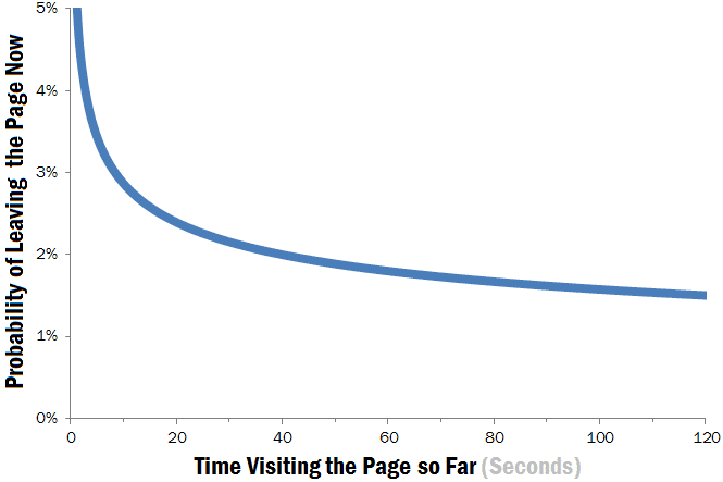
What does that mean? Simply put, users typically “screen and glean” a website during the first moments of their visit in order to assess whether they have come to the right place. If a website passes this initial skimming test, the site is more likely to be explored longer and more thoroughly. Meanwhile, if a website is deemed by the user to be unhelpful, the user is likely to leave within the first moments of their visit, and not wait around to see if their minds can be changed.
Microsoft and N/N Group’s research is significant because they demonstrate a quantifiable reason why users leave a website, and what the benefits of capturing initial attention are. N/N Group concluded their article by suggesting that “bad” websites would be abandoned in the first 10 seconds, while “good” websites tend to be explored for 2 minutes or more. The shortcoming of their otherwise excellent research is clear: We need to understand what makes a good website good, and what makes a bad one bad to a user.
In Proctor & Gamble’s world, the “First Moment of Truth” is the most crucial time-frame to engage consumers; their research suggests that the moment a consumer encounters a product is approximately the moment they will make up their mind to buy it or not. As our frequent readers will know, EyeQuant scientific board members explained why this was the case in a study from 2012, effectively suggesting that a product must visually “pop out” for it to be noticed. If it pops out, it’s likely to be chosen. In web design, the name of the game isn’t to make your entire website bright and shiny, but to recognize and select only the most important elements (like your value proposition, or call-to-action), then make them stand out against everything else. How do you do that? Understanding and creating contrast is one thing, but here’s another:
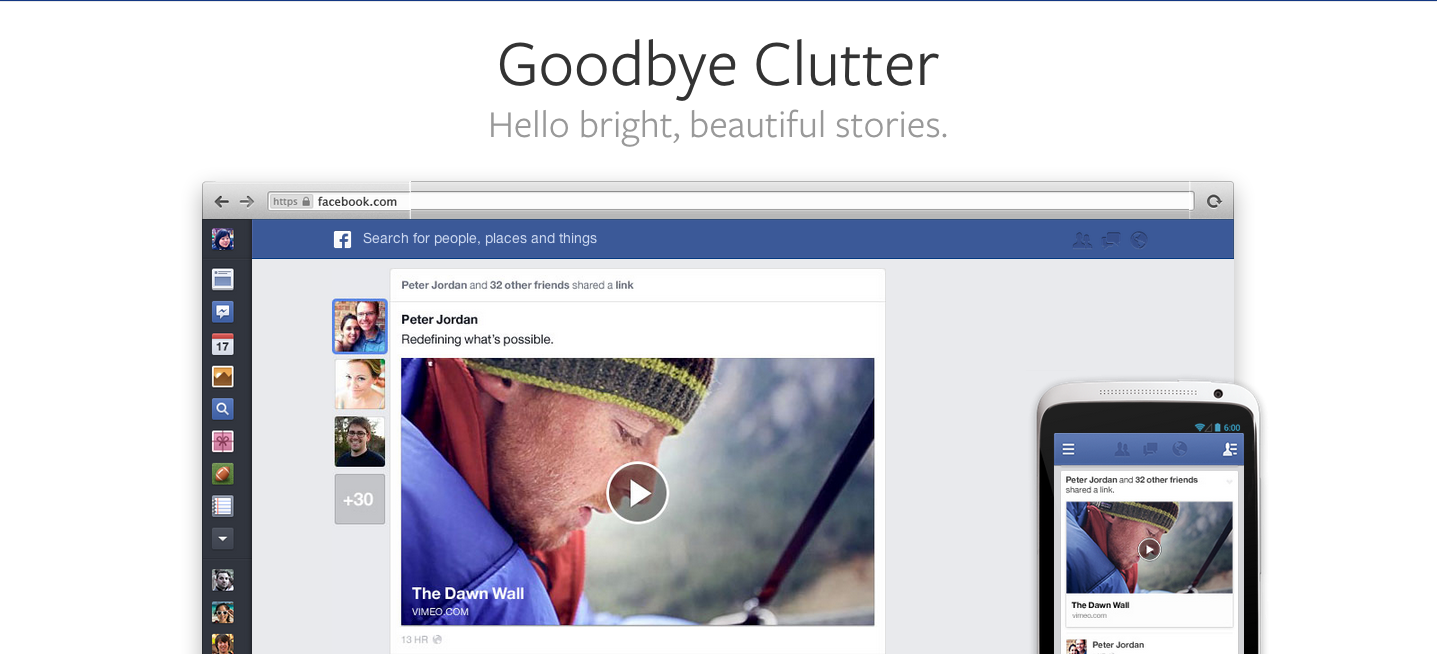
De-cluttering draws attention to the important elements on your page by removing inessential information like pop-up ads and secondary value propositions/ call-to-actions. The more space you give to your important content, the more visible it becomes – just think flickr, twitter, airbnb, or even Facebook’s new design.
But wait, there’s another reason why you should give your page a Spring cleaning: The more information you hurl at your users, the more often they will have to shift their focus. De-cluttering your landing page provides a debris-free navigational path, and will direct them more quickly and more efficiently to what is important.
We humans aren’t really able to simultaneously juggle information and tasks, our brains must simply switch back and forth between differing information, which is a taxing endeavour, to say the least. Giving your user at calm environment in which they can explore your offer reduces stress and simplifies the task-at-hand. How do you know if you’re demanding too much of your users?
Ask yourself these 3 questions:
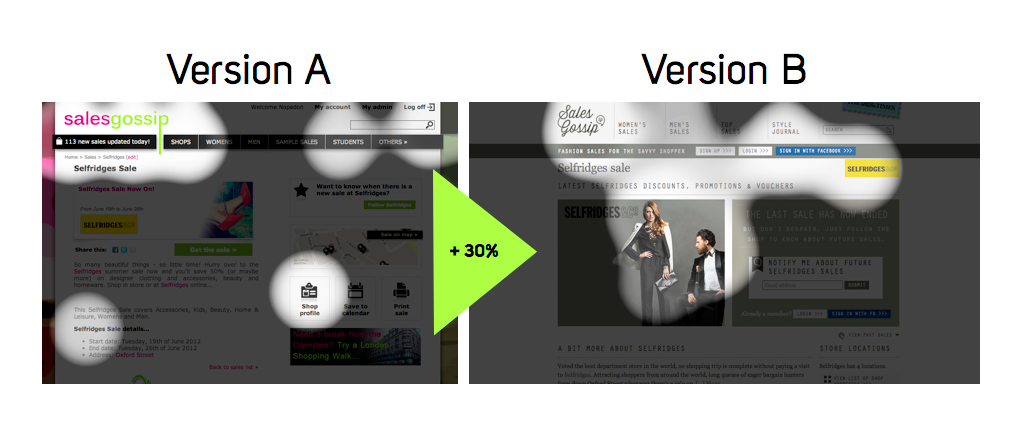
EyeQuant just released a case-study with fashion site SalesGossip that does a great job of illustrating this need for a singular and easy-to-follow flow. By simplifying and consistently organizing the content on their page, SalesGossip improved its navigational flow – and achieved an instant 30% boost in sign-ups along the way. Take a look at these EyeQuant perception maps showing the site before and after its design change. The success of the attention flow in Version B is clear:
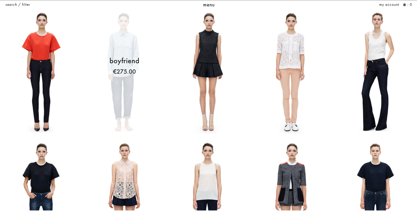
But what about websites that require a lot of information available at any given time, like an e-commerce site? Part of Spring cleaning isn’t just throwing out the page elements that you don’t need anymore, it’s also about organising the remaining contents in a consistent, understandable manner. Despite its slow loading time, Spice Girl – cum – lauded fashion designer Victoria Beckham just launched a strikingly simple, consistently organised e-shop. Part of simplifying the path your user can take is, once again, to remove distraction-worthy elements. Too many hyperlinks, buttons to click, or alternate pathways provide too many options to leave the process you want your users to go through.
In past blog posts, we’ve spoken a lot about attention-driven design. Designing a website with user attention in mind isn’t just about directing their focus to your most important content, it’s also about creating and promoting a calm place for users to concentrate. Think of your users as Lawrence of Arabia, and you are an oasis amongst the chaos of shadowless, scorpion-ridden, sand storm-prone desert! Designing conscientiously with the overarching stresses of the web in mind won’t only help boost your own usability and conversions, but will play a part in helping the Internet become a calmer, easier place to exist in.
Here at EyeQuant, we’ve figure out that the easiest and most precise way to make sure that a user’s attention is being directed to the right places is through automated attention analysis. Our neuroscientific A.I. provides instant insight into the ways in which users see your website within the first moments of their visit.


Why do users miss what seems obvious? In our latest webinar, Professor Peter König, one of the world’s leading...
Read more
In this session, we explored how teams can move beyond instinct and start making creative decisions based on how...
Read more
What does attention prediction actually look like in day-to-day design work? In this month’s webinar, we’re joined by leading...
Read more