We value your privacy
This website uses cookies to ensure you get the best experience on our website.
 Skip to main content
This website uses cookies to ensure you get the best experience on our website.


Colour permeates our actions and reactions in every walk of life. It plays into our sense of identity, our choices, and into our relationship with the world around us.
To conversion optimisers, marketers, designers and advertisers, choosing a branded colour scheme that sells can quickly become a lengthy and complicated problem. There are so many things to consider:
In this article, we’ll take a closer look at colour from the perspectives of neuroscience, business, and psychology. We’ll also discuss how to use colour to capture user attention and increase conversions.
More specifically, we’ll discuss:
Let’s start at the beginning: colour is a construction of our minds.
Isaac Newton was perhaps the first person to observe that colour is not inherent to all objects; rather, an object either reflects or absorbs coloured light, and what is reflected is what our brains will process as a specific colour.
The colour spectrum is made up of three primary colours: red, yellow and blue. By combining these three colours, secondary colours – green, violet, and orange – are produced. Mixing any primary or secondary colour produces a tertiary colour – blue-green, blue-violet, red-violet, orange-red, yellow-orange and yellow-green.
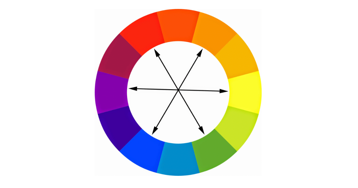
Goethe came up with the common representation of the symmetrical colour wheel. His Theory of Colours, published in 1810, experientially and conceptually explored the effects of colour on humans.
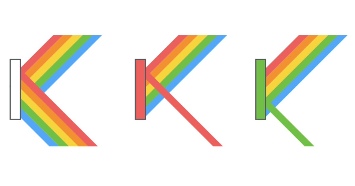
The common colour wheel represents the three primary colours, the three secondary colours, and the six tertiary colours so that the “complementary” colours are always opposite each other: red is opposite green, purple is opposite yellow, blue is opposite orange, etc.
Complementary colours are the pairs that will allow for the most contrast. According to Goethe, “the colours diametrically opposed to each other… are those that reciprocally evoke each other in the eye.”
“Human visual attention is for an important part bottom-up driven by the saliency of image details. An image detail appears salient when one or more of its low-level features (e.g., size, shape, luminance, color, texture,binocular disparity, or motion) differs significantly from its variation in the background.”
This is a quote from a research paper by researchers from the University of Barcelona on the saliency (or visual pop-out effect) of colour. Much of the visual attention we pay to specific regions of a scene depends on bottom-up (i.e. motivated by stimulus, rather than task-driven) attention. This describes why colour choices affect the way a user will interact with a website when they first arrive.
Human visual attention, in other words, first responds to contrasts in colour and light, then to the emotional and cultural value of a specific colour.
Our perception of colour has evolved over thousands of years to help us “discriminate edible fruits and young leaves from their natural background” (Koenig).
In his research into the nature of colour contrast in the Ugandan rainforest – a so-called birthplace of civilisation – Professor of Neurobiopsychology (and EyeQuant co-founder) Dr Peter Koenig and his fellow researchers found that the axis of Red-Green colour contrast plays the largest role in attracting our overt attention in natural scenes, while the effects of a Blue-Yellow colour contrast are much less influential. While this research is specifically related to jungle scenes, it certainly offers interesting fodder for further research into how and why certain colours and colour combinations stand out to us more than others.
Colour saturation is another possible predictor of attention. Colour saturation is the intensity of a colour, expressed as the degree to which it differs from white.
Crucially, the more saturated an element is in comparison to its surroundings, the more quickly it is likely to be noticed.
What do certain colours symbolise?
Green symbolises trustworthiness, youth, and energy. But wait, so does yellow… and orange, and blue! Breaking down the associations that colours have to certain states of mind can be terribly confusing.
In semiotics – or the study of signs – the use of colour as a substitute, or sign, for information is frequently broken down by Peirce’s Trichotomy of Signs:

You can only paint your living room walls once they have been built, sanded and prepared, and the same principle goes for your website: a basic global framework of decisions must be made before aesthetic choices such as colour can be made.
There are no secret formulas involved in choosing a colour scheme, nor is there one colour or colour combination that is guaranteed to attract your users to your product.
To make this crucial aesthetic decision, you must first understand what it is that you want to achieve, and most importantly, who you want to achieve it for.
In this way, colour should act as a substitute for information. Instead of telling a user to “look there” or “feel this way” about a webpage or product, use colour to fill in the blanks.
One example of using colour to “fill in the blanks” is the notorious “BOB” (Big Orange Button).
The BOB has become a symbol of colour’s role in conversion rate optimisation. But why is the BOB the saviour of conversion, the Queen of the CTA’s, the undisputed fan favourite of users?
While there are no clear reasons why a bright orange CTA purportedly converts so well, we could offer some possible reasons.
“Safety orange”, or a bright orange (Pantone Number 152) is used to differentiate important information from its surroundings, especially in contexts that require quick decisions and immediate attention such as in traffic, hunting and disaster relief. The allure of bright orange has to do both with its saliency against common natural backgrounds such as a blue sky or a dark green forest, but also with its semiotic connotations; because of its symbolic status as a “safety” colour, we could hypothesise that bright orange encourages more urgent decision-making – which is good news for e-commerce buttons.
A Big Orange Button works best when it stands out like a hunter’s safety vest in the forest: it needs contrast – often in the form of complementary colours – to attract and direct attention.
A popular design model for creating balance within a colour scheme is to adopt the basic 60-30-10 rule. Here, the rule dictates that your most dominant colour should be used 60% of the time, your secondary colour 30% of the time, and an accent colour 10% of the time.
Typically, the most dominant colour should also remain the least saturated colour, while your bold or highly saturated accent colour should be saved for your most important content.
Behind this intuitive strategy lies an idea that is consistent with the science of visual attention. In simple terms, what we are visually drawn to relies on intersecting sets of spatial and contrasting characteristics. A sparsely used “accent” colour is likely to attract visual attention both because it is scarce and because it elicits a high value of visual contrast.
In the jungle, we’re neither given the luxury of whitespace, nor respite from the surrounding visual chaos.
Websites are different. Whitespace is crucial to drawing user attention to key areas and to balancing and directing the flow of information across a page.
This, of course, is no news to you: minimal, flat, simple and uncluttered design is a common strategy for creating high-converting, usable webpages. However, adding whitespace to a webpage in order to draw more attention to a key element can be trickier than you think.
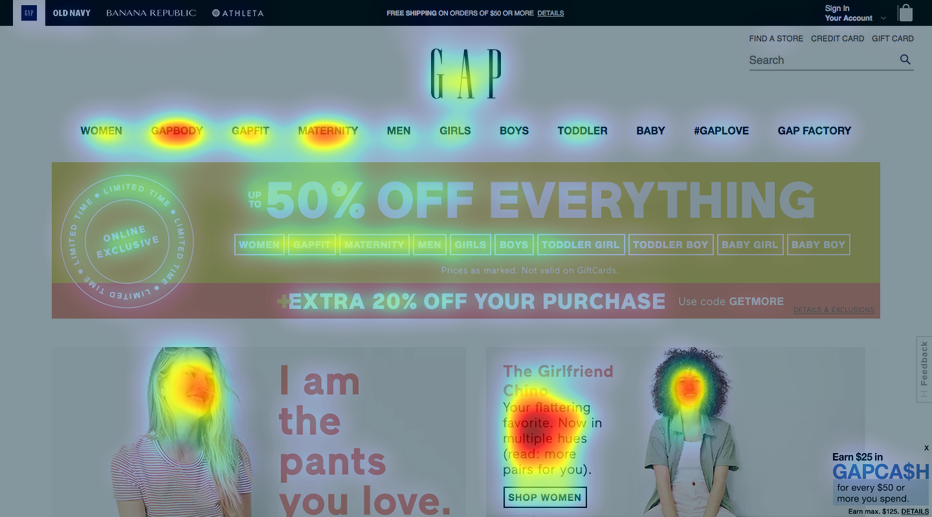
A huge ad, such as Gap’s “50% OFF EVERYTHING” (see below), might seem as if it would capture our attention immediately. Using EyeQuant’s Attention Map analysis, we can see that the ad is actually largely ignored!
This analysis shows an accurate prediction of what users will most likely see (or miss) in the first couple of seconds after landing on the page. It’s clear that the large “50% OFF EVERYTHING” sign in the middle of the page receives comparatively (and surprisingly) little user attention. The highly salient black text at the very bottom of the page, meanwhile, receives far more heat because of its point of contrast compared to the rest of the page.
In all likelihood, an emotional framework of colours has already been established by your competitors and the brand ecosystem you work within. Do you hop on the bandwagon or do you swim against the current?
Well, it depends.
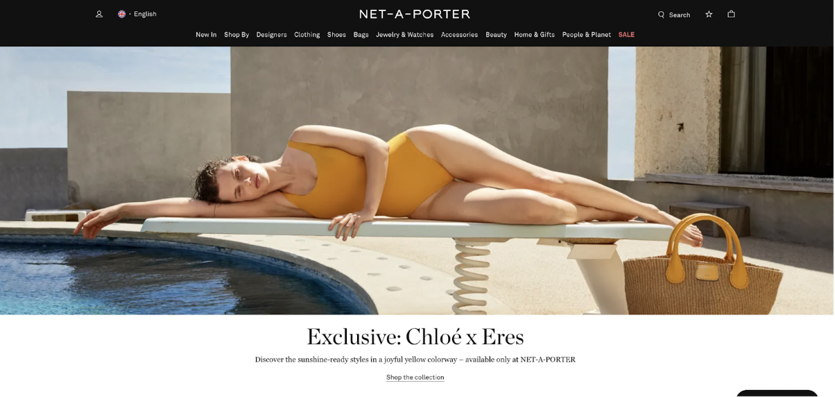
Fashion E-Commerce is a vast ecosystem that tends to adhere to a colour scheme. Chanel introduced the now ubiquitous monochromatic black and white scheme to fashion in the 1920s, and sites such as Net-A-Porter, American Apparel, and ASOS continue to stick with it.
In this case, a predominantly monochromatic colour scheme (with moments of colour splashed in) is used for the user to immediately identify that they’ve come to a fashion-forward site. For example, take a look at Net-A-Porter’s strategic use of red to draw attention to their sale items.
Environmentally-conscious products might intuitively choose a green-based colour scheme, as it’s iconic of their relationship with Mother Earth, but they are often just as likely to choose green’s complimentary colour – orange – to provide a welcome change. Choosing a colour based on semiotics alone is common practice, yet limiting.
By the same token, working on a monochromatic grey scale (as is the case for many companies within the fashion industry) works well because it also converts easily (important information can be picked out using splashes of colour). However, relating a brand to a colour for symbolic reasons alone may lead to reduced bottom-up attention.
Remember, users will see what is salient on a page before they start processing the emotional and cultural importance of colour.
Neil Patel once wrote that the person responsible for A/B testing at Gmail ran tests on 50 shades of blue before deciding on the hue that worked the best for their users.
For the vast majority of us, this quantity of tests is far out of reach (Gmail does have 425 million test subjects, after all), but Neil does point to a now-famous A/B test. Here, Performable tested a green CTA button – which is consistent with their overall branded colour scheme – against a red CTA button.

The red CTA button outperformed the green by a whopping 21%.
To try and understand why this was the case, we could point you to studies that suggest that red is, indeed, the most salient – and hence most attention-grabbing – colour, but saliency is dependent on context, or how a certain colour pops out in relation to its surroundings.
What we do know, however, is that making sure that your most important elements are the most visible ones will typically result in better conversions – and colour is one of the main mechanisms to achieve that. The only way to find the best-converting colour for your webpage is to test, test, test.
“Therefore, do not go out and blindly switch your green buttons to red without testing first. You should test colors on your page and with your audience to see what happens. You might find something interesting in your data that we don’t have in ours.” – Hubspot
For more resources on colour and how to use it to attract attention online, see:
Learn more about how you can use EyeQuant to test your designs.


Why do users miss what seems obvious? In our latest webinar, Professor Peter König, one of the world’s leading...
Read more
In this session, we explored how teams can move beyond instinct and start making creative decisions based on how...
Read more
What does attention prediction actually look like in day-to-day design work? In this month’s webinar, we’re joined by leading...
Read more