We value your privacy
This website uses cookies to ensure you get the best experience on our website.
 Skip to main content
This website uses cookies to ensure you get the best experience on our website.


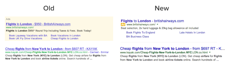
It’s official – Google has rolled out a major redesign of their search results and search ads. The company line, as outlined by Jon Wiley – Google’s lead designer for search – is that the new design improves “readability and creates an overall cleaner look“, while the redesign of the ads is “making the multi-device experience more consistent.”
Google’s desktop ads now do match the design of their mobile versions and achieving multi-device consistency certainly is a great reason. We’d like to take a data-informed guess on what other good reasons Google might have had for this major revamp of their most important interface.
Readers of this blog will know that our mission is to teach computers to see designs like humans do – using neuroscience and machine learning. In this article we’ll make use of our EyeQuant technology to better understand how Google’s new ad design affects viewers, and thereby, clicks.
First things first, some of our assumptions for the analysis:
1. It’s unlikely for Google to roll out a relatively major design change without having tested its effect on AdWords CTR (i. e. Google’s main source of revenue) first. It’s pretty safe to assume that the new design performs at least as well (and most likely better) in terms of CTR than the old one.
2. Google is still commited to its ‘Don’t Be Evil’ motto, which in particular affects any conflicts of interest in serving their two most important stakeholders: search users and advertising customers.
Now, as the headline gives it away, we do believe that the redesign is a subtle work of design genius. Here’s why.
Yep, Google somehow squared the circle here. When designing ads, one is usually torn between:
The first strategy usually implies a sacrifice of direct ad visibility and its ‘pop out’ effect, and worse, moral principles.
Yet, Google’s new ad design manages to achieve the following (besides its officially announced goals):
1. It does clearly label the ads as such – one could even argue that the labeling is clearer than before, as now every ad is explicitly labeled. Not evil.
2. At the same time it makes the ads blend in much more with the organic results. Ethically, this is a bit of a tricky move, in particular since they had banned a similar type of design explicitly from being used by AdSense publishers. But hey – every ad is labelled as such.
3. The best part? The new layout attracts MORE design-driven attention to the ads than the old one did.
We ran EyeQuant tests on both the old (~Q1 2013) and new SERP layout to see in which version the upper ad unit would generate more attention – solely based on its design and common viewing behaviours and patterns. EyeQuant results are 90% equivalent of what an empirical study with >25 subjects would provide. The following heatmaps of both the old and new ad units design show the respective probability of an area to be fixated in the first few seconds of exposure – the top 3 ads are marked up in pink:
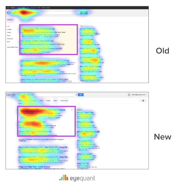
As it stands, the results show that the new design generates significantly more attention for the top 3 ads than before – especially for the desirable (and expensive) #1 ad. The attentional pull from the organic search results remains unchanged.
It probably goes without saying WHY all of this is good for Google.
But HOW did they do it? There are several factors involved, and we can reverse-engineer them with a bit of knowledge on how human visual attention works:
In conclusion, this is a supremely clever, subtle redesign and there’s lots of reasons to believe that it will effectively drive eye-balls, clicks and ad revenue.
Full disclosure: While several Google teams are using EyeQuant as customers, EyeQuant was not involved in any part of the redesign process.
If you’d like to get a more detailed look into how you can use design to influence visual attention in a systematic and predictable way, check out our quick 8 minute introduction right here:


Check out our latest top tips on how you can use EyeQuant to spy on your competitors, analyse mobile...
Read more
In our latest blog we explore how to use neuroscience to help create higher performing digital products.
Read more
Figma is the go-to prototyping platform for many UX and web designers – and not without reason. Its functionality,...
Read more