We value your privacy
This website uses cookies to ensure you get the best experience on our website.
 Skip to main content
This website uses cookies to ensure you get the best experience on our website.


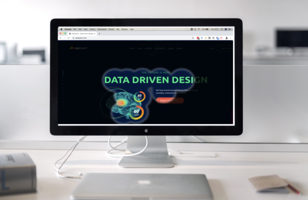
Perfecting your user experience (UX) is an ongoing process. Whatever stage of growth your business is in, and however well your existing UX is performing, there’s always room for improvement.
As technology changes, so do trends, best practices and users’ expectations. Adopting a data-driven approach to UX means you can stay ahead of the curve with a seamless experience that evolves with its users.
Here are 4 ways that a data-driven approach to UX design can make it more intuitive and more enjoyable for your customers to interact with your business.
User research and testing are fundamental to creating an experience that meets the needs of your customers. Just as beneficial as user testing, pre-testing methodologies such as talk-out-loud and task completion generate insightful data that can directly influence your UX for the better.
While testing content on users has become quite commonplace, it’s amazing how few people employ pre-testing initiatives that yield equally beneficial results.
There is a wealth of data that already exists about the way that people read, scan and view different types of content. Using this data, you can optimise your visual hierarchy to suit the way that humans digest visual content, and avoid some common pitfalls that even the most seasoned UX designers are susceptible to.
By removing unnecessary visual friction before you launch, you can hit the ground running with a scientifically-backed user experience design. This means that when you launch, you can jump straight into testing the unique, nuanced elements of your business and your site without the impediment of inefficiently optimised visual elements.
When a user lands on your site, you don’t want them to have to think about how they’re going to navigate their way around all of the content, links, images and buttons. A seamless visual experience with no distractions increases engagement and drives conversions.
We’ve all come across pages that make us think, “I have no idea what to do here!” Well, that kind of cognitive load is the #1 killer of conversions and the most likely instigator of a high bounce rate.
There is a wealth of data available that explains the way that sensory processing influences how people perceive visual stimuli. With the help of AI, neuroscientists have been deciphering how the brain processes visual information to decide what is important.
You can use this data to remove visual friction and reduce cognitive load for your users. With less cognitive effort required to process visual information, users are more likely to follow your optimal user path.
Understanding your customers before you launch your content can help you align your design to their needs.
Too often, content design is heavily influenced by personal opinion, business needs or a desire to “push the envelope” technologically. Fancy solutions with shiny packaging promise the world but are usually tone-deaf to what customers actually need.
The temptation to use the latest tech or jump on the latest UX bandwagon is ever-present. Instead, use tools such as value proposition canvases and jobs-to-be-done frameworks to understand and evidence your true customer goals, and design content that directly addresses their needs.
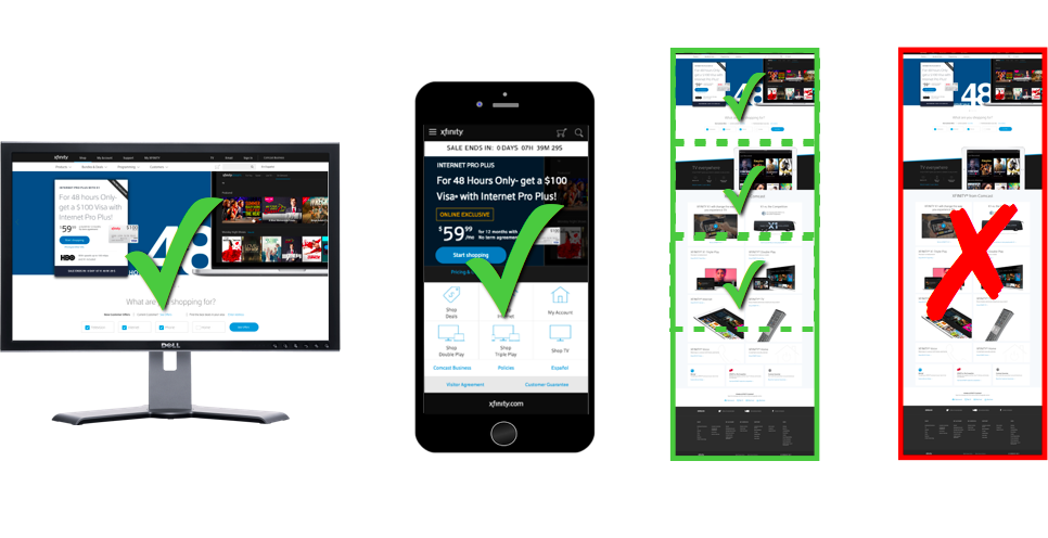
The way that you optimise your content will often depend on the way it is being consumed – the device, medium and format through which your users choose to access your content.
For example, you could look at the device logs on your Google Analytics implementation and examine the funnels to see where the highest rate of dropout is for each device.
Once you begin to understand how your users are interacting with different parts of your site, you can begin to be more selective about what the user needs, when, and on which device, rather than trying to cram everything into one screen.
Some browsers have built-in emulators to identify how content will render on different devices. Using this data, focus on the 80:20 rule to ensure that you have the best coverage based on the highest volume of a particular set of devices.
You should also consider that mobile devices have two viewports (landscape and portrait) and think about how to leverage this. A great example (and quite an old one now!) is Apple’s iPhone calculator, which serves its purpose in portrait mode, but offers even more functionality in landscape.


 Posted by: Gemma Todd
Why do users miss what seems obvious? In our latest webinar, Professor Peter König, one of the world’s leading...
Read more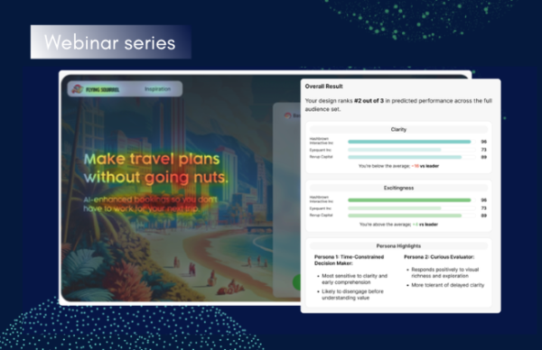 Posted by: Gemma Todd
In this session, we explored how teams can move beyond instinct and start making creative decisions based on how...
Read more Posted by: Gemma Todd
What does attention prediction actually look like in day-to-day design work? In this month’s webinar, we’re joined by leading...
Read more