We value your privacy
This website uses cookies to ensure you get the best experience on our website.
 Skip to main content
This website uses cookies to ensure you get the best experience on our website.
It’s hard to imagine Karl Lagerfeld wearing Flip Flops, a t-shirt and shorts. He’s not only a fashion designer, but a fashion icon himself.
Similarly, you wouldn’t expect Matthias Müller, the CEO of Porsche, to cruise around in a run down Trabi.
At EyeQuant, we’re building the world’s fastest and most accurate tool to optimise your website’s design – together with some of the most esteemed attention researchers at Caltech, the USC and Stanford. Our big vision is a web where users visit a website and find what they are looking for immediately.
But here’s the thing: our own online storefront was far from being optimal. We knew it for a long time. We knew it had to change, the sooner, the better. At the same time, more and more customers were signing up, loving the actual product and interface. We served over 20.000 eye-tracking equivalent attention analyses just in 2011, helping customers to achieve conversion uplifts of up to 170% by following a simple, simple rule:
Show your users the good stuff right away. Don’t make it just easy to see your headline, benefits and call-to-action: make it inevitable.
EyeQuant is without a doubt the best and fastest tool for testing and improving this aspect of your design. But our website didn’t look like that. Sure, our users were appreciative about the fact that we’re neuroscientists, not designers. They weren’t buying a beautifully effective store front, but a solution that works. Still, we were embarassed about it. So finally, we redesigned EyeQuant’s website, following our own principles and using our own fantastic tools.
Here’s what the old EyeQuant website looked like:
EyeQuant’s Perception Map shows what visitors will see in the first 3 seconds – in EyeQuant’s very own case, they saw the headline, our logo and part of the displayed perception map example (luckily this map wasn’t featuring another perception map!):
Every single one of our customers will know that this is actually a terrible result, since it shows that visitors weren’t able to immediately see our call-to-action to take free test. Clearly, this is the most desired action we’d like visitors to take on our website!
Now, usually we would advise customers to opt for a rebrush or a simple optimisation project instead of a full-blown relaunch – since EyeQuant’s results are available within seconds, we could have simply optimised the visibility of our call-to-action step by step. However, we decided to go all out, as we wanted to accomplish two goals:
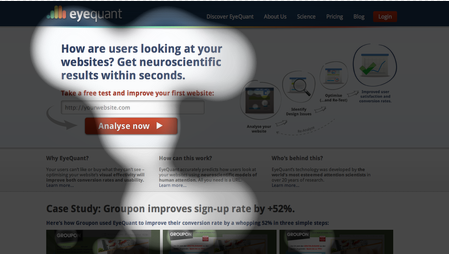
And we’re very happy with the result: users not only immediately see our logo (Who?), a value proposition-focussed headline (What & Why?) and our call-to-action (What next?), but also get presented with our latest case study, in which Groupon used EyeQuant to improve their sign up rate by a whopping 52%. (more on that soon!)
What about goal #2? Most links to our content sections are from the navigation bar, which shouldn’t “jump” at visitors immediately, but shouldn’t be hard to find neither. The Perception Map above already shows that it isn’t in a user’s main focus right away (good!). To assess this further, we made use of EyeQuant’s quantitative analysis feature, called Regions of Interest or ROIs. ROIs tell us how much more or less visible an area is compared to site average – we clearly want our navigation bar to be in the positive range here. It took a bit of tweaking, but here we go:
 +20% is a great result. Mission accomplished.
Needless to say, we’re very happy with the result of our relauch and hope you are, too.
Thoughts and feedback are as always much appreciated.
Thanks to Flickr user Siebbi for the cool shot of Karl.

In this session, we explored how teams can move beyond instinct and start making creative decisions based on how...
Read more
What does attention prediction actually look like in day-to-day design work? In this month’s webinar, we’re joined by leading...
Read more
The way teams predict attention is changing fast — and so are the tools that make it possible. In our...
Read more