We value your privacy
This website uses cookies to ensure you get the best experience on our website.
 Skip to main content
This website uses cookies to ensure you get the best experience on our website.


There’s a clear relationship between “clean” web design and user engagement.
As reported by Fast Company and Inc. Magazine, a new EyeQuant study has shown that there’s a surprisingly strong relationship between the “visual clarity” of a website (as rated by an algorithm) and its bounce rate. In fact, the results suggest that up to one-third of a user’s decision to stay or bounce comes down to a snap judgment of whether or not the page is too cluttered. In this post, we’ll take a closer look at the data and the methodology behind the study.
Within the design community, there’s been a definite trend towards simpler, more stripped-back design. At EyeQuant, we’ve seen many of our customers “de-clutter” their way to higher conversion rates, and even observed that amongst a collection of online retailers, the ones with “cleaner” design were growing the fastest.
What we wanted to understand is this: does “clean” design have a positive impact on user engagement across the board, or is it limited to specific cases like overly cluttered-sites or retail?
The Experiment Setup
Using Amazon’s Alexa service, we gathered approximate engagement stats for 300 popular websites across several website categories: from fashion, to insurance, to travel. In particular, we looked at bounce rates for the desktop homepage of those websites. Why bounce rates? First, it’s one of the engagement metrics that almost all companies measure. But it’s also easier to compare bounce rates across different website categories than, for example, time on site or number of page views.
To measure how “clean” each of the designs were, we used the EyeQuant visual clarity algorithm, which assigns a 0-100 rating to each design.
We built the algorithm by recruiting hundreds of users to participate in a study where they were shown a series of randomized pairs of designs. The participants’ task was simple: to identify which of the 2 designs on the screen they felt was “more clean”. This “forced-choice” approach helps to identify patterns in which kinds of designs people feel are more “clean”, and helps us determine how much people tend to agree with each other (turns out, it’s more often than you’d think). Using machine learning, we were able to take this data and build a predictive model that analyzes any design and rates it, with over 85% accuracy compared to a 200-person study.
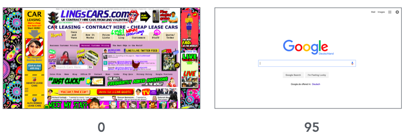 The Extremes: here are examples of a very low clarity score (the famous Ling’s Cars), and a very high clarity score (Google).
The clarity score is driven by factors like the amount of text on the screen, layout, and the imagery used on the page (pictures with many sharp contrasts and lines tend to make the whole page feel cluttered).
Finally, we calculated a Pearson Correlation between the Clarity Score and Bounce Rate for all 300 websites.
We observed a surprisingly strong negative correlation (r= -0.57, p < 0.001) between Clarity Scores and Bounce Rates across the 300 websites, meaning that cleaner sites do tend to have lower bounce rates. Similar results were observed when we looked at individual website categories by themselves.
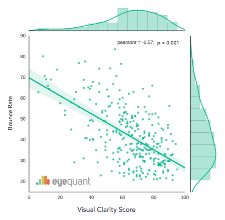
The graph above plots each website’s clarity score and bounce rate. The green line shows the trend in the data.
Perhaps the most striking data point is the r-squared value of 0.327, which implies that roughly one-third of the variance in bounce rates can be explained by the variance in clarity scores – a much stronger effect than we expected to find.
An open question is whether or not there’s another variable at play here that tends to move in the same direction as the clarity score and magnifies the perceived impact of visual clarity. But if such a variable exists, we haven’t found it yet.
For anyone involved in design decisions online, this study should serve as a warning to fight the natural tendency for pages – particularly home pages – to get cluttered over time. Think about which content is really important for users and focus on (only) that content.
The results also suggest that it’s worthwhile to try “de-cluttering” existing designs, as improved user engagement often leads to higher conversion rates. This is especially true for companies that are running an A/B testing program, and are capable of measuring the impact of de-cluttering on their own website.
—


Why do users miss what seems obvious? In our latest webinar, Professor Peter König, one of the world’s leading...
Read more
In this session, we explored how teams can move beyond instinct and start making creative decisions based on how...
Read more
What does attention prediction actually look like in day-to-day design work? In this month’s webinar, we’re joined by leading...
Read more