We value your privacy
This website uses cookies to ensure you get the best experience on our website.
 Skip to main content
This website uses cookies to ensure you get the best experience on our website.


When I’m chatting with clients, partners, and prospects, I find myself talking a lot about the idea of “visual clutter”. My colleague Bitsy has written extensively on the topic of “attention-driven design”, but I wanted to add my take on the issue.
This morning I had a call with an EyeQuant user who’s starting a new conversion optimization agency in the UK. In his past life he was a SEO expert, so today he was analyzing some of his SEO clients’ websites with EyeQuant to spot some opportunities for improvement.
When we looked at the Perception Map for one particular website, the 3 most important pieces of content were seen right away. At first glance, EyeQuant was suggesting this was a pretty good page.
Not so fast, I said. Looking at the Attention map, we could see that there was an orange-yellow haze over many parts of the page. Visually, user attention was scattered across the page. The page was simply too busy.
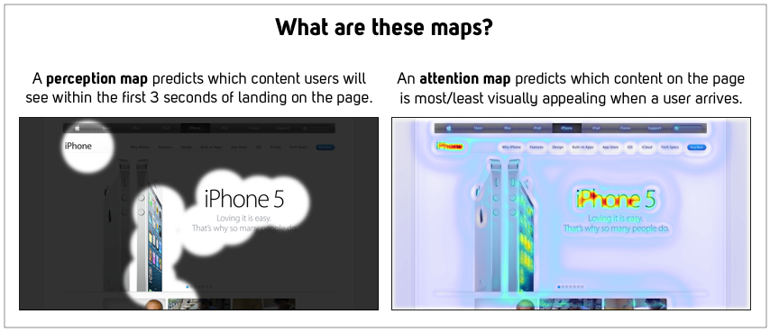
“Visual Clutter” annoys users. Time and time again, we see that focused pages outperform crowded screens.
Here’s my favourite (extreme) example. No disrespect to the folks at Cruise, but this is what their landing page looks like:
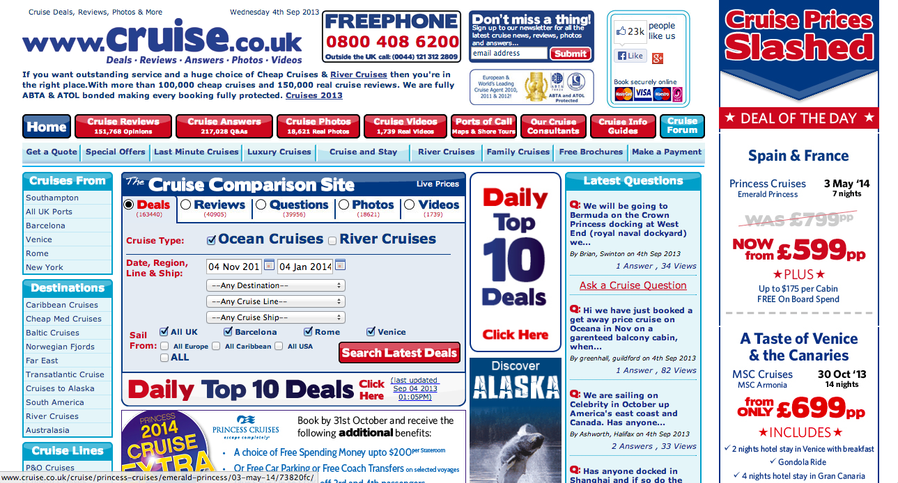
You’re probably thinking “wow that’s busy”. EyeQuant agrees. Check out the Attention Map for this same page:
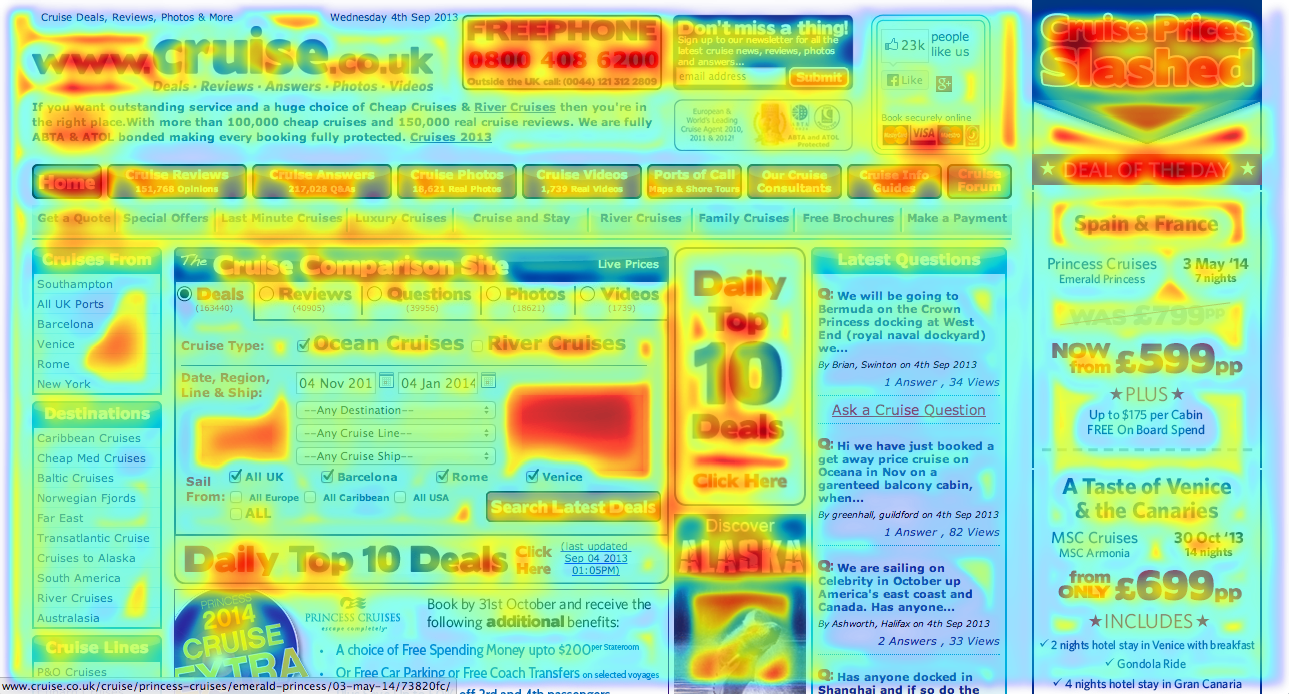
There is so much content competing for attention on this page, that users are almost surely overwhelmed.
And yet, when a website isn’t converting, many people rush add content. More benefits listed. More special offers. More options. More testimonials. It’s a natural reaction: “people aren’t convinced yet? Well what if I also told them that ……..”
So here’s my challenge to you: the next time you want to test one of your pages (which you should be doing right now), don’t change elements and don’t add new ones. Pick 3 of the less-important “things” on the page and delete them. That’s your test.
Here’s how I suggest you do it:
Look at your page, think about which 3 things are most important. Usually that’s the 3 W’s: what is this page about, why should a user care, and where are they supposed to go next? If you can’t narrow this down to 3, you can cheat and pick 5 things. Not more.
Go to http://www.eyequant.com and analyze the page. If you haven’t used EyeQuant before, your first test is free and your results will be ready in seconds.
Look at the “Attention Map” – that’s the one that looks like a “heat” map. Excluding your 3-5 key content pieces, anything that has some red/orange/yellow overlay on it is a great candidate for deletion. Remember, you have to delete 3 things!
If your page now looks ridiculous, make any small layout tweaks that might be necessary. Try not to do anything radical though.
Run A/B test.
Did it work? If you try this, I’d love to hear from you. In fact, if someone has interesting results that we can share on the blog, I’ll hook you up with another 10 EyeQuant analyses! Just shoot me an email at kurtis@eyequant.com or tweet me at @kurtiswmorrison.


Why do users miss what seems obvious? In our latest webinar, Professor Peter König, one of the world’s leading...
Read more
In this session, we explored how teams can move beyond instinct and start making creative decisions based on how...
Read more
What does attention prediction actually look like in day-to-day design work? In this month’s webinar, we’re joined by leading...
Read more