We value your privacy
This website uses cookies to ensure you get the best experience on our website.
 Skip to main content
This website uses cookies to ensure you get the best experience on our website.


Great SEO brings users to your site. A great UX helps them achieve their goals after they arrive.
Too often, however, teams focus on only one piece of the puzzle:
In either case, growth stalls. As acquisition becomes ever more expensive, it’s essential to “bridge the click”—for those who focus on the before to think about the after, and vice versa.
When it comes to the largest U.S. commercial banks, few get both right. But examples of stellar performance, and underachievement, abound.
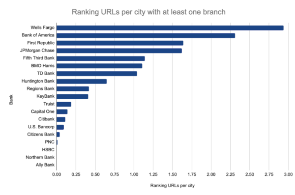
Our research on the 19 largest U.S. commercial banks relies on ranking data from more than 50,000 search results and UX insights from EyeQuant’s AI-powered analysis.
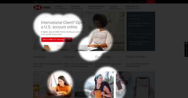
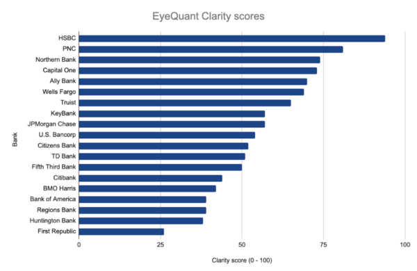
Take the top-performing bank from a UX perspective, HSBC. Based on EyeQuant data, the site scored a 94 out of 100 on Clarity, a measure of whether a design is clear and uncluttered.
Neuroscientific research shows visual saliency affects fixation locations and durations, which are predictive of choices. Put simply, higher clarity scores mean lower cognitive load, lowering the bounce rate and making it easier for users to buy.
EyeQuant’s Perception Map highlights the elements that users are likely to notice in the first three seconds. For HSBC, the primary call-to-action (CTA), to open a checking account, is one of the first visible items, supported by an image of a woman looking toward the CTA. These design best practices guide users toward the highest value activity.
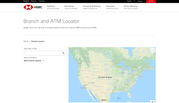
But what about HSBC’s search presence for non-branded queries? It’s effectively zero. HSBC has a single URL for all branch locations. Without location-specific content, they lose out to other banks—like Bank of America—that have dedicated URLs.
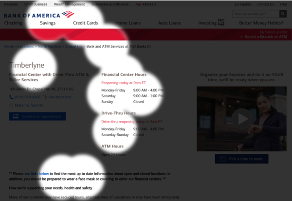
However, Bank of America, which ranks second among all banks for organic visibility, scores third-to-last on UX metrics.Why? A weak visual hierarchy on those location pages so vital to organic rankings. Imagine you’ve just clicked through from search results. What stands out? The page is a jumble of similar font sizes, weights, and colors.
Even beyond the three-second first impression, the page has a muddled design. Red, attention-seeking areas are scattered across the page:
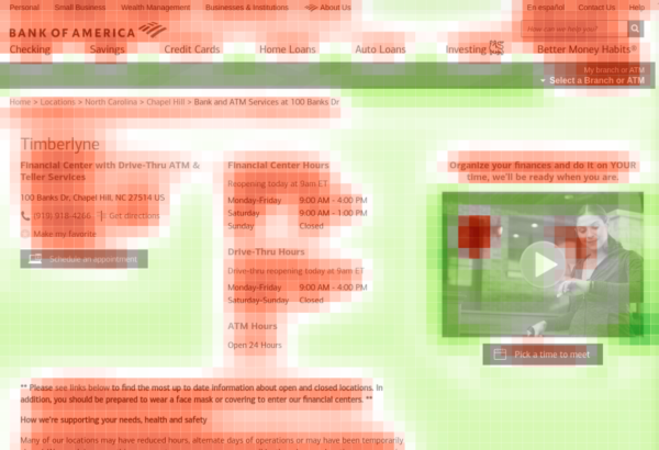
Despite plenty of white space and a limited amount of text, it still feels cluttered—and the Clarity score (39 out of 100) suffers. Solutions will vary from site to site, but best practices are a starting point:
Given the choice between not having location pages and needing to improve their design, however, the latter wins.
A major driving factor in designing a better, more modern banking website is to break established trends. Many banking sites overwhelm the user and try to fit every possible element “above the fold.”
With the use of sufficient whitespace and varying heading styles, you can establish a clear visual hierarchy that allows the user to quickly find the information and take the actions that brought them to the site.
Massive banks have massive backlink profiles. Even a smaller, regional bank like Huntington has a Domain Rating of 75—better than all but about 30,000 websites on Earth. Wells Fargo has a stronger link profile than all but 1,800 websites.
As a result, Google is unlikely to pick winners and losers based on link profiles. Everyone is credible. For queries like “banks near me,” the map pack skews toward physical proximity—which banks are closest to the searcher?
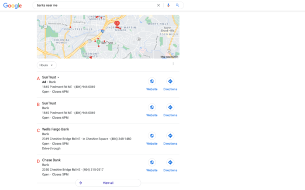
The remaining search results elevate banks with location-specific URLs. Poor performers like HSBC have a single “Branch and ATM Locator page.” They’re giving nothing for search engines to grab onto.
A pure SEO evaluation would critique the page for its “lack of text signals.” But, from a user’s perspective, it falls short, too.
A click from a search result doesn’t take you directly to a page with an address and phone number. You have to (re)enter your city or zip code, identify the closest location on the map, and click the map pin.
From a usability perspective, regardless of whether you follow the three-click rule (i.e. users should be able to find what they’re looking for in no more than three clicks), asking a user to re-enter information is a no-no.
This problem is thornier for branchless banks like Ally, whose business model limits the creation of pages that match the intent for queries like “banks near me” or “open a checking account.” (Google returns a local map pack for the latter query—a signal that searchers prefer banks with physical branches.)
For someone like Ally, organic growth depends, in part, on a shift in user behavior. More queries that imply an interest in branchless banks are a boon—and trending in the right direction.
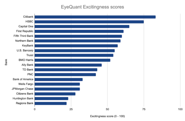
Among the banks in the study, Wells Fargo was the only bank to rank among the top six for both SEO performance and Clarity. Its shortcoming? Excitingness.
A second core EyeQuant metric, Excitingness, measures the emotional impact of a page. A high score indicates a “stimulating” design; a low score indicates a “calm” design.
For banks, it’s a metric to approach cautiously—a high Excitingness score is vital to a casino, less so to a bank.
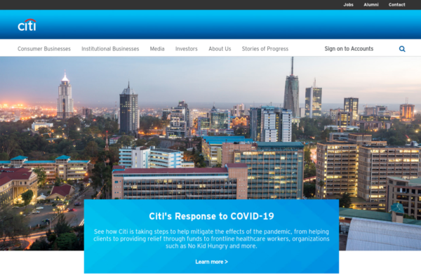
But that doesn’t justify the drab, button-down design that plagues many corporate sites. Citibank, which scored the highest among all banks for Excitingness, uses a sunset skyline to evoke the energy of a metropolis—without undermining a stoic sense of responsibility.
For banks, a low Excitingness score is likely less damaging than a bottom-tier Clarity score. But some sites, like Citizens Bank, may have over-indexed on Clarity, loading their design up with whitespace while draining the energy from the page.
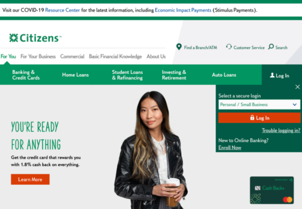
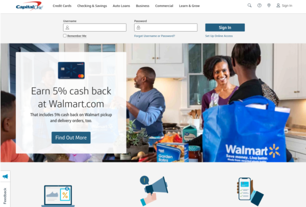
Capital One outscores Citizens on Clarity (73 to 52) and also delivers one of the top Excitingness scores. The difference is palpable: a lively photo with a warm, colorful background, which still preserves high-contrast sections for the login and CTA.
It’s easy to forget that we’re all selling to people. Good UX design transfers data to your user while requiring minimum effort. A strong visual hierarchy is a necessity. Don’t be afraid to test how typography, illustrations, high-quality photos, bold colors, animations, and interactive elements all impact emotion.
Bank-to-bank comparisons make sense for UX. They’re incomplete, however, when comparing organic performance.
You can beat out every direct competitor—and still not sit atop search results. When it comes to SEO, your competitors are websites that compete for clicks, not just paying customers.
On desktop, one-third of results are websites other than financial institutions; that figure increases to half for mobile users:
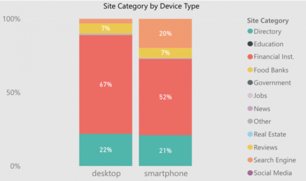
The biggest non-bank consumers of target traffic? Directories. This situation isn’t unique to banking. A search for “restaurants near me,” “best dentists in [city]” or virtually any other query with local intent is loaded up with directories.
Users like directories. They’re also a crutch for search engines, which struggle to parse which bank or bakery is best based on keywords, images, page speed, or URL structure. Review-laden directories are useful proxies for evaluating things a crawler can’t.
From an SEO perspective, one part of the solution is a strong presence on top directories. You need to be visible where users end up, even if it’s on another site.
But you can also use directory content to identify opportunities to improve your site. If directories help users decide among options, does your site do the same? Many bank websites offer only two things: a direct path for existing users to log in and a promotion.
Differentiation? That’s harder to spot.
In each search result, Google lays bare everything it’s learned about user intent. If that intent reflects uncertainty—a need to learn about options, which banks others like, and why they like them—your site, whether a homepage or a location page, should help resolve those concerns.
A user who “pogosticks” from search results to your site and back to results (and then to a directory) wastes valuable traffic and jeopardizes hard-earned rankings.
If you have nailed your value proposition, make sure a banner doesn’t cover it up.
As search engine result pages further diversify, banks and other financial institutions have to get more creative about SEO.
Non-website results that you can influence and capture are things like featured snippets, in-search answers to questions, map results, and placements in directory listings.
GDPR and COVID-19 have been a perfect storm for website banners. Just as (some) marketers had weaned themselves from aggressive pop-ups, compliance and informational banners took over.
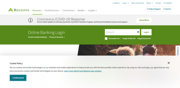
Here’s the Regions Bank homepage upon arrival:
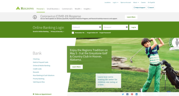
Here’s the page after clearing one of the banners:
It’s a simple click to dismiss the banner, but the first impression lingers. Regions Bank certainly isn’t the only offender. But some sites convey the same information with less impact on design:
 The quick-fix solutions implemented over a year ago—and likely to persist for months more—are worth reviewing.
Obtrusive banners exemplify the risks and consequences of a siloed approach to website marketing. Someone put out a fire; no one’s swept the ashes.
No study is perfect. Rank-tracking tools deliver the occasional aberration. Eye-tracking analysis—by humans or AI—translates qualitative data into quantitative scores.
Additionally, some site designs have changed from when we ran this analysis to now, and organic search results are constantly in flux.
Caveats notwithstanding, here’s what we did:
Organic visibility is the average number of URLs that rank among the top 20 results for any city in which the bank has at least one branch.
This metric normalizes rankings among national banks with a presence in hundreds of cities versus regional banks with a presence in dozens. The metric may still skew in favor of banks with more locations in a single city.
The Clarity score (0 – 100) measures how “clean and clear” a design looks. A lower score indicates a cluttered design.
The Excitingness score (0 – 100) measures how stimulating a design looks. A lower score means a calmer design.
The combined UX score (0 – 200) sums the Clarity and Excitingness scores. Clarity and Excitingness are not linked on a scale. One score may be more indicative of conversion than the other.
This metric averages banks’ Organic visibility rank and Combined UX rank. A lower score is better.
For example, a score of 1 would indicate that the site is first in both; a score of 10 could indicate a site was 1st and 19th, 10th in both, etc.


In this session, we explored how teams can move beyond instinct and start making creative decisions based on how...
Read more
What does attention prediction actually look like in day-to-day design work? In this month’s webinar, we’re joined by leading...
Read more
The way teams predict attention is changing fast — and so are the tools that make it possible. In our...
Read more