We value your privacy
This website uses cookies to ensure you get the best experience on our website.
 Skip to main content
This website uses cookies to ensure you get the best experience on our website.


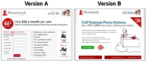

MarketingExperiments recently posted a fantastic landing page success story on their blog that piqued our interest: Phonebooth, a company offering VoIP services for businesses, achieved a whopping 262% increase in conversions. Here are the two versions they tested:
MarketingExperiments credits this success to minimizing friction and reducing user anxiety by implementing trust seals and improving the page’s copy with added elements like ‘product of the year’, ‘no contracts’, and ‘zero setup fees’.
These are all important aspects of Phonebooth’s conversion process, but we noticed something else.
Here at EyeQuant, we believe in attention-driven design. The premise is simple: When a user arrives on a landing page, their attention should be immediately directed to the most important content.
As we’ll see shortly, Version B (the winner) does a much better job of this than its rival. But what is the most important content? To answer this question, EyeQuant recommends a method we like to call the 3 W’s.
The 3 W’s framework is simple. When a user appears on your landing page, they should immediately see what the page is about, why they should care, and where they should go next.
Using EyeQuant, we can quickly evaluate exactly what users see in the first few seconds of their visit, and judge these pages based on the 3 W’s. The quantitative Regions of Interest (ROI) feature within EyeQuant allows us to directly compare the design of these two pages. Let’s see how they did!

Establishing Relevance (“What”):
In Version A, the headline does not explain what Phonebooth does; however, the sub-heading indicates that it offers “Business Phone Plans”. This phrase yields an EyeQuant ROI value of 54. In other words, the highlighted area is 54% more attention-grabbing than the average pixel on the page.

Version B’s headline is much more explicit about what Phonebooth offers: VoIP Business Phone Systems”. This headline has an ROI value of 111. That’s 111% more attention-grabbing than page average, but more importantly, it’s a 205% improvement over the control page.
One could argue that Version B’s ability to establish relevance may be the single greatest improvement over Version A – especially when you consider that the “what” statement also benefits from better copy, changing from “Business Phone Plans” to “VoIP Business Phone Systems”.
Core benefits (“Why”):
Version A’s headline expresses its main benefit: “Only $20 a month per user”. This headline has an ROI value of +105.

Version B moves that statement to a seal on the left, and instead uses the phrase “Up to 60% less than other leading providers” as the main benefit. This line has an ROI value of 95. In this respect Version A actually out-performs Version B from an attentional standpoint.

Call to action (“Where Next”):
Version A uses a red “Get Quote” button as its call to action, while Version B uses a green “Get Started” button. The ROI value for Version A is -24, meaning that it’s less attention grabbing than most elements on the page.

The green button in Version B has an ROI value of -3, suggesting it’s about as attention-grabbing as the average pixel on the page.

Neither of these are great scores for such an important landing page element, but Version B does significantly improve upon Version A.
The great thing about conversion optimization is that no matter how good your landing page is, it can always get better – even after a 262% boost. EyeQuant suggests this is absolutely the case for Phonebooth as well. The perception map below shows what users see within the first 3 seconds of landing on the page (Version B).
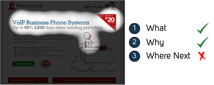
While the “what” and “why” elements are visible right away, the call to action (“where next”) is still somewhat hidden. Our 3 W’s model tells us that by further tweaking the design of this page to draw more attention to the CTA, it could increase conversions even further.
If you’d like to try out EyeQuant on your own website, head over to http://www.eyequant.com.


Why do users miss what seems obvious? In our latest webinar, Professor Peter König, one of the world’s leading...
Read more
In this session, we explored how teams can move beyond instinct and start making creative decisions based on how...
Read more
What does attention prediction actually look like in day-to-day design work? In this month’s webinar, we’re joined by leading...
Read more