We value your privacy
This website uses cookies to ensure you get the best experience on our website.
 Skip to main content
This website uses cookies to ensure you get the best experience on our website.


Clarity – a relic once associated only with monks that evolved into a desire of the masses. Given the rise of technology and the bombardment of information that comes with it – it’s no surprise clarity has also become one of our most valued commodities.
Last week we wrote in detail about the Distraction Economy. A phenomena happening today where companies find themselves living or dying by their ability to offer a great user experience that also achieves two key things: focus & clarity.
Already, it’s generally accepted throughout design communities that clarity is an important component of the user experience that teams should strive to provide. Yet the vast majority of companies fail to achieve this ideal.
You may think your design is the exception but the truth is your website is probably too cluttered and it’s hurting you a lot more than you think.
The problem: in our reality of information abundance met with attention scarcity, designing for the clarity user’s now need is a lot harder a task than most teams anticipate.
In this post, we’ll explore the topic in detail so you understand how to rid your website of clutter to give users, and your business, the experience they need.
By definition, clutter is a lack of order. Throughout our lives, we encounter many things that are cluttered; our homes, our desks, our minds, and especially our websites. Specifically, in terms of design, clutter is best described as the presence of visual confusion.
The quintessential example of this confusion in a design is the famous car for hire website Ling’s Cars.
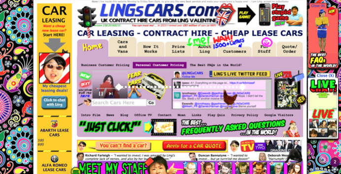
Users are immediately overwhelmed with dozens of calls to action intermixed among a plethora of animations and eclectic imagery. This amount of chaos and clutter is easy to spot, but how does one identify these same core qualities in a more conventional design?
Let’s take for example the homepage of Sears.com:
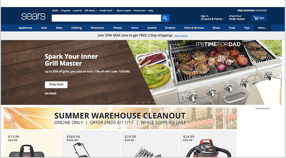
It follows a common layout used by many eCommerce shops. There’s a clear CTA, large headlines, and distinct sections. Using EyeQuant’s visual clarity analysis we can get an idea of how clean and clear users are likely to perceive this design to be. Surprisingly, this page scores a 36/100 on the visual clarity scale meaning it is far more cluttered than most home pages in its category.
So what exactly is it about this design that is creating visual confusion? For that, we can take a look at the EyeQuant clarity map to see what content is contributing the most to clutter.
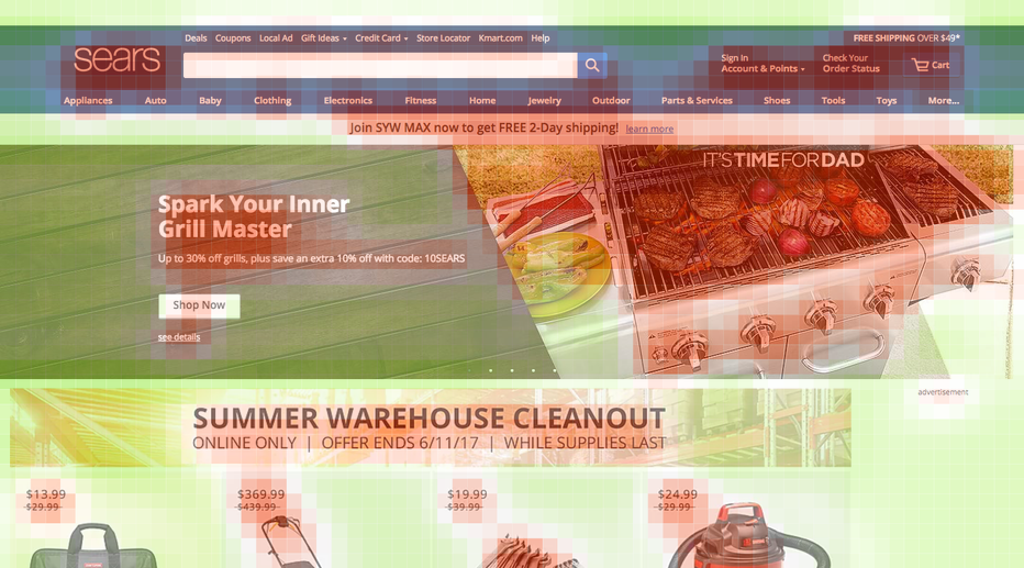
Users have a tendency to punish text, so it’s fitting that the abundance of it in this design and the lack of spacing between lines is contributing to clutter. Also, an interesting component often overlooked by designers is the impact of image choices. Here we see the particular image chosen for the grill master banner is has too intricate of patterns and is likely negatively impacting user perception of clarity.
This is a prime example of how clutter in design isn’t always that easy to spot, but with a few tips and tricks we provide later you should be better able to avoid common mistakes designers make adding clutter to their designs unintentionally.
But this still begs the question, with a site that brings in revenue why should a business like Sear’s invest resources into making sure their design achieves a high level of clarity?
The answer to that lies in the effect clarity of design has on key business objectives.
A couple of years ago we wrote a blog post exploring whether or not there’s a correlation between clarity and key business metrics like growth rates of eCommerce sales.
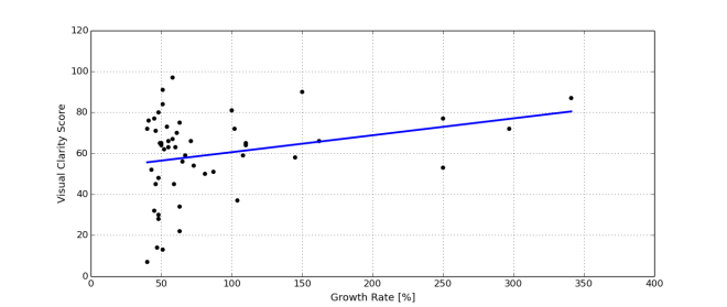
While the clarity of design wasn’t the only contributing factor, it certainly had an impact. The same appears to be true today. We ran a clarity analysis on the home pages of National Retail Federation’s top 50 list of eCommerce sites which resulted in an average score of 64.
It’s worthwhile to take a closer look at the top-performing companies to deconstruct what is likely contributing to its clearness. At the top end of the spectrum is Apple, scoring the highest in clarity at 93.
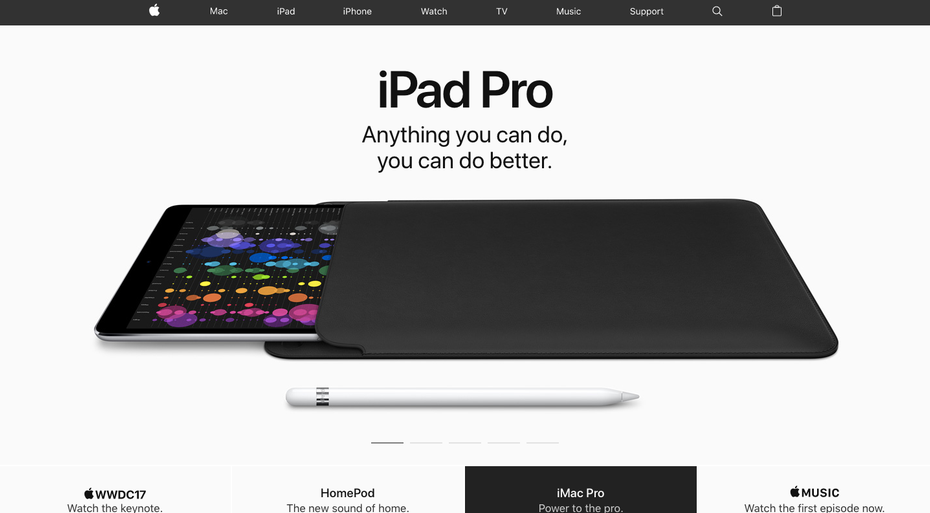
Here we see a fantastically simple design, with the product image at the forefront along with the bare essential amount of text and a well-designed menu. Another example more like the common eCommerce store ranking in the top 10 of is Macy’s , scoring an 84.
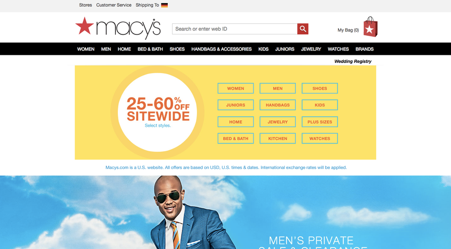
Macy’s does an excellent job using tables and padding between elements to present many options while still maintaining clarity.
The evidence of clarity equating success doesn’t stop there, we also see it on a micro-level. By analyzing the controls vs. winning variants of A/B tests we can see how increasing clarity is also likely to result in increased uplift.
A/B test 1 image
….
A/b test 2 image
…
A/b test 3 image
….
….
The reason clutter is such a problem for users fundamentally comes down to one thing: cognitive load. Cognitive load is the amount of brainpower needed to accomplish a task. You can think of our brains as something akin to computers, they can only handle so much before they crash. Crashing in our context is when users become frustrated with the experience and bounce, abandon their carts, and jump over to a competitors site instead. In other words, cognitive load = conversion killer.
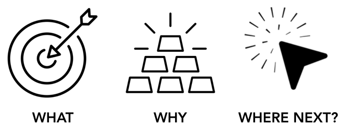
So how does one reduce the cognitive load? One method we’ve learned by looking at 1000’s of optimization projects is to make sure the most important elements are immediately seen. Over the years of looking at 1000’s of optimization projects we’ve found the best way to capture users is to make sure they immediately understand these 3 things: what this page is about (relevance), why they should care (value), and where should they go next (call to action).
Once you’ve identified what content needs to be seen, the next step is to make them stand out. For that we have a few simple design hacks is to increase the likelihood they grab user’s attention.
The easiest way to make an item pop-out on a webpage is to increase its contrast. The human brains’ ability to identify contrast in an environment goes back to our earliest days when that skill was a necessary function for our survival. Carried with us to today contrast is construed by a stark difference in the centre of an object and its surroundings.
Most effective of all types of contrast is luminance contrast, which we described in detail in this blog post shedding some new light on the great “which button color is better” debate. Put simply luminance contrast is the difference in brightness between an object and its background, and is one of the most effective way to make content stand out.
Another is hack is to move an object to the center, or left top left of the page. Humans have a natural bias to these areas ….


Why do users miss what seems obvious? In our latest webinar, Professor Peter König, one of the world’s leading...
Read more
In this session, we explored how teams can move beyond instinct and start making creative decisions based on how...
Read more
What does attention prediction actually look like in day-to-day design work? In this month’s webinar, we’re joined by leading...
Read more