We value your privacy
This website uses cookies to ensure you get the best experience on our website.
 Skip to main content
This website uses cookies to ensure you get the best experience on our website.


It’s one of the oldest debates in web design and digital marketing: which colour should you use for call-to-action buttons? We look at several theories and explanations, and find that the answer isn’t always black and white.

Plenty of people will tell you that red is the best colour because it conveys urgency and evokes excitement. Some say that green works best because “green means go”. Meanwhile, Unbounce suggests that a BOB (big orange button) is ideal because “orange represents energy, enthusiasm and a get-it-done attitude.”
So why have we still not found a definitive answer? The problem is that the data doesn’t support the premise that any one button colour is always the best option.
Hubspot published a popular case study that showed how a red button outperformed a green one in an A/B test. Other studies have seen orange, pink, bright green and even white buttons outperform red ones.
With all of this conflicting data, it’s no wonder that the folks at CXL claim that colour makes little difference on its own. Instead, a colour’s impact depends on the page’s visual hierarchy.
Regardless of the colour that they suggest as the “best” for call-to-action buttons, a common thread between many studies is the idea that the most effective button is one that stands out.
In neuroscience, visual saliency is the term used to describe how much certain content stands out within a scene.
Saliency is a complex topic, but here’s what you need to know: as a human being, your visual cortex (the part of the brain that processes visual information) is programmed to look at the most salient objects in a scene.
It’s not a psychological thing, and it’s not influenced much by culture, preferences or demographics. It’s the way the human brain has evolved to make it easier to rapidly detect potential prey, predators or mates in a cluttered visual world.
Visual saliency can actually be measured. The most reliable way to do this is to run a large-scale eye-tracking study and see where people look first on your web page.
In the context of buttons, there are many visual characteristics of a page that allow your brain to rapidly evaluate the design and provide instructions to your eyes.
At EyeQuant, we use machine learning to analyse fixation data from eye-tracking studies and determine which design characteristics contribute most to visual saliency. As it turns out, colour hue is a factor, but a far more important factor is luminance, and specifically, luminance contrast.
So what is luminance? Technically, luminance refers to the intensity or perceived “brightness” of a light. In the context of design, luminance contrast is the difference in luminance between an object on the screen compared to its surroundings.
Just how important is luminance contrast? NASA claims that luminance contrast is the most important aspect of colour choice in graphics, and a key component of attention management – this is a principle they adopt even when designing cockpit graphics.
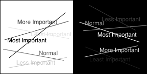
This example from NASA’s AMES Research Center shows how luminance contrast helps to define which content in a design is most important.
First, your CTA button should have a strong luminance contrast. Light background? Use darker buttons. Dark background? Use lighter buttons. But it doesn’t stop there.
One of the most overlooked ways to increase the likelihood of people seeing your button is also to maximise luminance contrast between button text and the button itself. You can combine both of these strategies for maximum effect.
For example, for a website that has a white background, a dark button with light button text is a safe bet to get noticed.
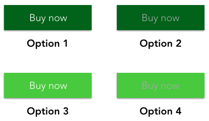
Let’s look at a practical example. Imagine your site has a white background. Your brand guidelines allow for two shades of green for the CTA button and either white or grey button text. In this case, the highest-contrast combination is the darker green button with white text.
As you can see below, this version of the CTA (Option 1) stands out more than any of the other possibilities within the brand guidelines.
Armed with an understanding of luminance contrast, it becomes easier to see why the colour choice for a CTA button isn’t as simple as green vs. red vs. orange.
For example, here’s a hyper-visible CTA button from Abercrombie & Fitch:
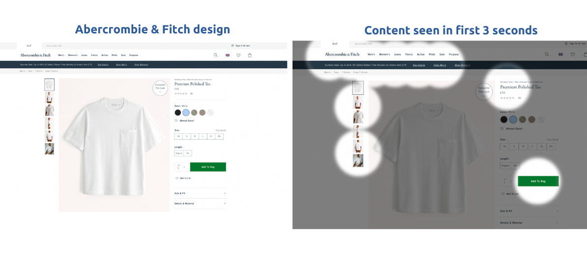
In the example below, we can see that green buttons aren’t necessarily always the best option. While the green button used on this product page is loaded with luminance contrast, according to the EyeQuant perception map, users will not look directly at the button within 3 seconds of landing on the page.
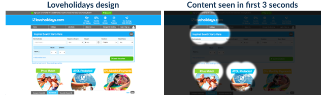
Not all red buttons are equal, either. Here’s an example:
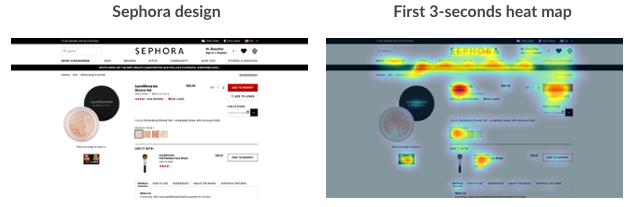
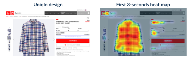
Notice how there’s less contrast between the red button and the background in the Uniqlo design than there is in the Sephora design. Not surprisingly, the Sephora button is seen in the first 3 seconds of viewing the page (according to EyeQuant attention analysis), and the Uniqlo button isn’t, despite it being much larger.
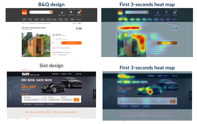
In this case, B&Q uses a richer orange than Sixt, which means it has a stronger luminance contrast vs. the background and vs. the button text, which results in higher visibility.
If luminance contrast is so important, does that mean we should all be designing with black and white?
Not quite, and this graphic (also from NASA) nicely illustrates why:
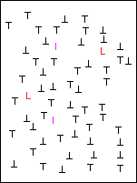
Here, you probably noticed the red and pink letters right away, even though they have less luminance contrast than the black letters. This is called the “pop-out effect”.
Because there are so many black letters, it becomes hard for your eyes to determine which ones are most likely to be important. Instead, the red and pink letters stand out because they’re a very different hue. Just like with luminance, it’s the hue contrast that matters, though there’s nothing intrinsically special about the colours red or pink.
The “pop-out effect” on websites is especially relevant when there are many objects on the page with high luminance contrast. Most websites use a white background and black text, so if you’re using black or white buttons, you risk having them get lost in the design despite their strong luminance contrast. This is why using brand colours for buttons can also be dangerous, as these colours tend to be used in multiple other places on the page.
To choose a button that has an appropriate level of hue contrast, we recommend brushing up a little bit on basic colour theory and the colour wheel. We wrote about this in a previous blog post.
The best colour choice for a CTA button depends not just on the button, but on its context and the content around it.
The best choice:
The tips above should go a long way, but EyeQuant has identified dozens of other factors that have a measurable impact on visual saliency.
To know with certainty which button will draw the most attention, you’d need to run a scan-phase eye tracking study for every page on your website, with several different button variants. That’s with real eye-tracking – mouse movement and click maps don’t count.
If that’s not a realistic option for you, EyeQuant simulates a real eye-tracking study based on the machine learning we’ve done with huge amounts of fixation data from past eye-tracking studies. It’s more than 90% as accurate as a real-life study and provides near-instant results.
 Posted by: Gemma Todd
Why do users miss what seems obvious? In our latest webinar, Professor Peter König, one of the world’s leading...
Read more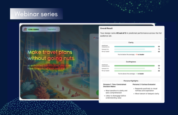 Posted by: Gemma Todd
In this session, we explored how teams can move beyond instinct and start making creative decisions based on how...
Read more Posted by: Gemma Todd
What does attention prediction actually look like in day-to-day design work? In this month’s webinar, we’re joined by leading...
Read more