We value your privacy
This website uses cookies to ensure you get the best experience on our website.
 Skip to main content
This website uses cookies to ensure you get the best experience on our website.


[Note: this post is also available as a SlideShare presentation.}
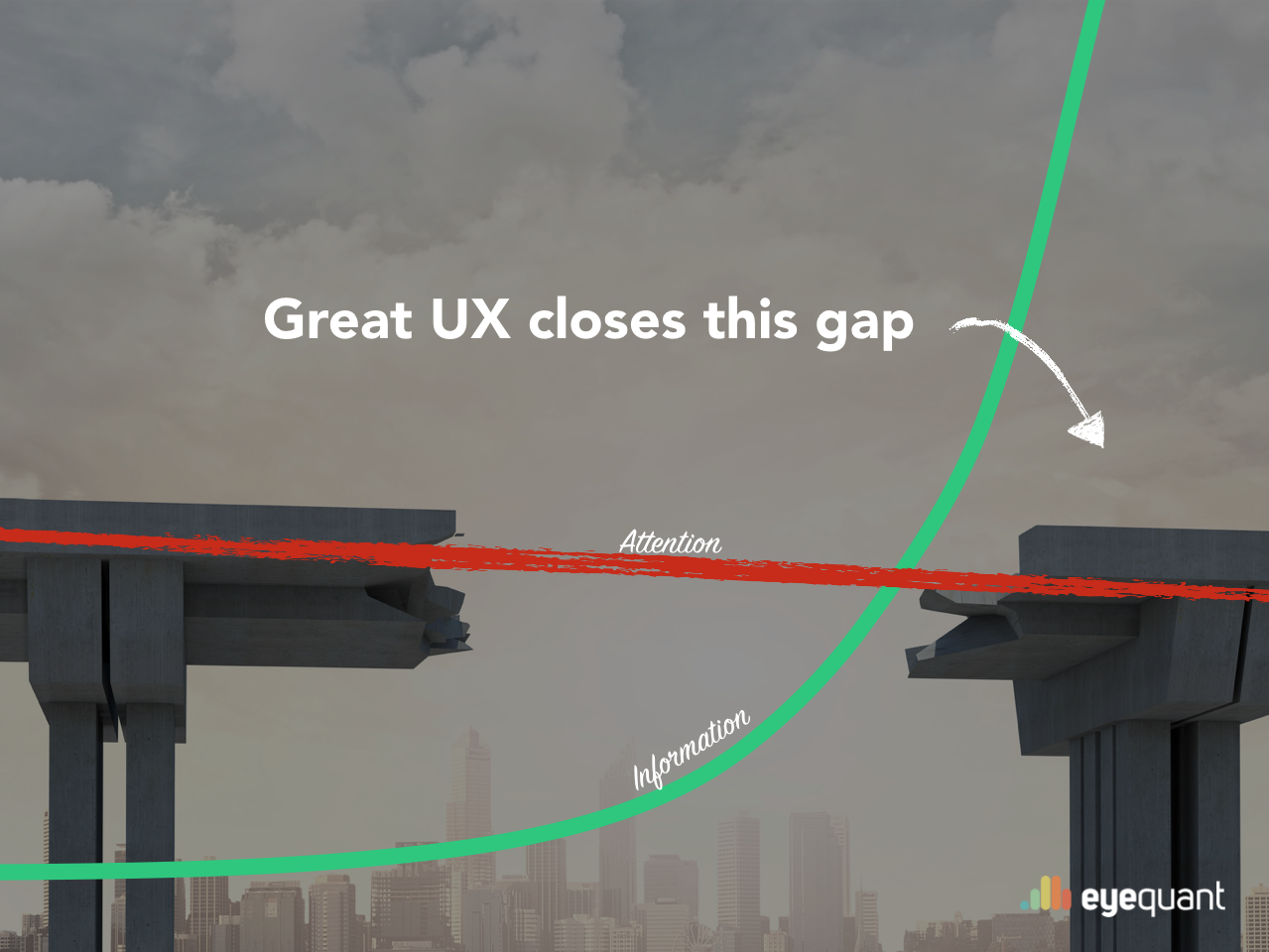
Information overload: two words that succinctly describe the reality of modern life. Since the advent of the internet, the amount of information available to us has grown exponentially – to the point where the scale of information in existence is nearly incomprehensible.
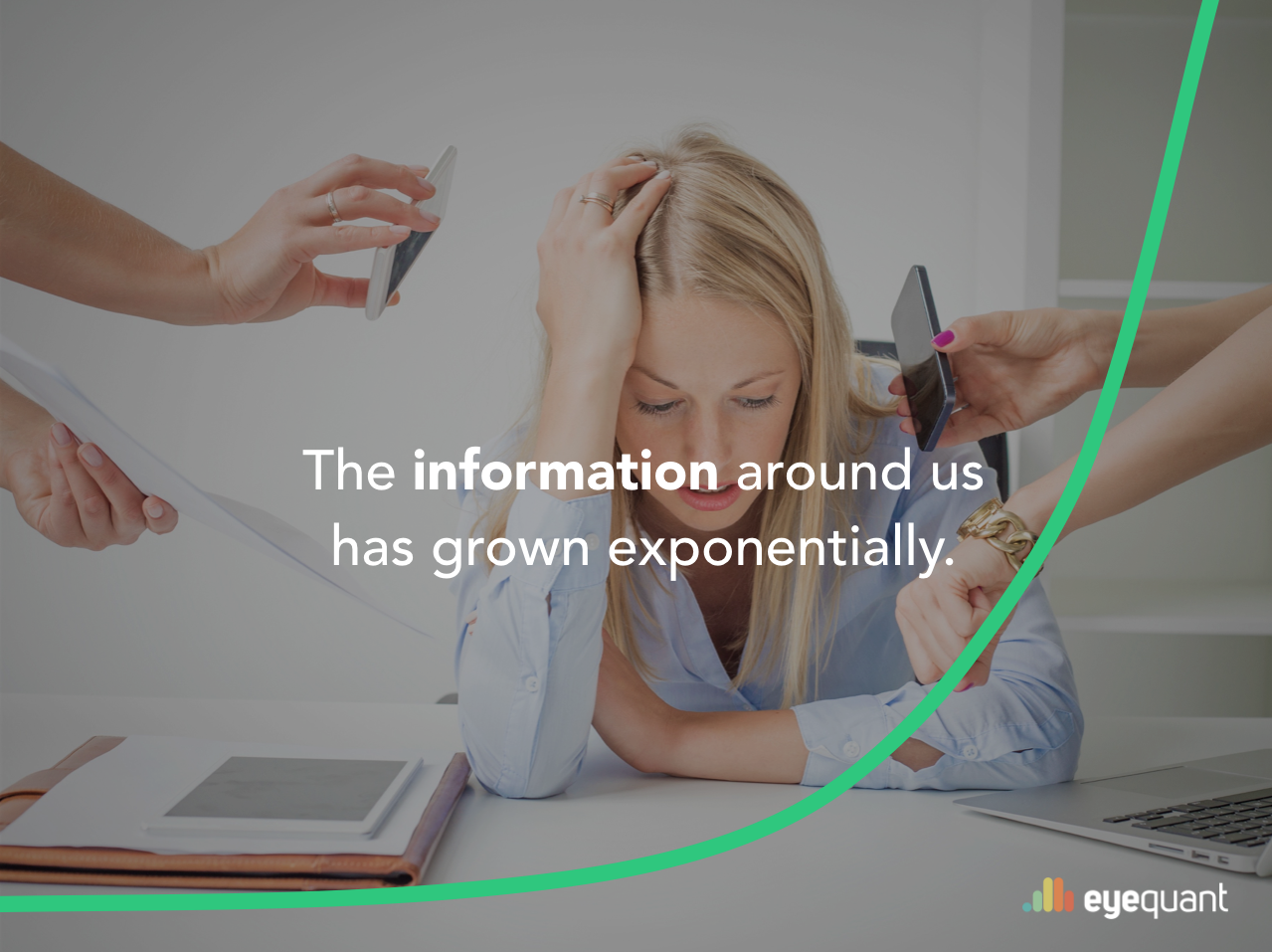
According to IBM, 90% of all data in the world has been created in the past 2 years alone.
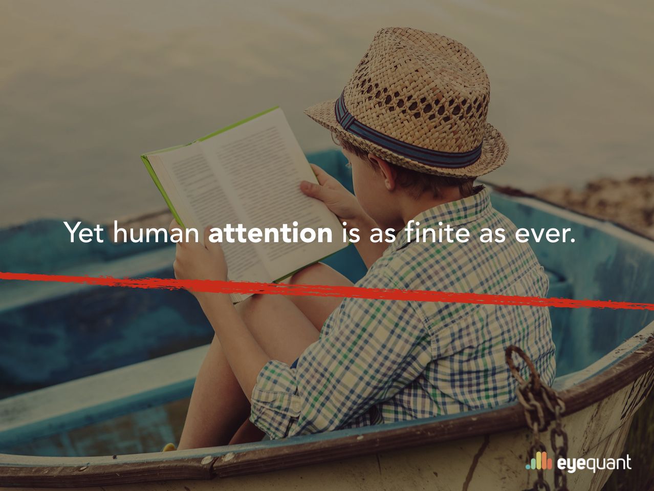
Yet for all the endless knowledge available to us, human attention spans have remained constant – they might even be decreasing.
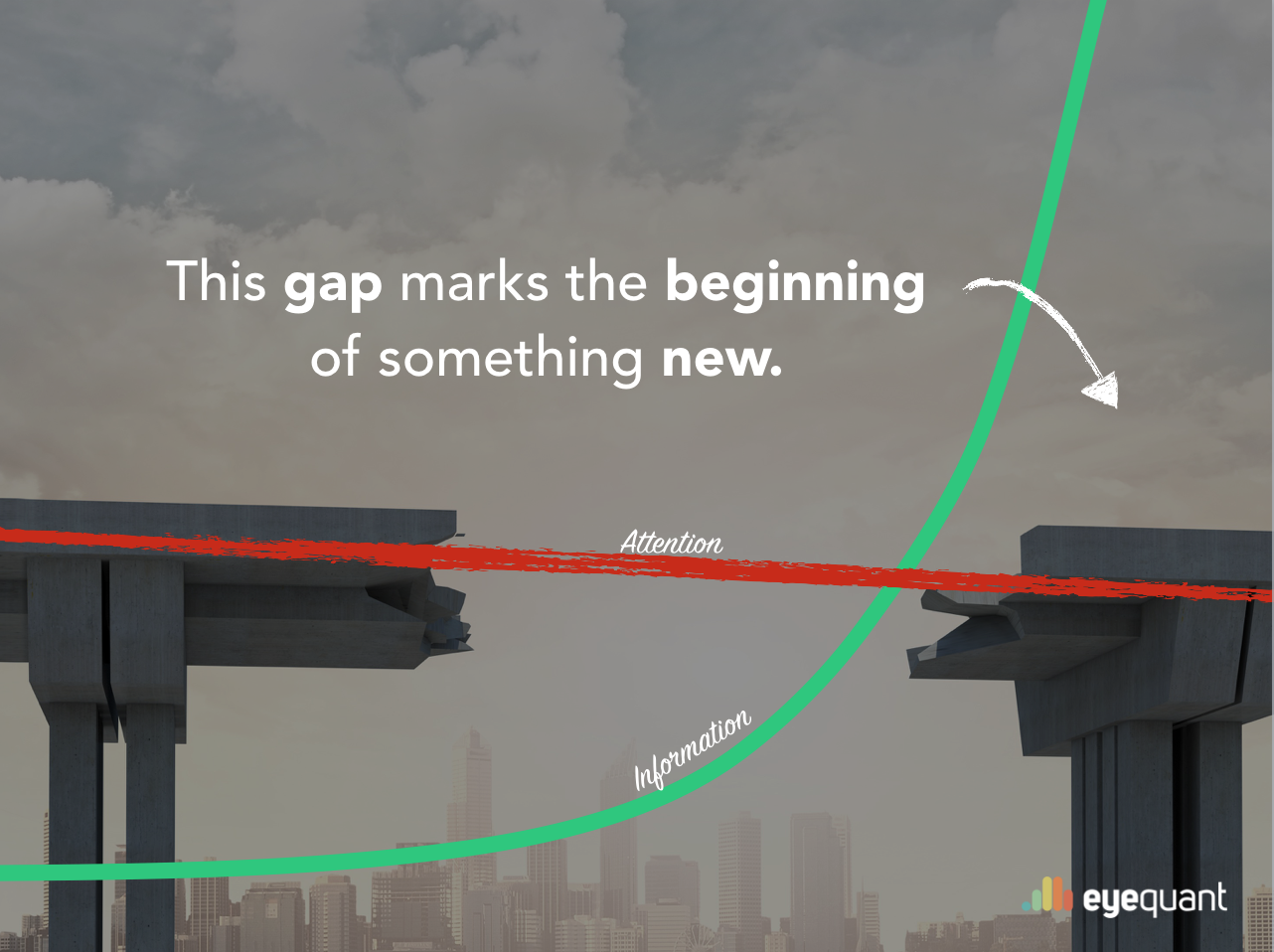
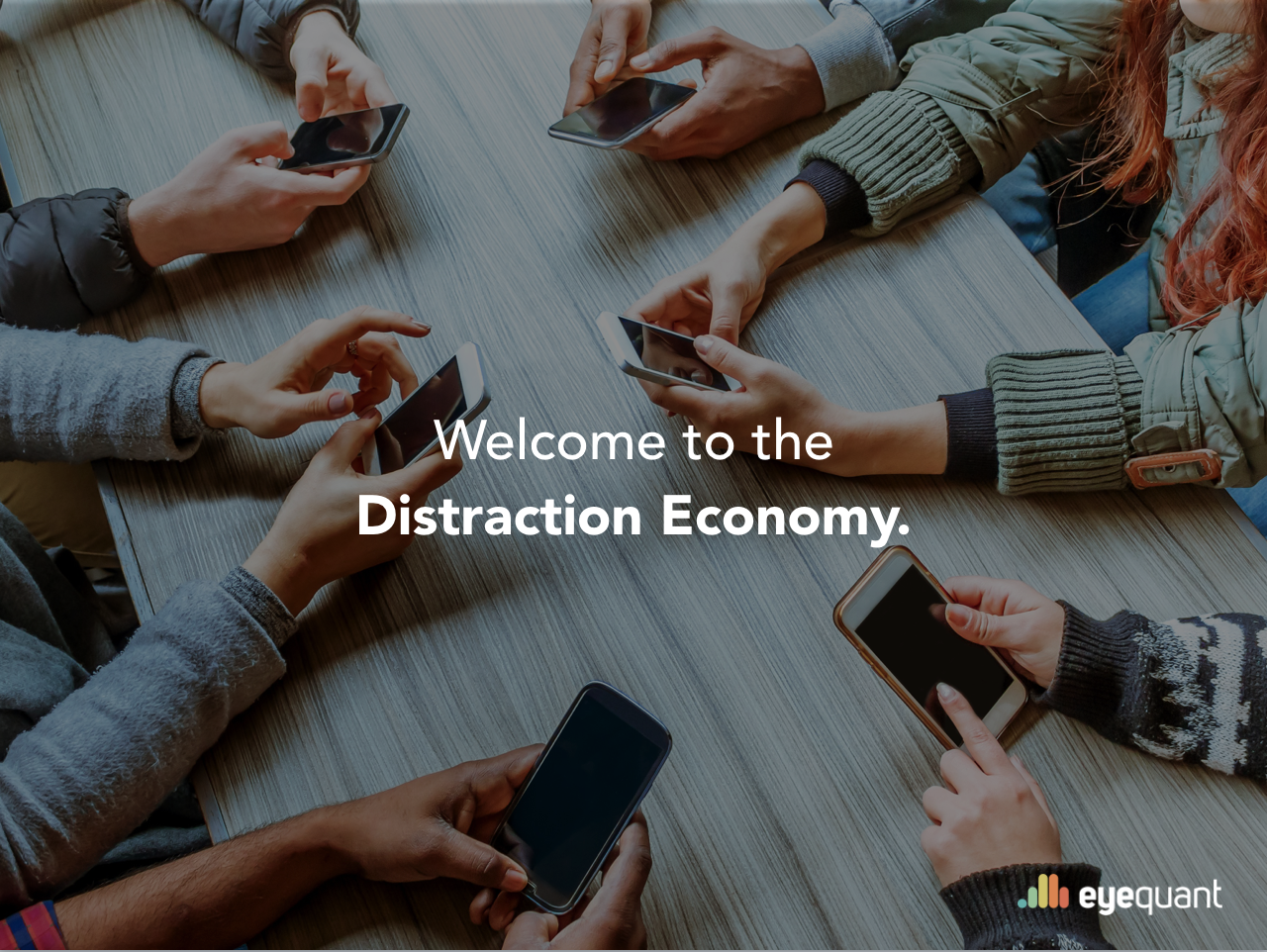
The result is a vast and growing gap between attention and information, and this gap marks the beginning of something new, particularly for companies vying for the attention of potential customers. We call it the distraction economy.
16 million text messages every minute. Another 452,000 tweets, 46,200 Instagram photos, 1.8 million snaps, and 15,000 gifs sent via Messenger. In that same minute, 156 million emails are sent [source].
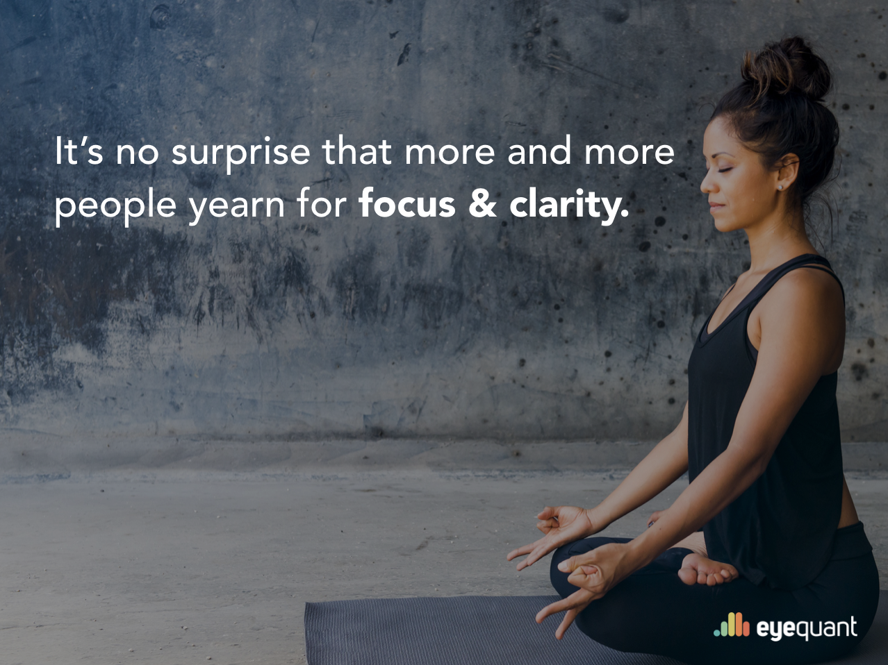
So it’s no surprise that more and more people yearn for focus and clarity in their lives.
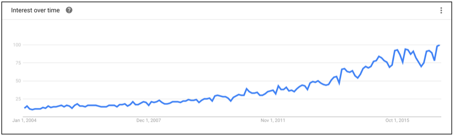
We’re all trying to cut through the clutter in our world. For example, a quick search in Google Trends reveals the dramatic increase in concepts like “mindfulness” over time.
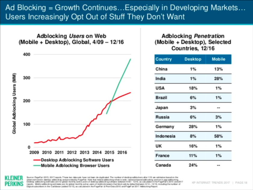
Likewise, it’s no surprise to see that global Ad Blocking growth has also exploded. The latest data from Kleiner Perkins shows that nearly 1 in 5 Americans uses an ad blocker on their computer.
One thing is absolutely clear: the Distraction Economy is a macro trend – it’s not a fad, it’s not something that’s going away any time soon, and it affects every industry. On the business side – as with any macro trend – we are already seeing clear winners and losers.
One hand, you have companies like Google, Facebook, Apple, Uber, Airbnb, and Netflix. On the other hand: Yahoo, Blockbuster, taxis, and network television.

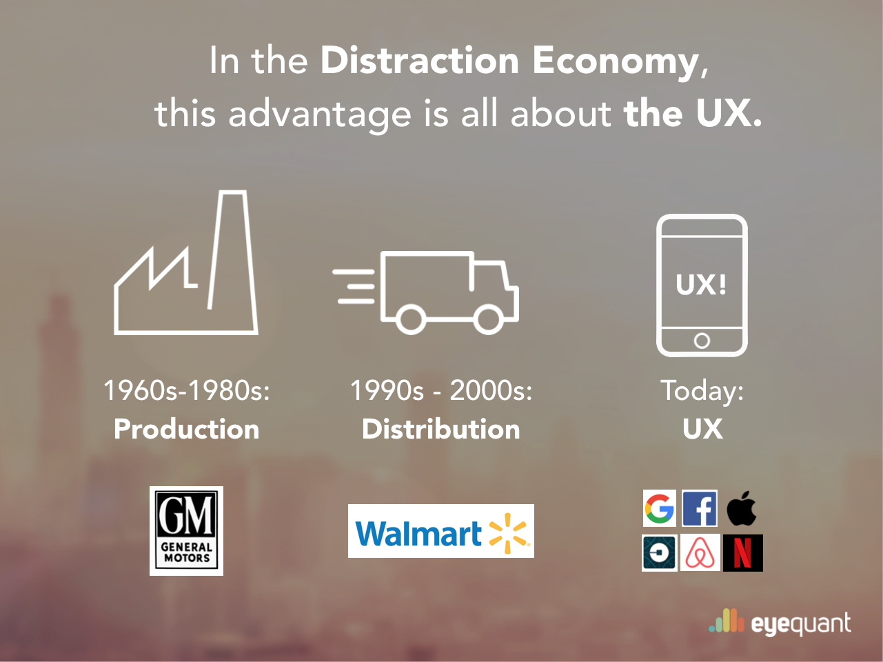
Economies always evolve around major competitive advantages. From the 1960s through the 1980s, it was production processes that drove competitive success (think General Motors). From the 1990s through the early 2000’s, it was distribution (think Walmart). Today? The advantage seems to be UX.
Tom Goodwin at TechCrunch characterized this perfectly:
“Uber, the world’s largest taxi company, owns no vehicles. Facebook, the world’s most popular media owner, creates no content. Alibaba, the most valuable retailer, has no inventory. And Airbnb, the world’s largest accommodation provider, owns no real estate. Something interesting is happening,” and that “the value is in the interface, not the products”.
New technology has certainly played a role in defining winners and losers in the distraction economy, but it’s more than that. All of the “winners” have a deep-rooted, culturally ingrained obsession with the user experience. It appears that more than anything else, great UX is the key to closing the attention-information gap and succeeding in the Distraction Economy.
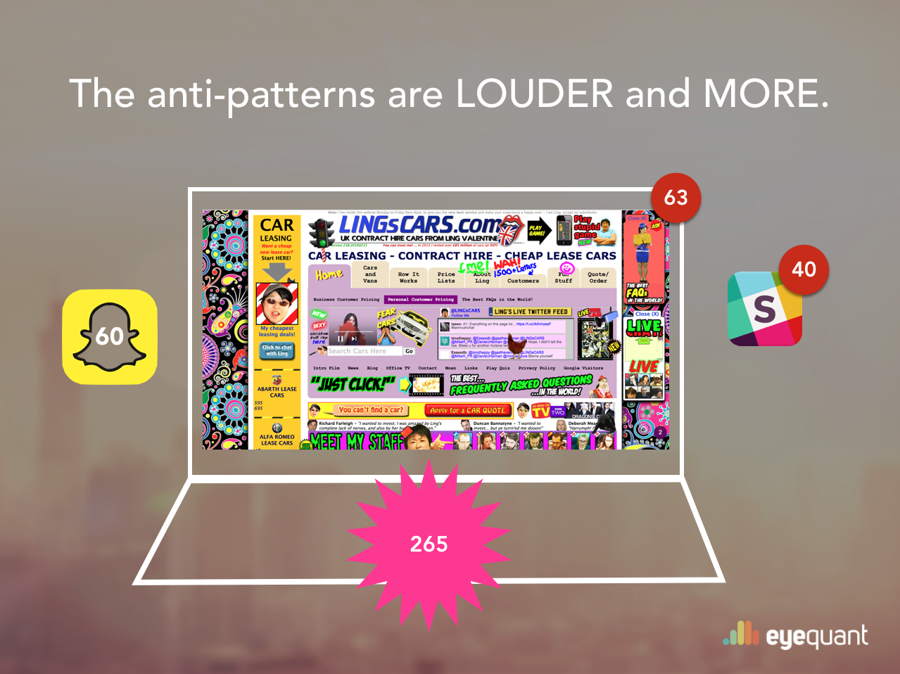
The anti-patterns are LOUDER and MORE. More promotions, more push notifications, more advertising. That’s the traditional approach to capturing attention, but it doesn’t work anymore. This isn’t the answer.
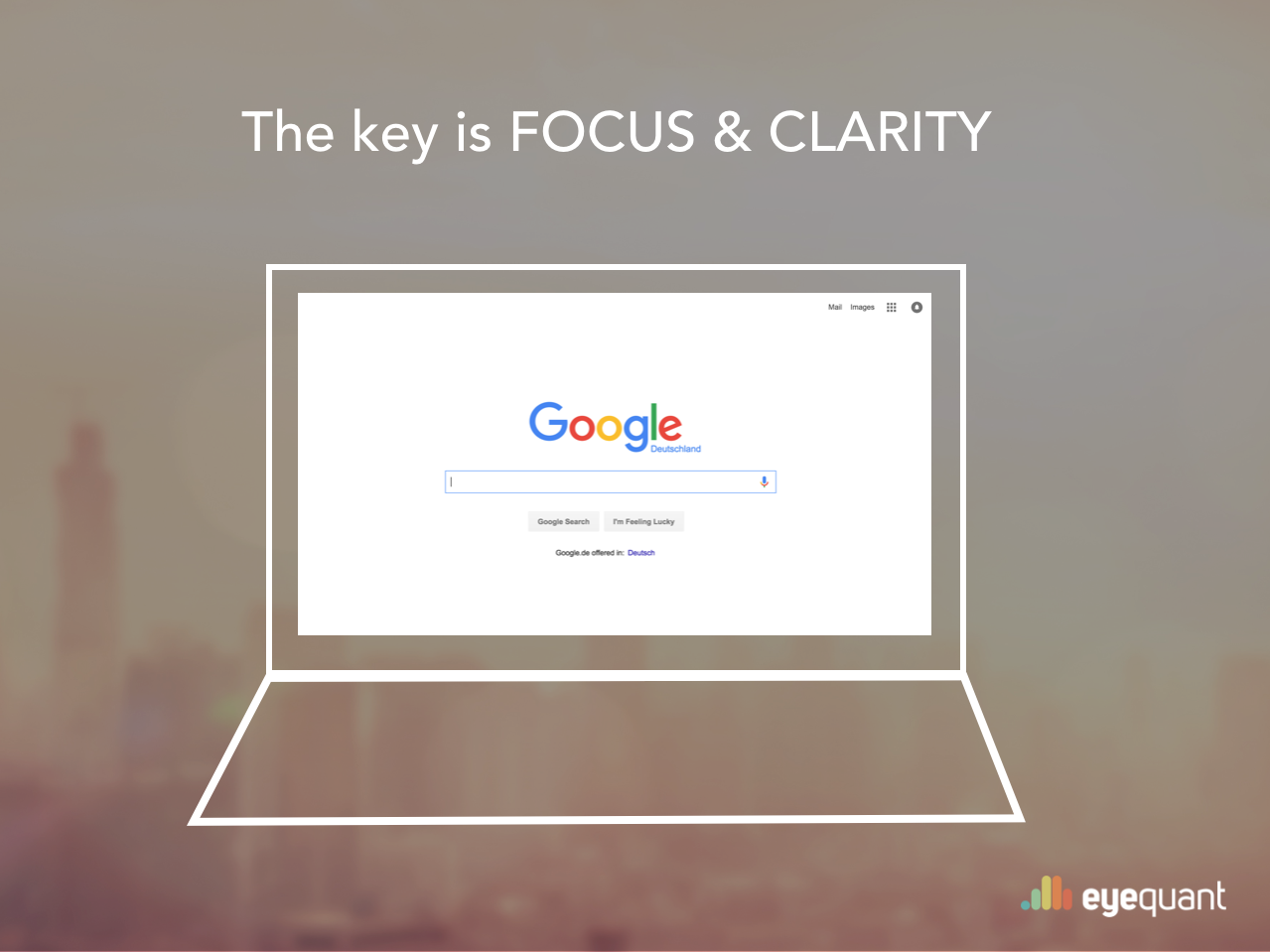
We’ve seen already that people want focus and clarity. Look at Google, for example. People love it not just because it’s got the best search results, but also because it’s simple, intuitive, and uncluttered. There’s absolutely no unnecessary content on the screen.
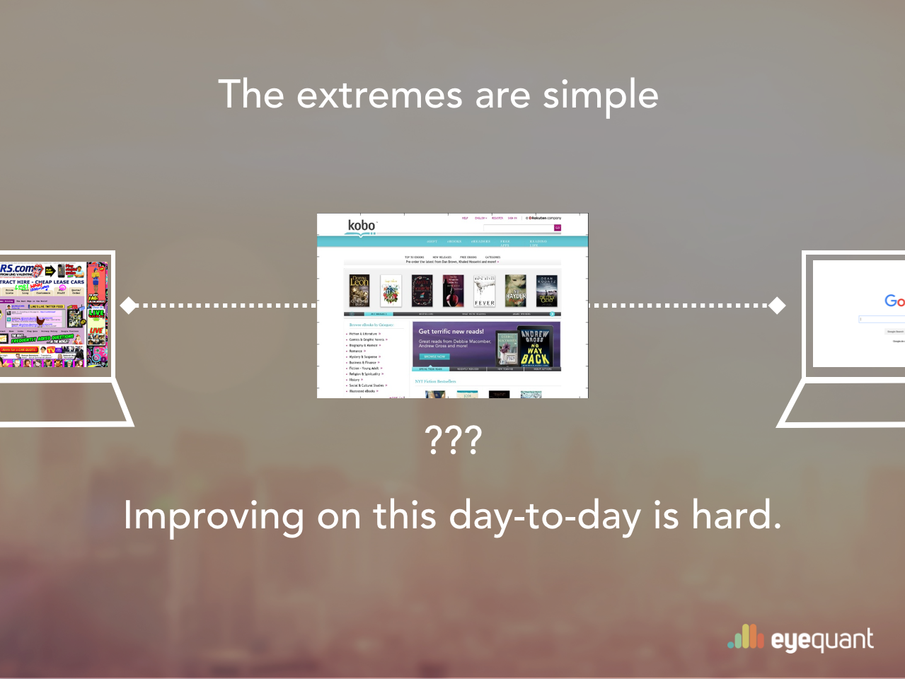
That might seem easy enough in principle, but most websites aren’t just a “simple” search engine like Google. And a basic truth of UX is that achieving simplicity can be incredibly complex. It requires deep knowledge of the customer. It requires hard choices, honest reflection, and defined priorities.
And while it’s easy to identify the extreme cases, it’s very hard for companies to make incremental improvements in focus and clarity day-to-day.
For example, if you read our blog, it’s probably because you’re interested in the design and optimization of websites. How do you ensure that you’re constantly making your eCommerce website clearer and more focused, particularly as the company grows and more & more stakeholders appear? It’s incredibly difficult!
Most companies – even those with dedicated UX teams – consistently fail to deliver the best possible experience because the design process is broken.
At most companies (at least the more sophisticated ones), the official design process looks something like this:
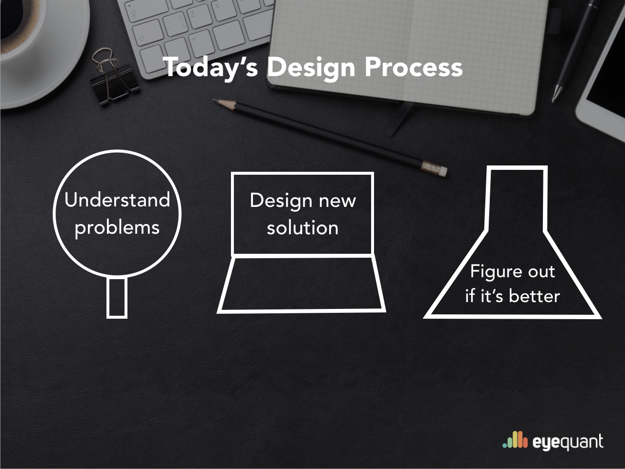
Design teams will usually have a much more complicated version of this flowchart, but most of them can be conceptually simplified to these 3 stages. Oftentimes, several user research and measurement techniques are applied in various stages of this process.
In the initial research phase (“Understand problems”), they’ll do some user testing to seek out sources of confusion. They’ll survey customers. They’ll consider insights from the analytics team, and maybe look at some mouse-tracking data.
Likewise, they might user test a new design before launch, or at least do some basic user acceptance testing. They’ll closely monitor key KPIs, and maybe even run a formal A/B test to measure the impact of the changes that have been made.
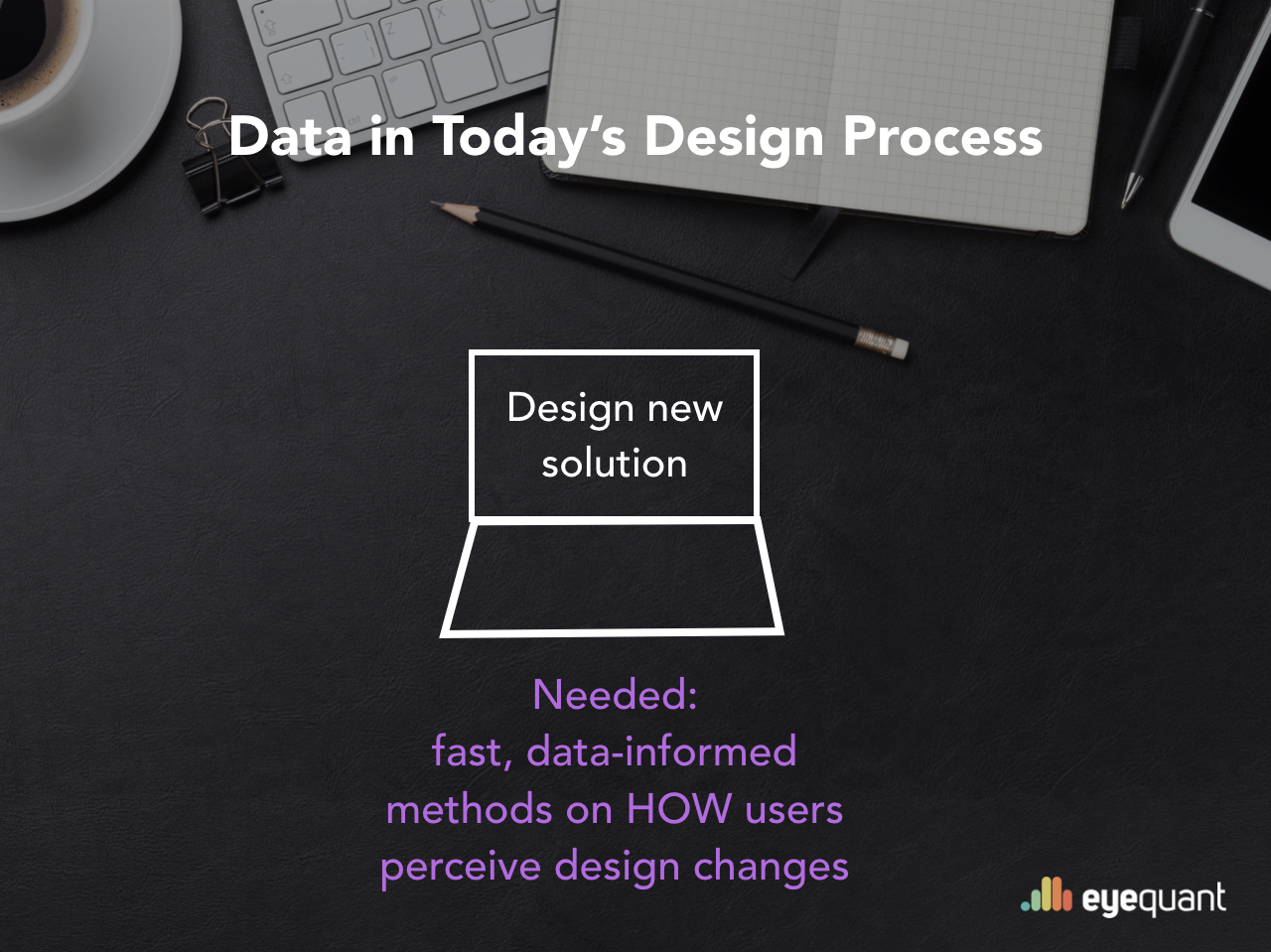
The problem is what happens in between. Every re-design is the result of a series of many small – maybe even seemingly insignificant – decisions made by the design team and the various stakeholders involved in the process.
Unfortunately, you can’t bring a panel of users to every meeting. You can’t user test every idea that the team comes up with. And you can’t put everything live for testing with real traffic without dooming a subset of your users to a terrible experience.
So what happens instead? Subjectivity. Hunches. HiPPOs. Design by committee. Groupthink. Stakeholder bargaining. Lazy assumptions. Basically, something like this:
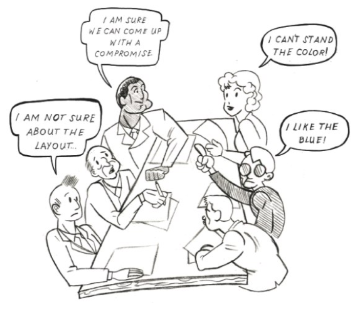
You won’t see this in any company’s official “design process” documentation, but it affects absolutely every company to some degree. The key to delivering focus and clarity for users is to reduce this effect as much as possible. That’s what makes the greatest companies of the distraction economy so successful.
Even the best companies aren’t perfect yet – they’re just further along than the rest. But how can you catch up, or even overtake them?
The first step is cultural. The people involved in the project need to check their egos at the door and embrace objectivity during the design process – not just at the beginning and end. A company culture that truly embraces UX will lead to additional resources. More people to do user research. More tools to help you. Bigger budgets.
But most user research methods today still lack one thing: scalability. Insights need to be easily accessible, and available quickly enough to avoid delaying the rest of the design process. They need to tightly integrate with the design work flow instead of being a separate project. Scalable UX is the next great competitive advantage.
If there’s one thing to take away from this article, it’s to be on the lookout for ways to incorporate UX research into your normal design process. UX isn’t a one-off study or a separate project: it’s an every day thing. By shortening the feedback loop between ideas and the user experience, you can put your company in a position to leverage UX as a competitive advantage.
Remote user testing platforms like UserTesting.com were the first step in the right direction. At EyeQuant, we’re helping our customers (like Google, Canon, and F-Secure) take another big step by building tools for instant, data-supported feedback to make the entire design process more objective.
By applying machine learning to user research data, we’re already able to instantly measure the perceived clarity of any digital interface, and the degree to which users will zero in on key content. So you can measure what matters: clarity and focus.


Why do users miss what seems obvious? In our latest webinar, Professor Peter König, one of the world’s leading...
Read more
In this session, we explored how teams can move beyond instinct and start making creative decisions based on how...
Read more
What does attention prediction actually look like in day-to-day design work? In this month’s webinar, we’re joined by leading...
Read more