We value your privacy
This website uses cookies to ensure you get the best experience on our website.
 Skip to main content
This website uses cookies to ensure you get the best experience on our website.


If you’ve been following the EyeQuant blog, you probably already know that most websites are too cluttered. Why should you care about this? Because cluttered web designs aren’t just an aesthetic problem, they’re a business problem. In fact, clean, focused design is a key to success in the Distraction Economy and it’s worth taking a closer look at your website. To give you a jump start, here are 3 simple steps to de-clutter your site effectively:
We’re all too familiar with encountering giant blocks of text to describe in detail some aspect of a product or offering. But the truth is, most of us don’t actually read the bulk of information presented to us in this format. In fact, a Nielsen Norman study found that users omit about 80% of the words they see when scanning a website. One likely reason is because users are looking for key information, not every little detail. And if they can’t find that information quickly, they might just leave the site and switch to a competitor.
For example, have a look at this product page from Paula’s Choice; do you think all of this information provides immediate value to the user and needs to be above the fold?

The design team decided to pack as much information as possible onto this product detail page, giving it a cluttered impression. To confirm this, we ran the design through EyeQuant’s Visual Clarity Analysis to get an objective understanding of just how cluttered it is. It rates designs on a scale from 0-100 in terms of clarity and represents a 200 participant user survey. This site scored a 29/100, and with the Clarity Map we can confirm that the massive amount of text lowers the score (red areas):
 Perhaps the overload of content is the consequence of stakeholder debates, or indecision on what is most important for users to see. Whatever the reason, the consequence is a design that overwhelms users and may lead to a higher exit rate than necessary.
Another simple way to reduce clutter is to space out content and extend the site vertically. This will have 2 positive effects: first, reducing the amount of displayed elements gives your design a cleaner look. Secondly, less content competing for visitor attention above the fold allows the most important elements to stand out more effectively.
Ocado’s homepage is a good example of how too little whitespace can lead to confusion; every product is competing to be seen and acted upon. Here, reducing the amount of shown products above the fold could for example drive more users to their “great offers” banner at the top of the screen:
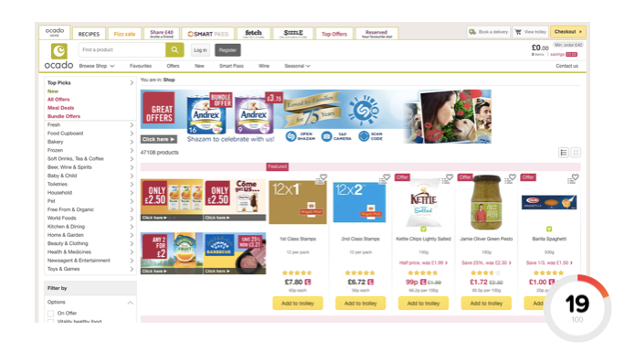
This Ocado page scored a 19/100 on EyeQuant’s clarity score, suggesting that it’s too cluttered.
Choosing the imagery of a design can be quite tricky, since oftentimes many stakeholders are involved in this decision. This can result in a decision process frequently based on the aesthetics of a particular background image rather than it’s functionality. Take this design by Chobani for example:
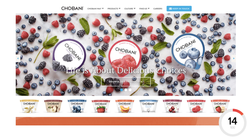
The likely intention behind this background image is to highlight that Chobani’s joghurts are full of fresh fruit. Great! However, this particular image drags Chobani’s clarity score down to a 14/100 since there’s so much going on. As a result, the background image not only makes the headline (and especially CTA) hard to read, but it also distracts from it; a clear cut case of aesthetics over function.
To circumvent this from happening on your website, choose images that contain fewer lines, edges, or sharp contrasts.


Why do users miss what seems obvious? In our latest webinar, Professor Peter König, one of the world’s leading...
Read more
In this session, we explored how teams can move beyond instinct and start making creative decisions based on how...
Read more
What does attention prediction actually look like in day-to-day design work? In this month’s webinar, we’re joined by leading...
Read more