We value your privacy
This website uses cookies to ensure you get the best experience on our website.
 Skip to main content
This website uses cookies to ensure you get the best experience on our website.


On the EyeQuant blog, we often write about the importance of visual hierarchy on websites, and making sure that users can quickly find what they’re looking for. We often give tips for how to visually emphasize key content. But how do you know which content is actually important and needs to be seen right away?
One way is to use our 3 Ws Framework, but another powerful method is to do a bit of user testing to understand user goals, motivation, and intent. To show you what we mean, we partnered with Userlytics, a remote user-testing service that works with brands like Facebook, Airbnb, and Apple.
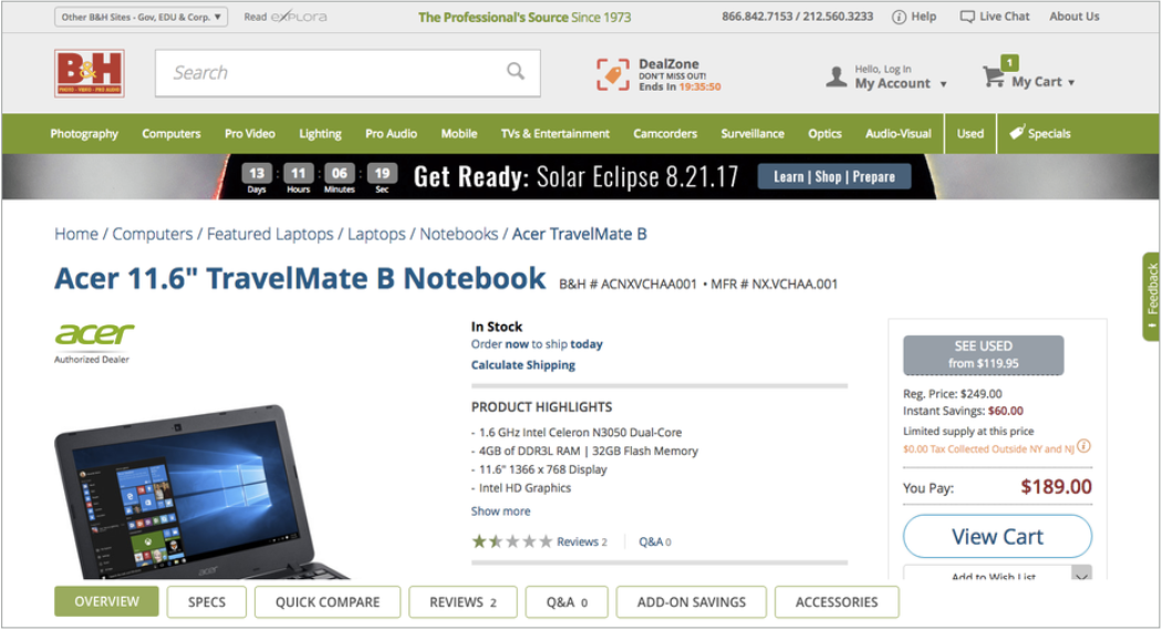
Together, we tested a product page by B&H Photo and Video (below) to figure out what provides the most value to users and whether those elements actually pop out to visitors.
Userlytics created a user testing script with questions that users should follow and answer while interacting with the site. Their basic task was to look at the product page, explain what they like or dislike, and add the product to the shopping cart.
Users rated their visit as a positive experience and found the site easy to navigate. However, optimizing a page’s effectiveness is always an ongoing process, and in this case two elements were repeatedly mentioned.
First, the star rating is positioned towards the bottom of the product page. Every user reported having actively looked for ratings and reviews when shopping online, which tells us this element could have a significant effect on users’ buying decisions, and could be even more prominently featured.

Secondly, users appreciated the navigation bar at the bottom of the screen. It leads to different sections of the product description and gives instant access to all the information users might be looking for (including the reviews).
![]()
These user testing insights are tremendously helpful when prioritizing the content on our pages. They let us understand what actual users’ preferences are and adjust the visual hierarchies accordingly. Is there a prominent element that user’s don’t care about immediately? Scratch it or move it below the fold. Does a certain element provide instant value? Make it more visible.
When making these design changes, it’s tempting to rely on intuition and make decisions based on experience. This is risky, though. Our perspectives are likely different from that of a new user, and our assumptions can cause us to miss opportunities to give visitors what they’re actually looking for. This is why it’s important to add objective data to the process.
For this reason, we ran B&H’s product page through EyeQuant’s visual attention analysis and saw a disconnect between what users want to see, and which content visually stands out. The attention map below shows which content is most eye-catching, with red areas highlighting areas which attract the most attention:
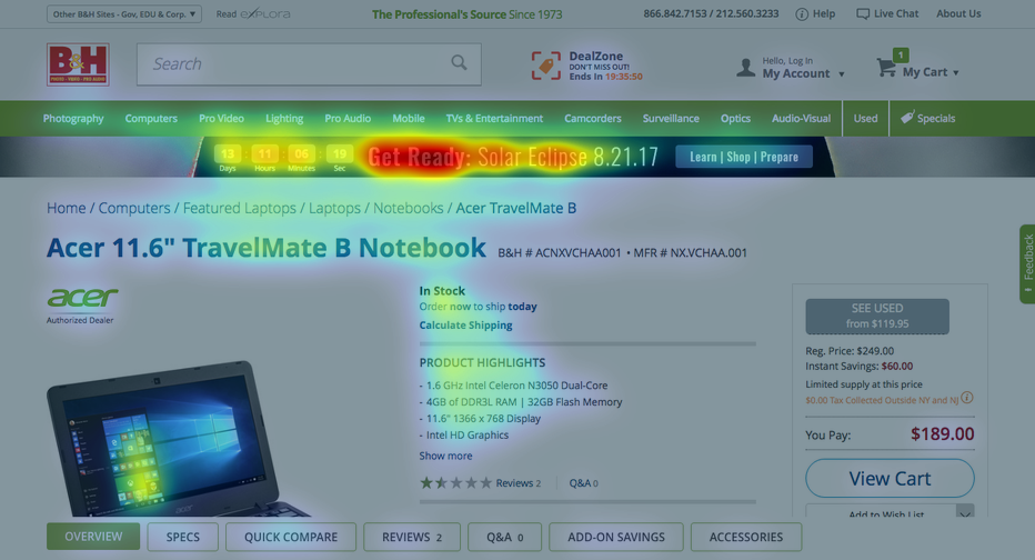
On this particular design, it’s the countdown to the US 2017 solar eclipse that will most likely be seen first. While this might be interesting for a select few visitors of B&H, the majority of users might actually be interested in something completely different. This is confirmed by Userlytics’ user tests which did not mention the ad as something particularly interesting. Rather, one user even reported that it was confusing to her, since she didn’t understand what it was about.
It distracts from the main content and as a consequence the product description, price, and elements that users liked remain secondary in terms of attention. Here, B&H could improve on their site by putting the review section and nav bar more into focus via changes to the layout for example. This way, users will find them quicker, leading to an improved experience and potentially higher conversion rates.


Why do users miss what seems obvious? In our latest webinar, Professor Peter König, one of the world’s leading...
Read more
In this session, we explored how teams can move beyond instinct and start making creative decisions based on how...
Read more
What does attention prediction actually look like in day-to-day design work? In this month’s webinar, we’re joined by leading...
Read more