We value your privacy
This website uses cookies to ensure you get the best experience on our website.
 Skip to main content
This website uses cookies to ensure you get the best experience on our website.
There’s an age-old saying that goes, “The only thing that stands in the way of a business making more money is a design committee meeting.”
Too often, a vague sense of compromise seems to be the only thing that is accomplished during a website optimization or re-design meeting. In the end, everyone is left with the feeling that a melon-baller has been taken to their heads, drained by the knowledge that that nobody really knows what they’re talking about, nor precisely how to fix what needs to be fixed.
So, how can you turn a design meeting into a painless and (most importantly) fruitful experience?
In this article, we pick apart the 3 lame optimization ideas that tend to hold up design meetings, and provide strategies that will put everyone at ease.
It’s unsurprising that someone is using their knowledge of the online marketing blogosphere to corroborate their opinion. Following the advice of experts and the gurus is common practice (and can provide actionable ideas), but it’s essential to be aware of contextual as opposed to catch-all ideas:

Catch-All Idea: There is little measurable data out there to suggest that any single color converts better than another. Suggesting that a call-to-action button should be changed to orange, or green, or purple just because a blog says so falls into the catch-all idea category, where someone is looking for a quick win over an educated decision.

Contextual Idea: Suggesting that the call-to-action button should be changed to orange because it will contrast well with a pale blue or green background qualifies as contextual idea. Extensive research, including this study from the California Institute of Technology (Caltech), show that user attention is initially attracted to the most salient areas (or areas that “visually pop out”) on a page, especially under time constraints or while attempting to multi-task. Saliency doesn’t necessarily occur from one, brightly colored element, but from the contrast and spacing that surrounds it. Place an orange CTA in front of a yellow background, and it will get lost. For that matter, not even a flashing yellow “BUY NOW” button will catch user attention when it’s set against a cluttered page.
There’s only one way to verify whether an idea garnered from a blog will work: test it.
E-commerce companies in particular tend to place an inordinate amount of importance on branding and advertising on landing pages as opposed to showcasing the core benefits of the product on a landing page. The rationale behind this tends to be that an emphasis on branding will link the product’s online presence with its offline presence.
Unfortunately, landing pages just don’t work like this.
A landing page should clearly communicate what the product is, why it’s useful and innovative to a potential customer, and where the customer can go to learn more – all within a few seconds. Cluttering a page with expensive ad campaigns merely serves to distract from the core value of the product in question. Confuse your user, and they’re far more likely to bounce before they look for a button to click.
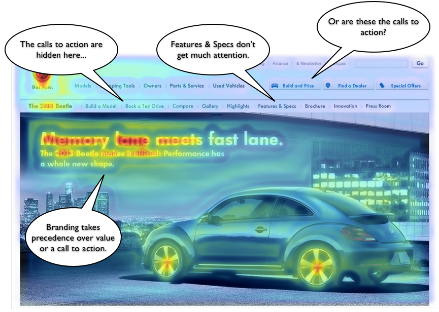
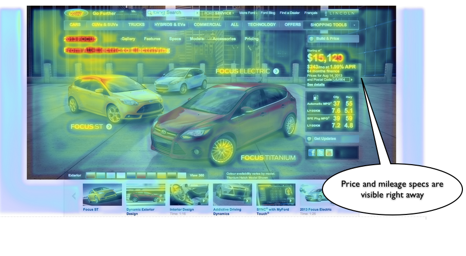
Visual examples of user behaviour often succeed in ending branding discussions when rhetoric and statistics fail. Predictive Heatmaps like EyeQuant’s show where a user will look when they first arrive, objectively (and accurately) illustrating why overbearing branding confuses users and drives them away from completing a task, while also providing great insight into what could be changed.
Bonus: They can be generated in a few seconds.
Here’s an example: The landing page for the 2013 Volkswagen Beetle tells us an awful lot about how the car is being marketed, but when a user first arrives at the page, they miss its core benefits, pricing, and where a prospective customer can go to learn more:

As a comparison, the landing page for the 2013 Ford Focus still showcases a slick photo shoot, but from the heatmap below, it’s easy to see that the product’s core value, it’s price and fuel efficiency, are immediately visible to users:

Here’s the short response:
Jared Smith sums up the reasons why you should never, ever resort to carousels or scrolling banners on your landing page incredibly well with his Should I use a carousel?.
Like this:

Or like this:

Choosing a carousel is approximately tantamount to telling your customers, ”we can’t make up our minds about what we’re selling, so can you just do it for us?”. Carousels are confusing, they crash frequently, and in an attention-starved online world, they have the uncanny ability to make people back away and never come back.
Just ask Adam Fellowes, head of UX at Digirati:

Design meetings get out of hand when those present believe that their ideas are more important than anyone else’s. The result of this is narrow-thinking and an overarching fear of listening to what others have to say. When this is the case, adding a data-driven yet visually intuitive example tends to work very well to dispel tension.
After all, at the end of the day, success feels way, way better than compromise.


Why do users miss what seems obvious? In our latest webinar, Professor Peter König, one of the world’s leading...
Read more
In this session, we explored how teams can move beyond instinct and start making creative decisions based on how...
Read more
What does attention prediction actually look like in day-to-day design work? In this month’s webinar, we’re joined by leading...
Read more