We value your privacy
This website uses cookies to ensure you get the best experience on our website.
 Skip to main content
This website uses cookies to ensure you get the best experience on our website.


It’s become a mantra of today’s designers to opt for clean designs. No matter if you’re a B2B, eCommerce or SaaS company, limiting the amount of content on a page will almost always positively impact user engagement and conversions. This isn’t only based on professionals’ opinions and experiences either, but is also backed up by hard data. For example, we ran a study on 300 top websites from different industries and found that there’s a clear relationship between how clean a design is and how well it keeps users on a site. Specifically, we found that cluttered designs, the opposite of clean design, lead to higher bounce rates across all industries. Yet, despite all the best practices and data, clutter can still be found all over the web.
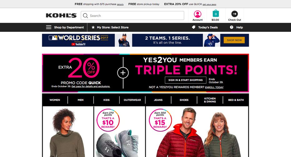 Kohl’s website bombards users with promotions, product images and banners.
This all begs the question: why does clutter affect user engagement so much? There are two factors that come to play here:
1. It increases cognitive load.
2. It might distract users from key content.
Let’s go through them one by one.
Cognitive load is a measure that describes how much mental effort is required to fulfill a certain task. In other words, let’s say a user comes to your site to shop for some shoes. How much mental activity does that user need to invest to find some new sneakers? The more is required, the higher the cognitive load for that user.
With regard to web design, if a page is full of content (promotions, banners, blocks of text, CTAs, etc.) the user will immediately become overwhelmed. Cognitive load spikes and leads to confusion rather than a streamlined experience. The associated frustration of having to sift through the site will then prompt users to either have a bad start with your brand or leave the site all together. Today’s users are spoiled in terms of UX (think Millennials). They don’t put up with sites that look like they came straight from the 2000s anymore. As a result, they may switch to one of your competitors that offers the kind of design they enjoy using.
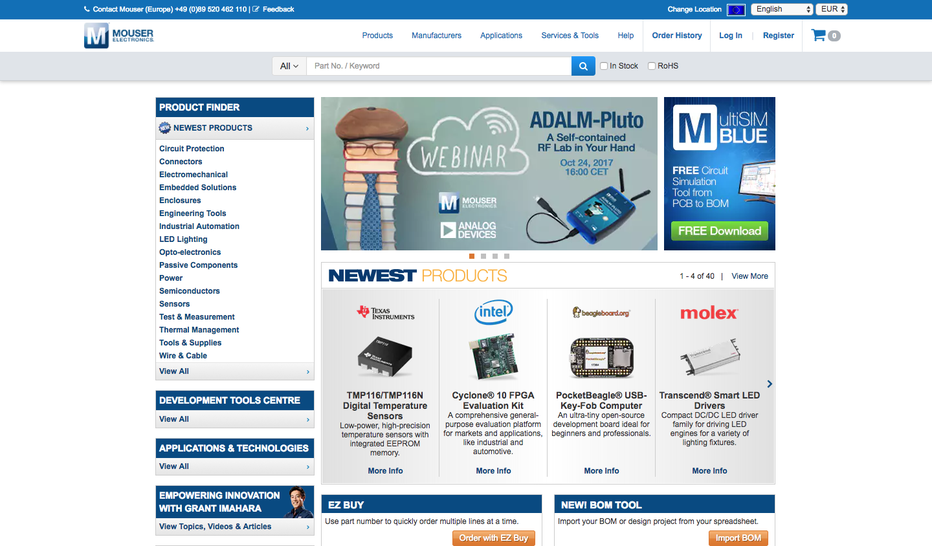 Mouser opted for lots of small, bold text and loads of options to choose from.
The second reason why clutter decreases user engagement is that users aren’t immediately compelled to engage with you rather than a competitor. For example, users that land on a SaaS site should ideally be able to have a rough understanding of the offering as soon as possible (see our 3Ws framework). Yet, if there’s loads of content on the screen, this might become a daunting task. Rather, you’d want the key elements to pop out to users so their eyes naturally fall onto your product description and value propositions. Yet, this is often not the case. Here’s why:
Think about it this way: the more content you present on a page, the more is competing for your users’ attention. Attention however is a limited budget that needs to be spent wisely. There’s only so much that will stand out to a user in the first couple of seconds. In other words, every element on your page is crying “look at me!”. As a consequence, if there’s lots going on and less important elements are “loudest” you could be losing users since they’re not immediately being persuaded to stay. They might not be seeing your main value propositions or headlines as fast as they should.
To see exactly how clutter affects attention, let’s have a look at a data-backed example in the realm of eCommerce: We ran a design by Paula’s Choice through EyeQuant to see 1) how cluttered this design appears to users and 2) which areas stand out most visually:
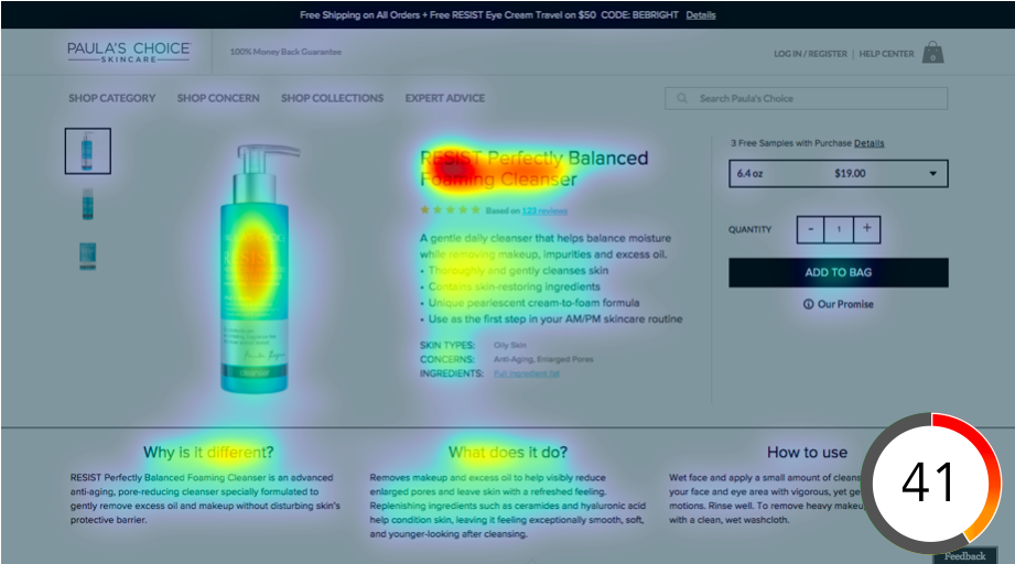
The heatmap shows us which elements attract the most attention (red areas) and the clarity score (41/100) indicates how users would rate this site in terms of clarity or clutter. Notice how attention is quite distributed across the page? The main headline receives the most, yet three blocks of the product description as well as the product image are competing for second place. This is due to too many elements being presented at once. This is confirmed by the low clarity score.
The good news is that designers have tremendous power over adjusting the “volumes” for different elements. They have two essential tools at their disposal to lead users’ eyes to key content:
1. They can design in a way that the most important elements have the highest saliency. Saliency refers to the potential of a given visual element to draw user attention towards it. In other words, the higher the saliency, the higher the probability that it will be seen first. One technique here is to increase luminance contrast for certain elements, for example.
2. They can reduce the amount of design elements on the page to lessen the competition amongst them. This also leads to a higher probability that the most important bits will stand out more.
Let’s have a look at Paula’s Choice’s European site as a comparison to the example above:
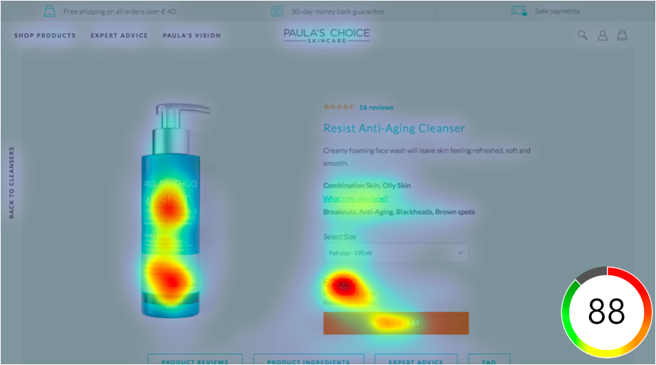
On this product page, attention is much more focused. Since it doesn’t contain any distracting elements (clarity score of 88/100) it centers around two key areas: the product image and the price / CTA. This makes the navigation easier and increases the chances of shoppers to actually place the item into their cart.
—
Want to see how clean or cluttered your website appears to users? Then let’s have a quick chat and run some of your designs through EyeQuant.


Check out our latest top tips on how you can use EyeQuant to spy on your competitors, analyse mobile...
Read more
In our latest blog we explore how to use neuroscience to help create higher performing digital products.
Read more
Figma is the go-to prototyping platform for many UX and web designers – and not without reason. Its functionality,...
Read more