We value your privacy
This website uses cookies to ensure you get the best experience on our website.
 Skip to main content
This website uses cookies to ensure you get the best experience on our website.


When we were roaming hunter-gatherers, paying close attention to the color-coding of our environment bettered our chances of survival. Colors sometimes helped us distinguish threats from non-threats, and signaled the ripening of fruits and vegetables. In the present day of skyscrapers and AI, color still has many of the same functions.
The emotional response triggered by color dates back to the beginning of our species’ life cycle. Interpretations and associations began to form a robust mental repository, from which we could extract meaning at the appropriate time. This process has become subconscious and automatic. How do we harness its power when working on an excellent UX design?
Color must be used with specific intent. It falls on you as a designer to create visual interest and draw the user’s attention to certain elements. Take note that particular details might prove to be distracting. Try to prevent the user’s mind from wandering away from the task at hand.
Choose a meaningful brand color from an equidistant palette. An explicit perspective about the brand’s identity is the foundation of color selection. The color for calls-to-action can be complementary to the brand’s colors, but different. It needs to stand out. The purpose of calls-to-action is to inform the user about the effect of a button, the existence of a link or a method of navigation.
In order to figure out which colors will appeal to your audience most, preliminary research is necessary. Without broad, systemized knowledge of who the project is aimed at, I’m afraid you’d be designing in a bubble. The age, gender and cultural background of your users can help you understand how they interpret the colors you plan on using.
Your users’ age plays a significant part in the decision making process. The website for a teen’s favorite rock band is nothing like the one for his grandmother’s life insurance company. Color can help you create and consolidate the brand’s image. Should it come off as playful and youthful, or stern and serious?
While the pink for girls and blue for boys paradigm no longer has any place in 21st century design, we must take into account that oftentimes the design of products geared towards the masculine public is perceived as off-putting by women. Research also found that while both men and women exhibit a clear preference for the color blue, a considerable segment of women also enjoy the color purple. The same was not true for their male counterparts. (via Interaction Design Foundation)
Cultural awareness can make or break your UX design. You can prevent potential blunders by becoming familiar with the color’s meaning in the specific cultural context you’re designing for. There are considerable differences in color interpretation between Eastern and Western cultures. Perhaps the most quoted and telling example is that of the color white, which is a symbol of purity and hope in the West, and the color of mourning in the East.
There are several tried and tested methods you can use to elaborate a color scheme. They become increasingly complicated as the number of colors increases. Here’s what you could try:
There are no recipes that guarantee success. A lot of the time, choosing a color scheme implies allowing yourself to get inspired by your surroundings, being mindful of the user research, and improvising in regards to the general structure of the scheme. You are free to customize it however you see fit.
It’s best if your color scheme is tailored to your project, not to a general scheme.
Color is one of the building blocks of visual hierarchy because it can be used to signal the importance of elements. It is at the core of interface functionality. EyeQuant’s Guide To Visual Hierarchy is a valuable resource for those who wish to delve deeper into the topic. Remember that, as a designer, you control the manner in which a user navigates a page.
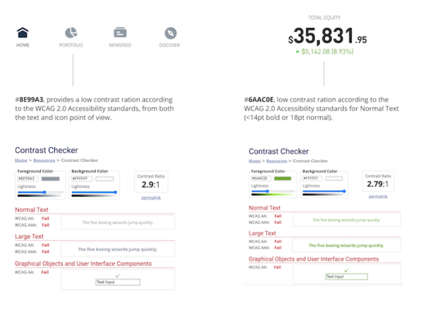
Color can be used to indicate a call to action, and to inform the user about the state of a device or the result of an action. The example below is from a GUI design we created for an electronic device. Logically, red is used to mark failure, and green to indicate a pass. Progress is shown through the loading element and underlined textually.

Always be mindful of color contrast and accessibility ratios across the interface. Contrasts must be chosen intelligently. Not all elements must have strong contrasting ratios, that would put a strain on the eyes. Be compliant with the guidelines of accessibility, as well as aesthetic and functional considerations.
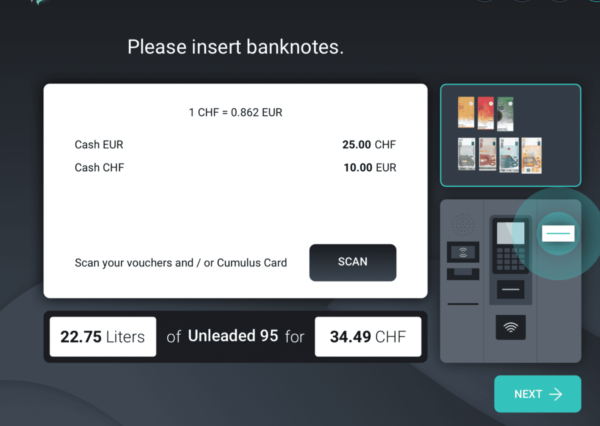
When you strive for functionality in design, it’s best to keep it simple. The example below is from one of our projects, in which we worked on the interface for a POS system. You can notice that while our gaze is attracted by the Next button, the black SCAN button is not immediately visible. Even though there are colors to the right, the contrast in the centre of the interface is strong. All that white signals that that’s where the relevant information is.
Thanks to directive 2016/2102, in the EU designing accessible digital products is a must. How do we bypass colorblindness when we’re conceptualizing our design?
Only more user testing and stakeholder feedback can determine whether your vision is in tune with the project’s objectives or not. When you have several elements on a page, it gets difficult to understand the relationship between them. It’s especially challenging to make adjustments to nuances.
Because EyeQuant simulates the way users interact with your page or app, it can help you understand which areas their eyes are drawn to and where their gaze lingers. With a tool as accurate as EyeQuant, you can surpass your limits in terms of juggling multiple elements at once.
As a designer, it is part of your role to use color to elicit the type of subconscious response which is most in tune with your project goals. Color influences where people look, and you can verify whether your design has had the desired effect by testing it with EyeQuant. You can now back up your design decisions with solid research and explain your choices proficiently to people without specialized training.
90% of people use color as a justification for purchasing a certain product. While there is no magical color which guarantees sales, you have the opportunity to find out what works best with EyeQuant.
While color should never constitute the entire basis of your design, using it in a mindful manner can help you connect with your users. Rigorous research is necessary in order to have a clear understanding of your users and their behavior. Great design goes beyond hunches and presuppositions. All of your decisions should be backed up by facts.
Remember, exercising empathy towards the user leads to higher engagement and conversion rates.
This article was voluntarily contributed by Dennis Lenard, CEO of Creative Navy, a London-based digital product design agency. With ten years of experience in the industry, he is passionate about cognitive science, the design of embedded GUI and demanding applications.


Why do users miss what seems obvious? In our latest webinar, Professor Peter König, one of the world’s leading...
Read more
In this session, we explored how teams can move beyond instinct and start making creative decisions based on how...
Read more
What does attention prediction actually look like in day-to-day design work? In this month’s webinar, we’re joined by leading...
Read more