We value your privacy
This website uses cookies to ensure you get the best experience on our website.
 Skip to main content
This website uses cookies to ensure you get the best experience on our website.


108 Million Web Users Are Color Blind: How Do They See Your Website?
You may have read the title of this article and asked, “Why is EyeQuant writing about color blindness when there are far more pressing matters – like the possessive pronoun in my call to action – at hand?”.
In this article, we’ll speak about color blindness and why it matters to your website optimization strategy – and your users.
Rumor has it that one of the reasons Mark Zuckerberg decided on blue as the dominant color in Facebook’s design was because of his red-green color blindness. Please, don’t guffaw yet, Zuckerberg’s design gesture was neither a personal twist nor mere eccentricity. He was simply designing for the widest possible audience.
1 in 12 men, and about 1 in 200 women – or about 4.5% of the world’s population – experience color blindness in some form. In rather rough mathematical terms, this means that of the approximately 2,400,000,000 internet users worldwide, around 108,000,000 users see things a little differently than you (and your designer) may have originally intended.
Our retinas contain two main types* of photoreceptors that help us along our daily journey to see and perceive the world around us: Rods and Cones. While we have about 120 million rods that help us to process things like dark and light (or “scoptic” vision), we only have about 6 to 7 million cones, and these are the hard-working little cells responsible for our perception of color.
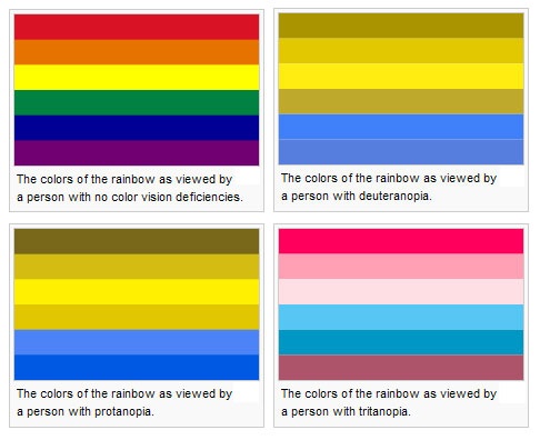
Most of world’s population are “trichromats”, possessing three kinds of cones in their retina to perceive color. These cones are made up of a ratio of approximately 64% “red” cones to 32% “green” cones, to 2% “blue” cones. Those of us with color blindness most often have “dichromatic” – or two-coned – vision, meaning that they are unable to immediately perceive differences in red and green (leading to deuteranopia – in which the “M” or medium wavelength cone is missing – and protanopia, in which the “L” or long wavelength cone is missing), or blue and yellow (the much rarer tritanopia, caused by missing the “S” or short wavelength cone).
While we don’t know precisely why it occurs, it is commonly understood that most color blindness is a genetic mutation deriving from the X chromosome, which also presents one possible reason why more men are color blind than women. Only tritanopia seems to derive from Chromosome 7, which is equally shared between men and women.

In a recent presentation given at Google I/O 2013, Google designer Alex Faaborg gave a brilliant talk about cognitive science and design (which is absolutely worth a watch in its entirety despite it’s 40 minute timecode).
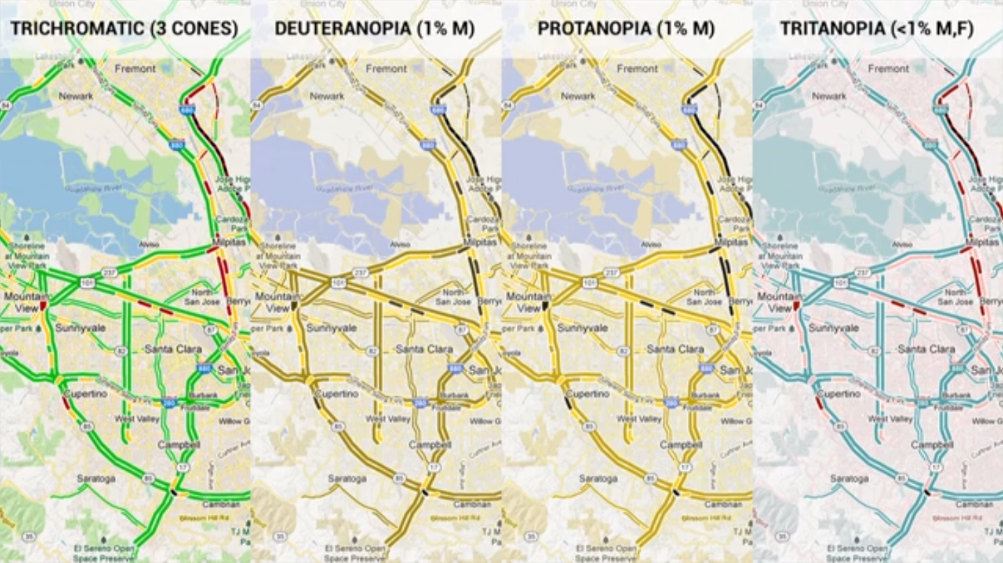
At about the 14 minute point, Alex starts to speak about color deficiency, and soon brings up the common misconception that designers should not use red – green differentiations in interface design, as they will not be perceived at all.
Alex suggests that, although enough contrast is usually present to differentiate between what would otherwise be perceived as red – green differences, it’s nevertheless prudent to run your designs through a filter to find out what 4.5% of the global population will initially see when they look at your interface.
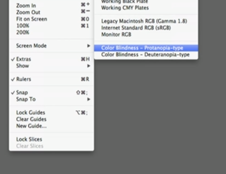
There are online applications to simulate this, but as Alex points out, this filter is actually already present in photoshop (we were surprised too!).
In researching this topic, we came across a lovingly written blog article by Jason Sherrill inetsolution. In it, the author professes his color blindness then takes us on a journey through his experiences with buying products online.
As almost any comment board on an online clothing shop indicates, the accuracy of color choices can be variable and at their worst, deceptive. For Jason Sherrill, color charts are often about as effective as herding cats:
“On FranklinCovey.com, I had to choose a color for the storage the case I was ordering. They presented two choices, both of which looked black to me. Since I didn’t think they’d make me choose between black & black, I concluded that one of the swatches must be dark red or dark brown.”
Luckily, this problem is not insurmountable. Many companies like Amazon allow for a scroll over “alt text” that would help him to differentiate between what he otherwise saw as a choice between black, and black.

Jason’s story is a question of responsible design as opposed to catering to a niche. With a simple tweak, Jason was reassured of his choices and more comfortable with clicking the “buy button”:
“When color charts with text labels do appear on a site, I actually find it easier to buy clothing online than in a store since usually in the store, the color is not printed anywhere on the product.”
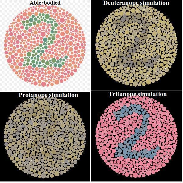
In his analysis of visual attention in chaotic jungle scenes, EyeQuant Science Director/Co-Founder and Professor of Neurobiopsychology Dr. Peter Koenig tested deuteranopes (or those with an insensitivity to green light) for their ability to identify red-green differences. Surprisingly, the deuteranope test subjects were able to compensate for their inability to differentiate between red and green with only a slight delay in time, about 300-400 milliseconds. This suggests that people with color blindness have developed compensatory mechanisms that allow them to distinguish contrasts in scenes at almost the same speed as those without color blindness.
In general, the results of this study point to the incredible adaptability of the human brain. People with color blindness must adapt constantly to the dominant trichromatic color spectrum of the rest of the world, but there are still ways to meet deuteranopes, protanopes, and tritanopes halfway.
There are two simple ways to optimize for color blindness:
EyeQuant is currently exploring how color blindness affects user attention on your websites. We’re looking forward to incorporating research on this fascinating subject into our upcoming attention models. Stay tuned!
* While we are well aware of these two main photoreceptors, there is in fact a third kind, and it helps to control our biological clocks: “These light sensors are a small number of nerve cells in the retina that contain melanopsin molecules. Unlike conventional light-sensing cells in the retina—rods and cones—melanopsin-containing cells are not used for seeing images; instead, they monitor light levels to adjust the body’s clock and control constriction of the pupils in the eye, among other functions. “


Why do users miss what seems obvious? In our latest webinar, Professor Peter König, one of the world’s leading...
Read more
In this session, we explored how teams can move beyond instinct and start making creative decisions based on how...
Read more
What does attention prediction actually look like in day-to-day design work? In this month’s webinar, we’re joined by leading...
Read more