We value your privacy
This website uses cookies to ensure you get the best experience on our website.
 Skip to main content
This website uses cookies to ensure you get the best experience on our website.


Product pages ultimately exist for one reason: to showcase a product a shopper is interested in and close the sale. It’s where we put our washing machines, dresses, and shoes on display to convince our shoppers that this is what they’ve been looking for, and that we’re the ones to buy from.
Here, it’s super important that the next steps visually stand out to make it as easy as possible for shoppers to place an item into their carts. There’s nothing worse than a frustrating user experience at this stage.
How then can we direct users’ attention to where it matters most? This article will show you 3 ways to make your product pages more effective:
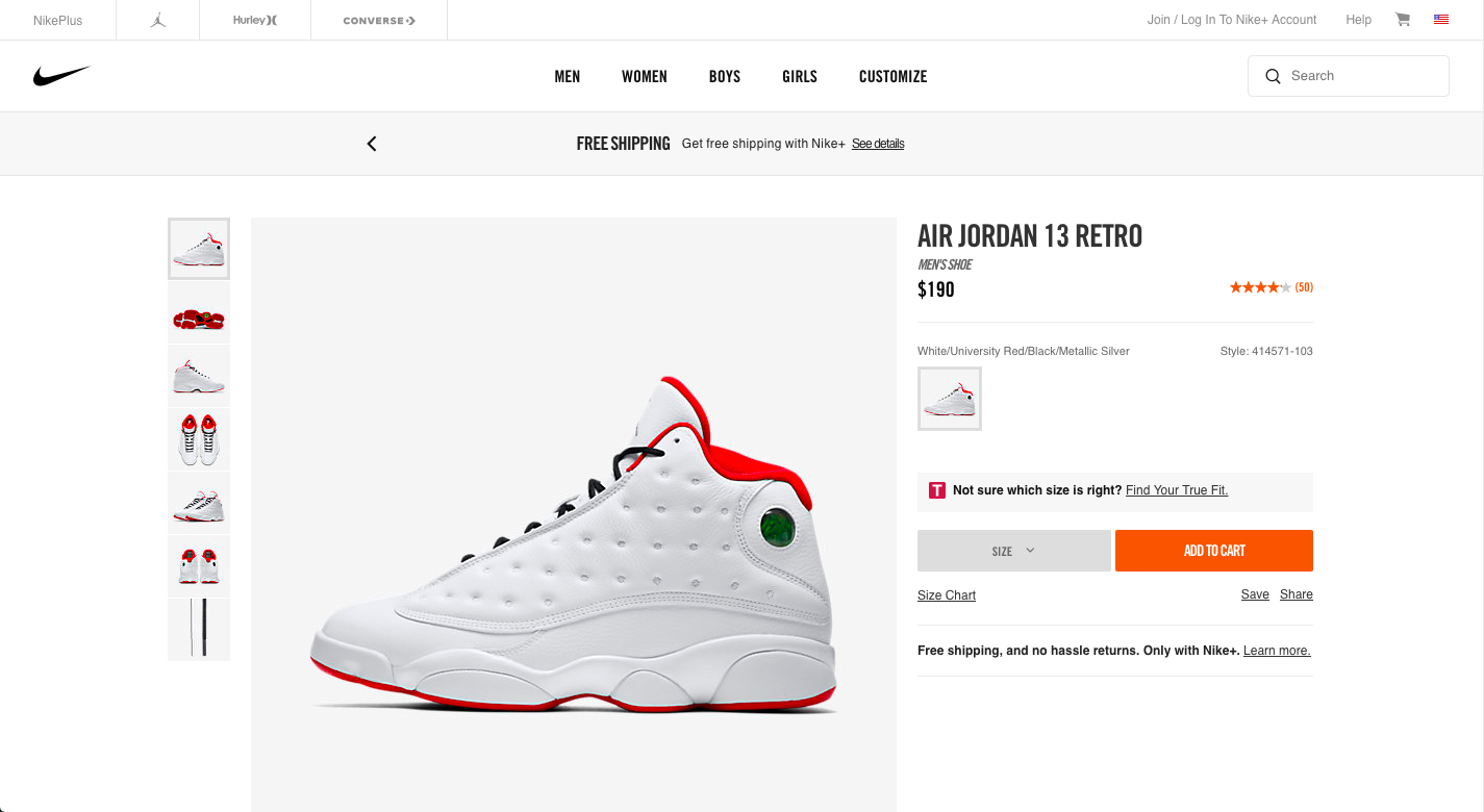
One powerful way of leading users’ eyes to where you want them to go is making use of contrast, the difference between two pixels (or areas) in terms of brightness or color.
Here are two designs that show how contrast affects what is focussed on first:
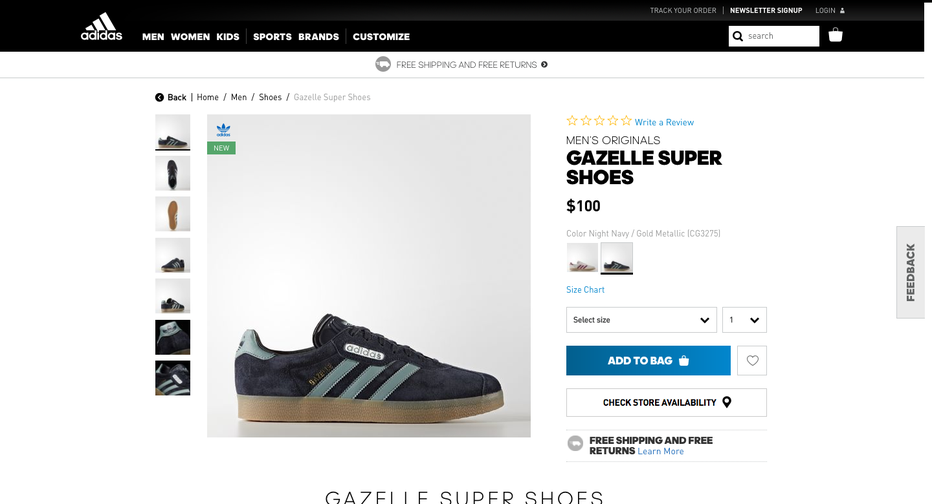
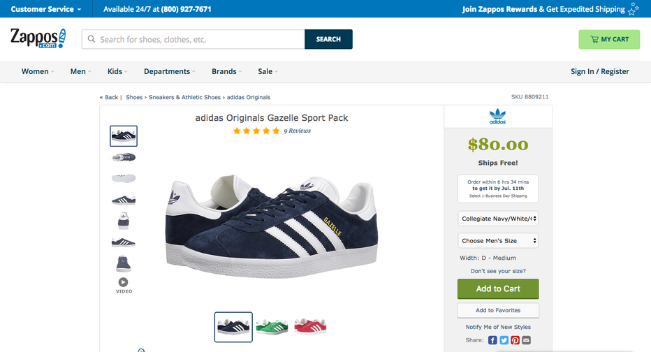
Both pages share a similar layout and contain all the essential pieces of content. The product itself is placed center-stage and the price as well as the CTA are located on the right. Nothing revolutionary going on here.
This doesn’t mean however that the viewing experience can’t wildly differ between these two designs. To test how they will be perceived, both designs were run through EyeQuant, an AI that predicts what users will most likely see in the first couple of seconds after landing on the page. Let’s take a look at two “perception maps” that show which content stands out (red circles show which areas attract the most attention):
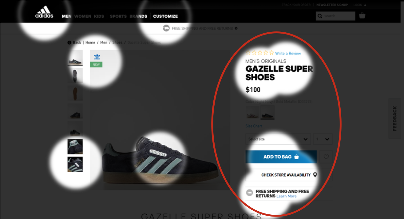
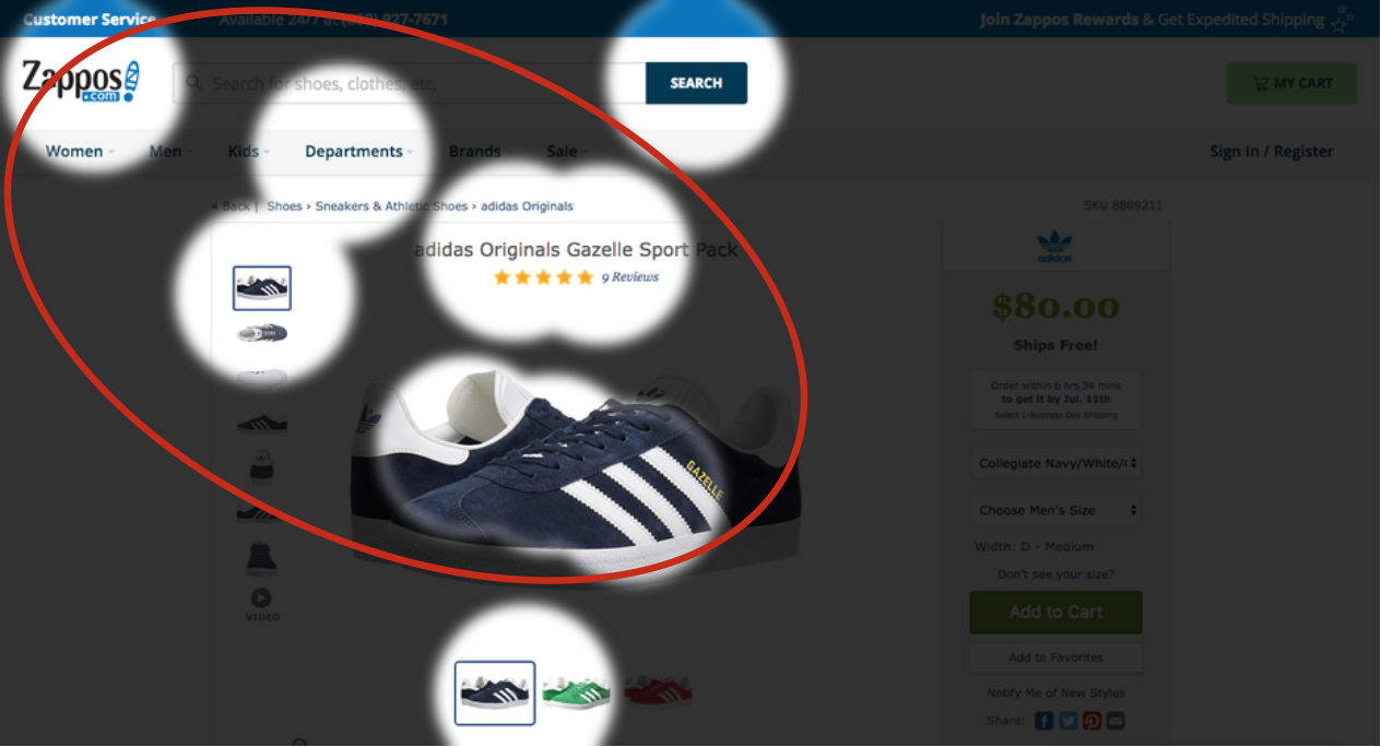
Adidas does a great job here: By effectively utilizing contrast, the design pulls in the user’s eyes towards the product details, call to action and “free shipping & returns” value proposition. This eases the navigation of the page since it is the design itself that is directing users’ attention towards the next steps.
Zappos’ design on the other hand has low (luminance) contrast towards the right side which makes the product details less visible. As a result, other elements with higher contrast, such as the product and headline, move to the foreground. To avoid this, Zappos could make some slight tweaks to the bar on the right. This could be as simple as changing the color of the price or CTA to make them more eye-catching.
Want to learn more about contrast in webdesign? Check out this article that shows what data from eye-tracking and NASA have to say about it.
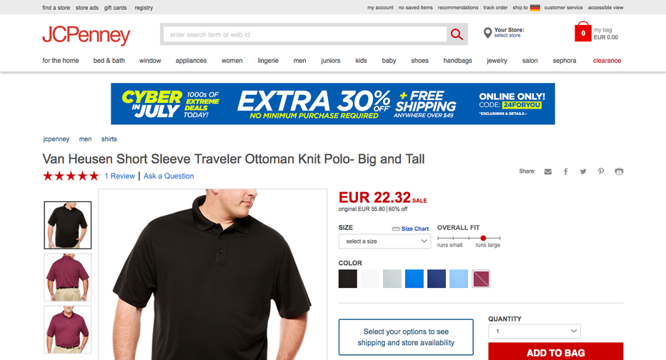
One thing to note is that attention itself is a finite resource – there’s only so much users can see in the first couple of seconds. Yet, many product pages still suffer from clutter and present too much content upfront. JCPenney for example decided to add a promotional banner to their product pages that hints at a 30% discount for certain items, but is unrelated to the displayed product:
Now let’s see if the banner has an impact on how users perceive this design:
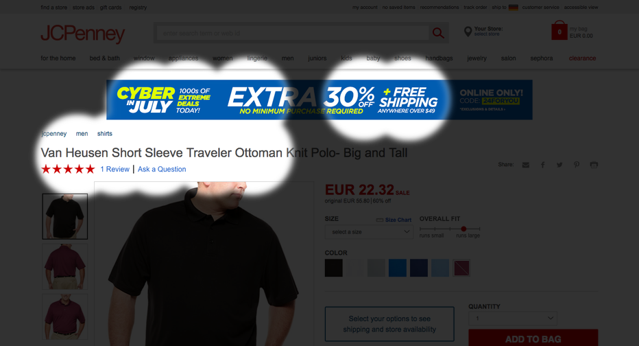
Two adverse effects are immediately noticeable: For one, it’s distracting from the product information such as price and color selection. As a result, users will have to invest more energy to find the next steps than would be needed. Secondly, it’s taking up so much space that the main CTA in the bottom right is almost pushed below the fold (at 1440X800px).
With these insights, let’s test if removing the banner leads to a better visibility of the next steps. The perception map already looks much better:
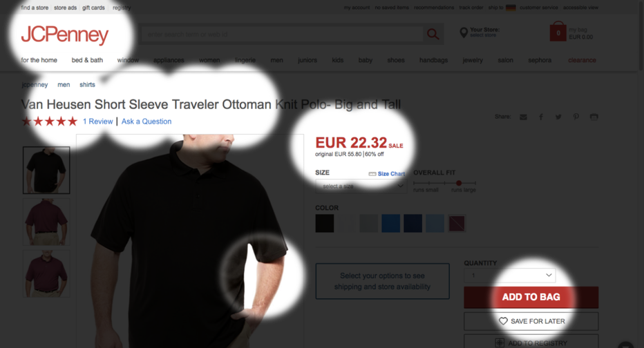
Now that there’s less distracting content, much more attention is directed towards the essential elements such as the price and main CTA, the information shoppers are actually looking for on a product page.
Not all locations on webdesigns are created equal. Eye-tracking studies with hundreds of participants show us that certain parts of the screen are more likely to be seen from the get go. The image below shows which areas will attract more attention, all else being equal:
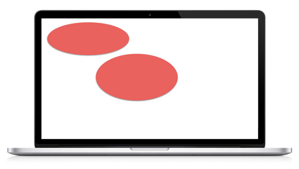
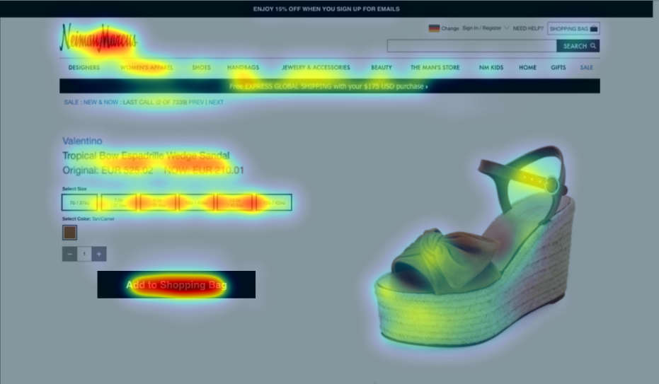
This is because most users are trained to read from left to right and we generally expect more important information to be placed in these areas. However, this is often disregarded in webdesign, especially on product pages. Just take a look at the following design from Neiman Marcus’ eShop:
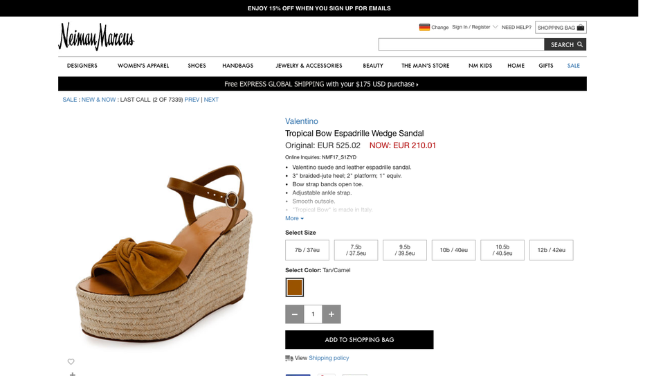
As many other product pages, Neiman Marcus follows a common layout here. If we now consider those high-value areas shown above, we might already have an expectation of what will most likely stand out. Let’s take a look at an attention heatmap that shows which areas attract the most (or least) attention:
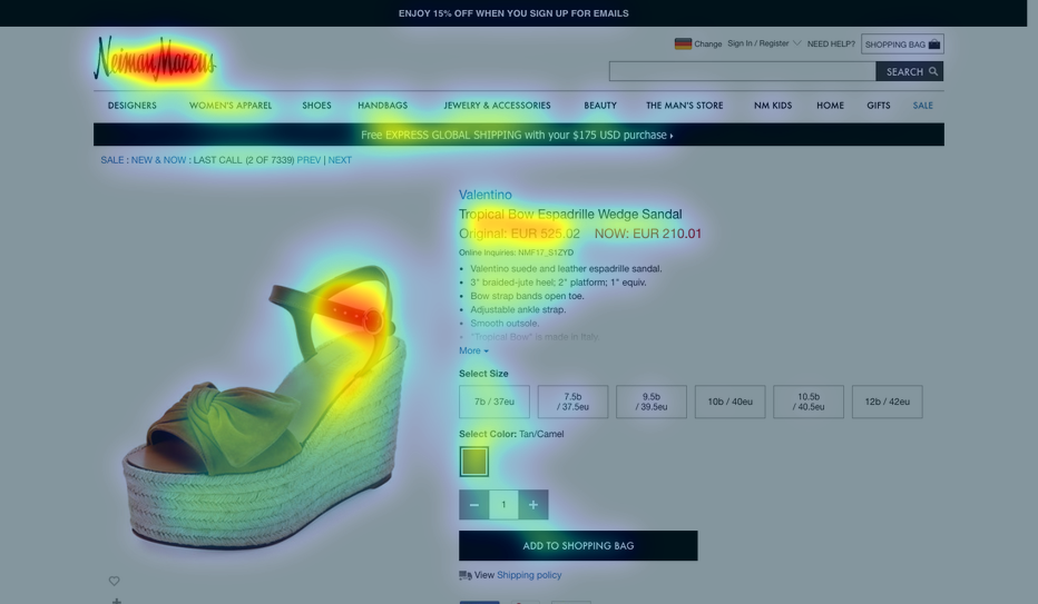
See how it’s mainly the middle and top left areas of the design that stand out? As a consequence, the next steps are barely being noticed in the first couple of seconds, mainly due to their sub-optimal location.
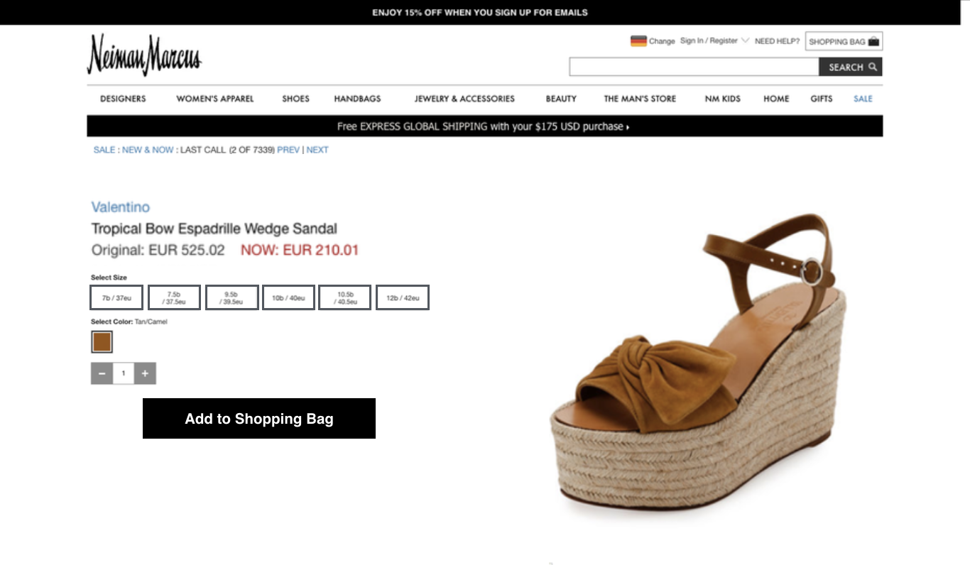
So what happens if we change the layout while taking the the high-value locations into consideration and apply the recommendations from above? For example, we could:
1. add contrast to the size selection buttons to increase visibility
2. de-clutter the site by removing a large chunck of the product description
3. make use of high-value real estate by flipping the layout
Here’s a quick mockup of what it might look like:
Now let’s see what effect this has on users’ attention:
With these design changes the most relevant content pops out and leads users to the next steps. By making the navigation of the page more intuitive, shoppers can more easily place the product into their carts and move closer to the sale.


In this session, we explored how teams can move beyond instinct and start making creative decisions based on how...
Read more
What does attention prediction actually look like in day-to-day design work? In this month’s webinar, we’re joined by leading...
Read more
The way teams predict attention is changing fast — and so are the tools that make it possible. In our...
Read more