We value your privacy
This website uses cookies to ensure you get the best experience on our website.
 Skip to main content
This website uses cookies to ensure you get the best experience on our website.


Data shows that most websites are too cluttered.
In our last post we wrote about the challenges posed by the modern Distraction Economy: how information overload has created a growing gap between the amount of information we’re faced with every day, and our capacity to consume that information. We’re all suffering from information overload, so it’s no surprise that the clearest messages are the ones that rise above the noise.
This is especially true online, where distracted users struggle to simultaneously manage several browser tabs while chatting with friends and thinking about which song to listen to next on Spotify (out of a library of 30 million tracks).
When it comes to websites (or any interface), users want a clean, clear, well-organized UI so they can find what they want as quickly as possible without getting distracted. It’s rare to meet a designer who doesn’t value the idea of clarity, yet the vast majority of websites are failing to actually achieve it.
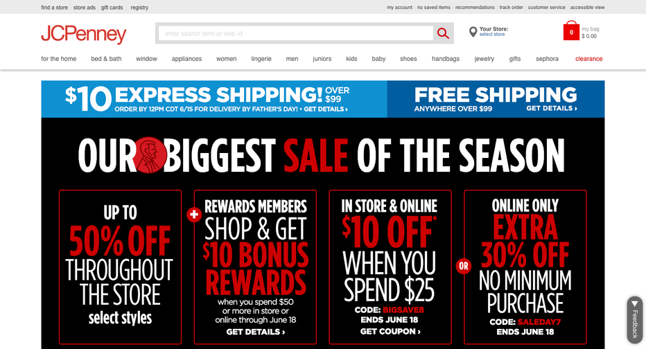 This recent screenshot of the JCPenney homepage shows how information overload can make it hard for users to understand which content really matters.
Among other reasons, clarity in design is considered merely “nice to have” by too many eCommerce teams. It’s important, but not as important as promoting that new product coming out next week, or the email newsletter, or the rewards program or this week’s blowout sale on dog food (or whatever else).
The truth is: your cluttered website isn’t an aesthetic problem. It’s a business problem that could be costing online retailers (collectively) several billion dollars.
The good news is that fixing this problem can serve as a legitimate competitive advantage if you’re willing to tackle it. In this post, we’ll try and help you do just that.

For most people, clutter is associated mainly with the feeling it triggers: the sense of being overwhelmed when you see it. We’ve all experienced this. But to systematically identify and reduce clutter we’re going to need a more tangible definition.
Cluttered designs are ones that lack visual order, thus increasing cognitive load as users struggle to parse the visual landscape and understand which parts are important.
1. There’s simply too much content (especially text) on the screen
2. Content doesn’t seem organized in a logical way
3. There’s too much visual noise caused by striking imagery and contrasts
So why does this happen? One reason is that the people who design them aren’t capable of looking at the website with fresh eyes, from the perspective of the user. They have too much built-up context and understanding; they know the content, and all the reasons why it’s being presented the way it is, so the sense of being “overwhelmed” doesn’t come as easily as it does for real users.
As an example, here’s a landing page promoting a special offer from British Gas. It’s not a particularly egregious offender, but there’s some duplicate content on the screen and a little more text than necessary. The different content modules don’t instinctively make sense; there’s a bunch of different blocks that are inconsistent in terms of spacing and alignment.
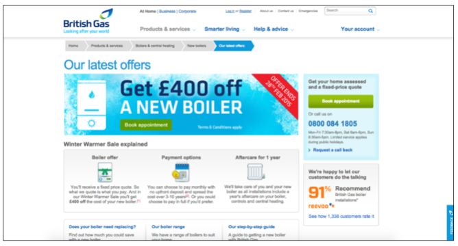
These things might not sound like a big deal, but they’re likely to bother the user, even if users themselves can’t articulate why.
In order to quantify this effect, our team at EyeQuant ran a series of user studies on all kinds of different websites, and used machine learning to build an algorithm that rates the visual clarity of any web design between 0-100, where low scores indicate that the design is very cluttered, and high scores indicate that the design is very clear (as seen in WIRED).
The British Gas design above scored a 48, which is well below the average for this kind of landing page. To their credit, the digital optimisation team took this feedback seriously, and set out to improve the clarity of the design (case study).
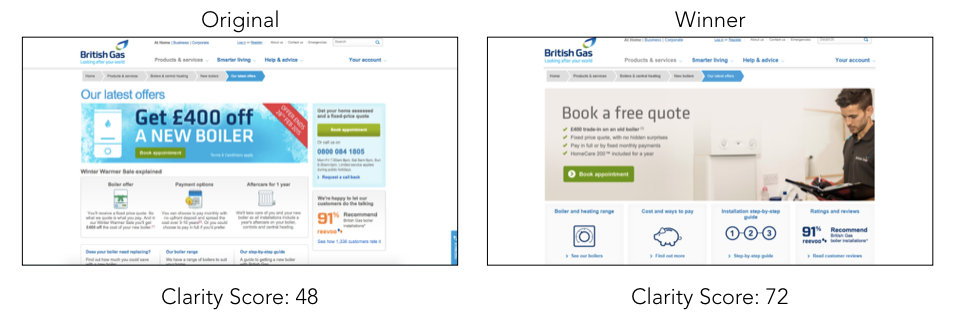
A re-vamped version of the page scored a 72 and out-performed the old version by 50% in an A/B test that was later featured as Test Of The Month by BEHAVE (formerly known as WhichTestWon).
British Gas isn’t the only company that’s managed to see impressive business results from de-cluttering. We found many other case studies where cleaner designs delivered significant business results.
Below are several public case studies from A/B tests featuring meaningful design changes. We’ve analyzed each of the variants to determine their Clarity Score, and in each example, the “de-cluttered” design increased conversion.
These are just a small collection of cases from the web, and surely the clearer design won’t win 100% of the time, but we’re yet to see any examples of an A/B test where intentionally adding clutter to a design has delivered an uplift.
Here’s a test Home24 ran on their homepage trying to improve the click through rates and final conversions (orders). Their hypothesis was that by cleaning up the top menu and the areas around the search field they would see a significant uplift.
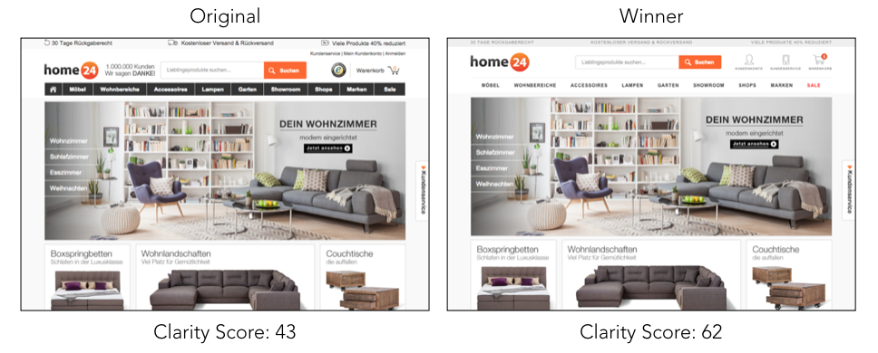
The changes made increased visual clarity by 44% and successfully lead to more user engagement, increased use of the search field, and a boost in final orders.
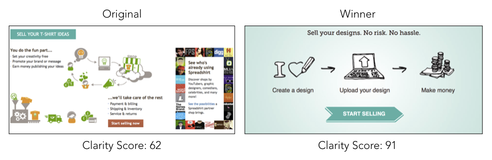
You can see the original was full of graphics and text, and it considerably lacked focus. The new version, which scored 46% higher for clarity, also performed far better than they imagined. Simply de-cluttering their design gave them a 606% increase in clicks and an 11% increase in final order conversion.
Product detail pages are often full of competing and seemingly important content. This example from Veggietales is no exception:
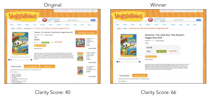
The team realized their design was overwhelming and needed to focus on just a few core items. They did so by eliminating the related product recommendations, moving more in-depth information about the current product below the fold, and increasing the prominence of their primary call to action. These changes increased revenue per visitor by 28%.
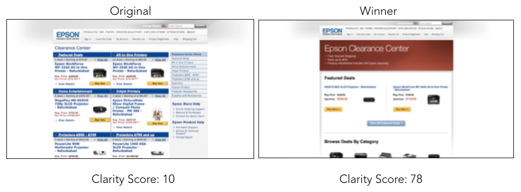
Epson struggled with figuring out how to direct attention to the most important content in a much cleaner and clearer way. They used EyeQuant to pre-validate new variants and found one that immediately communicated key benefits and substantially increased the overall visual clarity. The result was a 20% increase in the click through to the product pages, and a 10% increase in clicks on their “Buy Now” buttons.
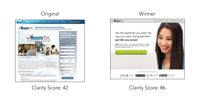
Here’s an example of how taking a risk on a major re-design can earn big rewards. You can see in MapleTA’s original version there was an abundance of text, no clear order, and outdated aesthetics. Their winning variant cut nearly everything but a hero shot, value proposition, and call to action and improving conversions by 611%.
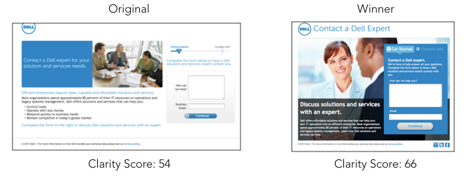
Dell wanted to increase form submissions on their pop-up contact window. They decided to simplify the design with a large background image, clearer sections, and reduced text. The test succeeded in reducing bounce rates by 27% and increasing submissions by 39%.
As you’ll see in the next section, design clarity is such a powerful factor that it even seems to have a quantifiable impact on sales growth at the company-level.
In a previous blog post, we explored the relationship between Clarity Scores of top online retailers (measured by EyeQuant) and their sales growth rates (as per the 2014 IR 500 Guide). What we found was that among top-performing eTailers, sites with cleaner designs have higher growth rates.
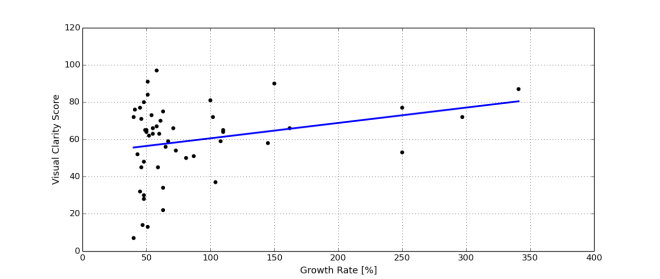
Overall, the fastest-growing retailers in 2014 had a mean Clarity Score of 59, which is above average but still shows room for improvement.
To follow up on that analysis, we recently tested the home pages of the National Retail Federation’s top 50 list of eCommerce sites, which resulted in an average Clarity Score of 64, suggesting that the bar has been raised since 2014.
One of the top performers in this list was Apple, which scored an incredible 93 for Visual Clarity on its homepage.
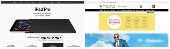
It’s a fantastically simple design with a product image at the forefront along with the bare essential amount of text and a well-designed menu. Among more traditional retailers, Macy’s led the way with an 84. In this example, they’ve done an excellent job of using tables and padding to create a sense of order. They also have a healthy balance of content and whitespace.
As we mentioned before clutter leads to increased cognitive load which results in more visual confusion and frustration. Eliminating unnecessary content is thereby an effective way to mitigate cognitive load, but also results in a powerful side effect — increased focus on the important elements still left in the design.
To illustrate this let’s look at an example of a product page from Baggin’s.

This page has a lot of elements competing for the user’s attention; the product, its description, a variety of logos, both a top and side navigation, promotional information, as well as a call to action. The challenge at this point is determining which content must stay (the most important), and which content should go (the least important).
After years of working with 1000’s of optimization projects we’ve developed a simple framework for identifying the core items generally necessary for conversion. We call it the 3W’s and the idea is that users should immediately be able to understand: What this page is about (relevance), Why they should care (value), and Where they should go next (call to action).
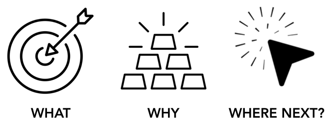
Going back to the Baggin’s example we can intuitively conclude that the ‘what’ is the product itself, the ‘why’ is in the pricing & description, and the ‘where next’ is the add to cart CTA. We can now use the EyeQuant Perception Map — a tool that highlights what users are likely to see and miss within the first three seconds of landing — to see if this content is actually catching the user’s eye.

If you look at what’s under the spotlight, we see that in fact a substantial amount of user attention is guided towards non-critical content like the 3 irrelevant logos. These logos are stealing attention from more important elements like the value described in the product description, which EyeQuant predicts users are likely missing all together. Let’s attempt to fix this by simply cutting some of that content.

We eliminated the logos, removed the side-navigation, and brought what’s left up and into the center of this design. There are probably more things that could be eliminated, but for now let’s run this through EyeQuant and see if the changes made any noticeable impact.

In this new version not only is our most important content (3W’s) now all immediately visible, but each is also receiving a larger share of attention than it had before. Reducing cognitive load is not only about limiting the amount of information users have to process, but also about bringing the most important information to the forefront of their minds.
De-cluttering as a strategy is all about reducing and removing unnecessary distractions from the user journey to reduce cognitive load and allow users to focus on the parts that really matter to them.
But you can’t just move or remove any content and expect the results you’ve seen in the examples we’ve shared. You still need to provide adequate context and content. Consider the type of page you’re working on, and the mindset of the user when they visit. For example, a product detail page with no pricing information won’t improve the user experience, nor will it help you sell anything – even if it makes the design feel cleaner.
The tricky part is determining exactly which content is actually necessary at each step in the user journey, and defining your own process to establish which pieces stay and which go. To answer this question, put yourself in the shoes of your customer – not your organizational priorities or departmental goals. This is also where it can help to do some customer journey analysis. As always, the more user research you’ve done, the easier this will be.
This is a great use case for competitive benchmarking, and it’s also where EyeQuant’s Clarity Score can be very helpful. For example, if you’re interested in de-cluttering a landing page for your car rental website, you can test a handful of other car rental landing pages to understand what the average Clarity Score is, and how wide the range is. If your own score is average or below-average, that’s likely an indication that you’ll benefit from de-cluttering further.
Evidence shows that in today’s world of information overload, de-cluttering your website is likely to please your customers and improve conversion rates (and ultimately sales). But we’re also aware that de-cluttering your website may have a larger effect in certain industries or competitive scenarios. Which kinds of websites have the most to gain from de-cluttering? The least? And how come category leaders like Amazon or Booking.com seem to get away with having much more cluttered designs than competing sites? Stay tuned to the EyeQuant blog to find out.


Why do users miss what seems obvious? In our latest webinar, Professor Peter König, one of the world’s leading...
Read more
In this session, we explored how teams can move beyond instinct and start making creative decisions based on how...
Read more
What does attention prediction actually look like in day-to-day design work? In this month’s webinar, we’re joined by leading...
Read more