We value your privacy
This website uses cookies to ensure you get the best experience on our website.
 Skip to main content
This website uses cookies to ensure you get the best experience on our website.


There’s a clear relationship between “clean” web design and user engagement. As reported by Fast Company and Inc. Magazine, a...
Read more The Overloaded Cart Page: Even Zappos is Committing this UX Sin. Working in the UX space rapidly leads to...
Read more Most Website Redesigns are a Waste of Money. Here’s What Sets the Successful Ones Apart. In the digital world,...
Read more Hacking Web Design with Neuroscience: 5 Ways to Change the Way Users See Your Site Today’s web and mobile...
Read more In 2006, Nielsen Norman published some fascinating research on how people scan and read websites. They announced that their...
Read more On the EyeQuant blog, we often write about the importance of visual hierarchy on websites, and making sure that...
Read more For the last couple of years, our friends at ConversionXL have compiled an annual State of Conversion Optimization report that...
Read more Any designer would agree that establishing a clear visual hierarchy is one of the most basic functions of web...
Read more If you’ve been following the EyeQuant blog, you probably already know that most websites are too cluttered. Why should...
Read more Product pages ultimately exist for one reason: to showcase a product a shopper is interested in and close the...
Read moreNo more posts to display
No more pages to load

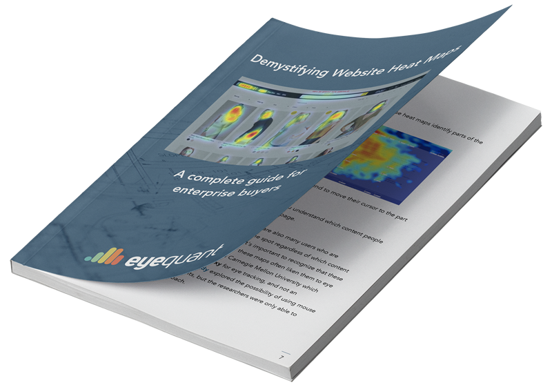
Heat maps: It’s probably the broadest, most popular category of insight tools available to any company that wants to understand and improve the user experience on their website.
They’ve been around for years, and most companies have used them at some time or another. They’re a staple tool for Analytics departments, Conversion Optimization teams, and User Experience professionals everywhere.
To learn how EyeQuant could improve your design process and increase conversion rates, book some time with one of our specialists.